Category: Black & White Photography
January 2, 2020

Five Simple Steps to Create Award Winning Images
You clicked on this link? Seriously, how gullible are you?
There are no simple steps or secret tips to creating a great image. If anything the title of this article should read:
5 Hard Things You Must Do To Create Images That YOU Love.
That’s the reality.
My goal is to create images that I love (not award winning images) and there are no set of rules, no camera, no magic settings, no new gadget, no plugin or secret technique that’s going to transform my work.
It takes hard work. It takes introspection. It takes persistence.
Since I tricked you into clicking on this link, I feel obligated to give you five tips. So here they are:
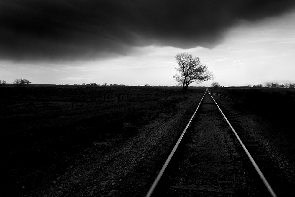
1. There are no simples steps!
It takes hard work to find and follow your Vision, to know what you love and then to single-mindedly pursue it.
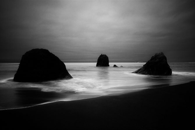
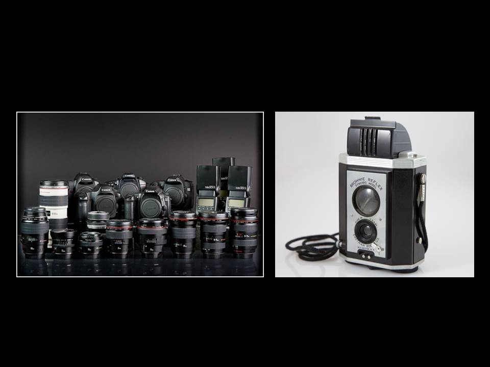
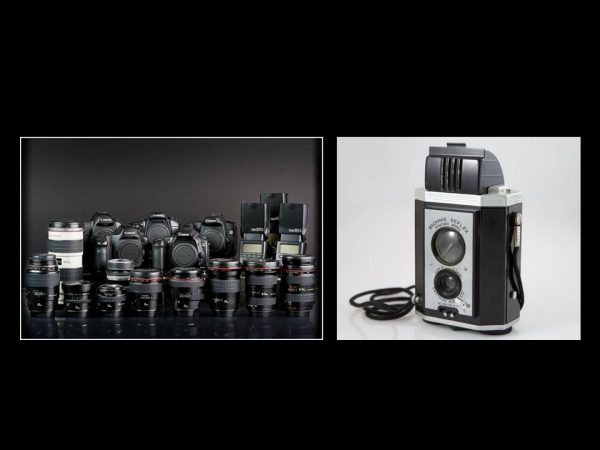
2. A “great image” has little to do with your equipment.
Never has owning a prime lens, shooting at the optimal aperture or having a better camera made a poor image good or a good image great.
A friend and I were recently looking at one of Dorothea Lang’s images when we noticed that it was not very sharp. And yet that did not detract from the image. The image was powerful because of her Vision, not because of her equipment.
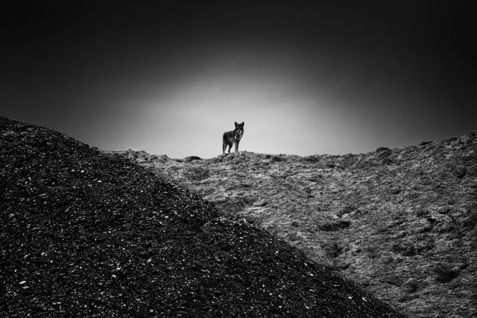
3. Don’t follow rules but rather see for yourself.
Rules are for people who have not yet found their Vision. Instead of following rules that will take you down the path millions of others are following, find your own Vision and create your own path!
Ansel Adams said “There are no rules for good photographs, there are only good photographs.“
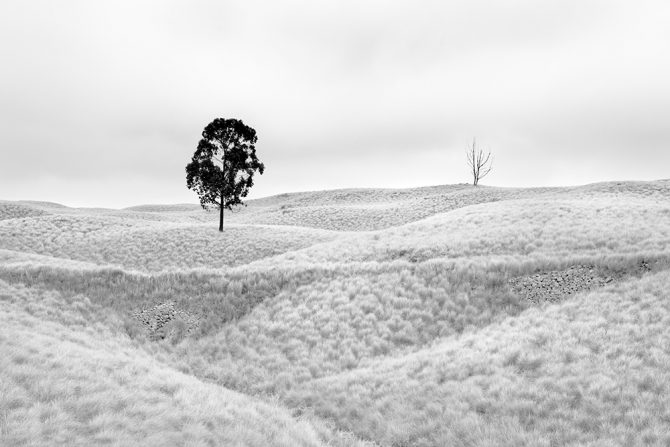
4. Create for yourself!
Create an image that you love and don’t be concerned if others will like it. Don’t worry if your photo club expert “Herb” will like it and don’t be concerned if it will win a contest or get a lot of likes.
Care only what you think of the image and don’t worry how anyone else will receive it. You are not creating for them (at least you shouldn’t be).

5. Create an image and then be brutally honest with yourself about it.
Ask yourself:
Do I love this image?
What do I like or dislike about it?
What would I do differently next time?
Is this image good enough?
That last question, “is this image good enough” requires so much honesty! If the image isn’t quite up to snuff…then admit it, trash it and move on.
And PLEASE don’t ask other people these questions about your work, you must answer them for yourself and then work to improve. This is hard introspective work and you must do it over and over again.
________________________________
The next time you’re tempted to click on a link that offers a secret something, a simple something or a new something that will transform your work into award winning images…save your time and money and instead Find your Vision and work to create images that you really, really love.
Cole
November 28, 2019

May 1, 2019
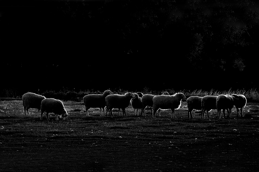
Dark Sheep
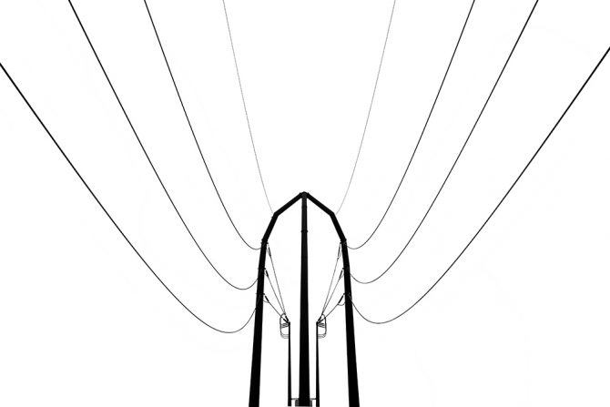
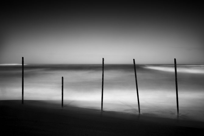
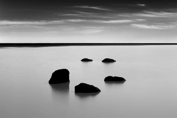
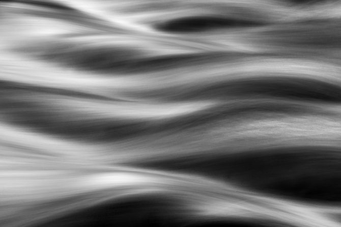
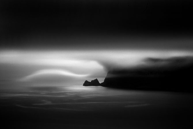
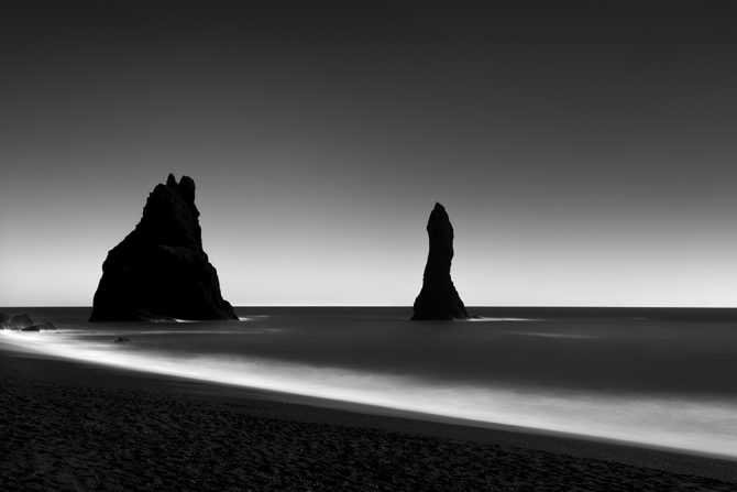
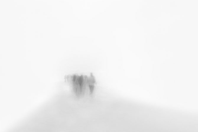
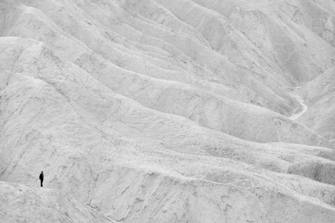
Even though I’ve been photographing in Black and White since 1968, I consider the years from 2004 to present to be my important ones. It was during these years that I found my Vision and pursued my Passion.

March 17, 2019
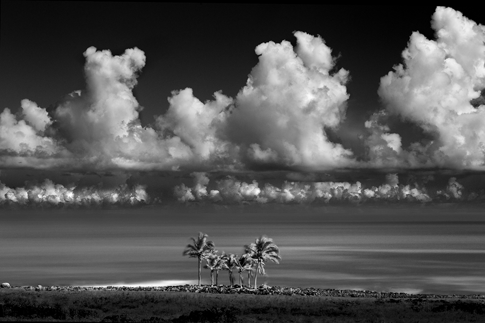

Palms, Rapa Nui
A photographer friend, George Digalakis, asked me to write this article for his blog: Inspirational Places. You can read the original article here: https://www.digalakisphotography.com/inspirations/ct-ei
My Favorite Location:
How does one choose their favorite location? It would be like choosing your favorite image or favorite child!
Sometimes it seems like the last location is always my favorite location. And philosophically, I don’t believe an exotic location should be necessary for creating a great image. My philosophical hero, Edward Weston, said the following when he was confined to a chair with Parkinson’s:
I should be able to look down at my feet and see something to photograph
But I have been fortunate to travel to many incredible locations. And of all the places I’ve been, Easter Island has been the most significant to me. Why? Because it has been on my mind ever since I read Thor Heyerdahl’s book “Aku Aku” when I was 17 years old.
Now fast forward 47 years to when my wife and I were compiling our bucket list and I mentioned that I’d love to add Easter Island to the list, but that it really wasn’t feasible. My wife asked: why not? I didn’t really have an answer and so off we went in 2015.
Easter Island is known as the world’s most isolated inhabited place. I tell people that it’s really not that hard to get to, but it isn’t for the faint of wallet. It’s an expensive journey.
Easter Island is small, about 7 by 15 miles and has about 5500 inhabitants, some of which are the native Rapa Nui and also many Chileans. Only the Rapa Nui can own land on Easter Island.
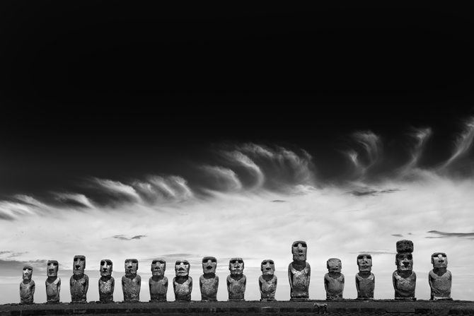
Easter Island is best known for its Moai, those monolithic statues carved by the ancients. There are about 1000 Moai on the island and about 30 standing on several different ahu’s or alters.
I spent two weeks there, circumnavigate the island 3-5 times each day. I focused almost exclusively on the Moai and created three portfolios:
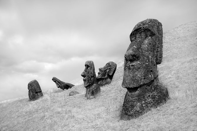
The Moai of Rano Raraku
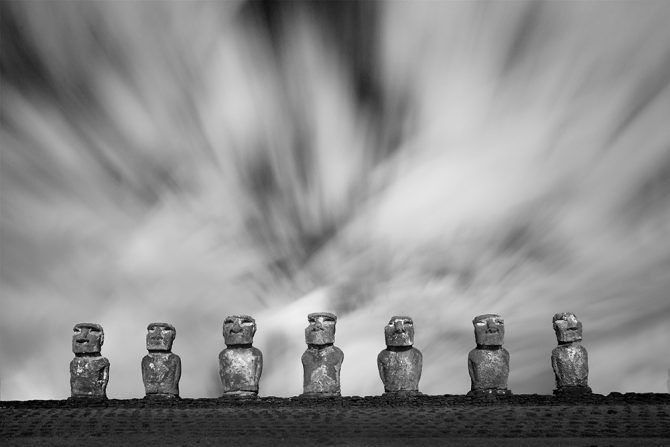
Standing Moai
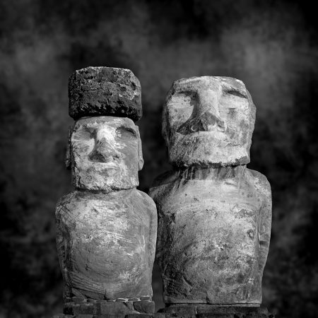
Moai, Sitting for Portrait
The portfolio I am most proud of is the “Moai, Sitting for Portrait” and how it came about. Here is my artist statement:
In January of 2015 I spent two weeks photographing the Moai of Easter Island. This fulfilled a lifelong dream, one that started when I was 17 and read the book “Aku Aku” by Thor Heyerdahl. I became fascinated with the Moai and they have been on my mind and influenced my art for these many years.
As I traveled to Easter Island and tried to imagine what I would encounter, something interesting happened: I fell asleep and dreamt that I had invited the Moai to come and sit for a formal portrait.
When I awoke I thought “why not?”
I knew there would be challenges: the Moai are reserved, aloof and almost unapproachable. They had suffered greatly at the hands of outsiders and the question was: would they come to trust me?
Distance was the first hurdle to be overcome: the island is small by automobile standards, but when we are talking about the Moai who walk everywhere, traversing the island to get to my makeshift studio could be difficult. Then there was the Moai’s physical condition: many were incapacitated by war and the ravages of time and could not make the journey. And how would I accommodate the size of the Moai, with some towering 33 feet tall?
Facing these challenges and armed with nothing more than a dream and hope, I issued the invitations…but would they come?
Initially only a few came; the younger and less suspicious ones. But slowly, as word spread of their experience, others started to arrive.
Photographing the Moai created some interesting situations: one older Moai refused to allow me to photograph his face and turned his back on the camera. Another arrived with a hawk and insisted on having his portrait taken with the bird atop his head. Several Moai with bullet wounds, inflicted by outsiders, insisted that I document those scars.
And there were tense moments, as two rival Moai came together face-to-face in the studio, but which ended well when they agreed to be photographed together. And there were touching moments as old friends were reunited after years of separation.
The Moai are quiet, stoic and could even been described as “stone-faced.” And it’s true, not once was I able to photograph a Moai smiling, but instead they have a dignified poise that transcends time.
It was a lifelong dream that brought me to Easter Island and a sleeping dream that caused me to create this portfolio.
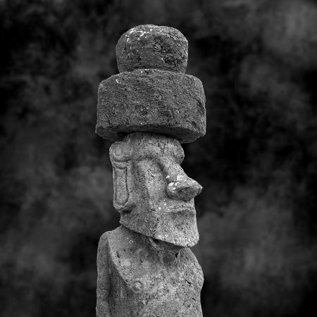
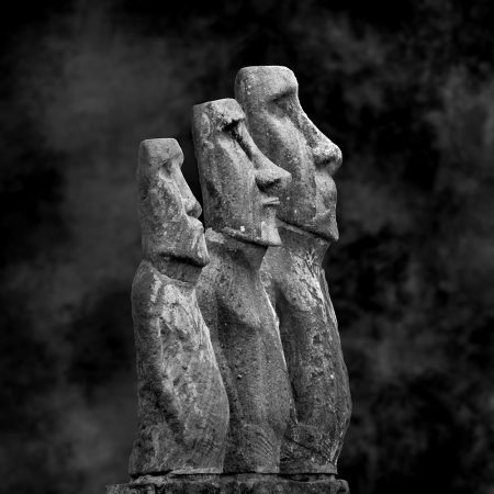
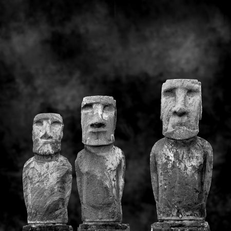
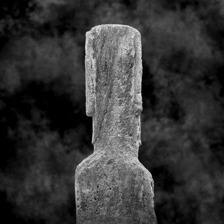
See all of the Moai portraits here
March 7, 2019

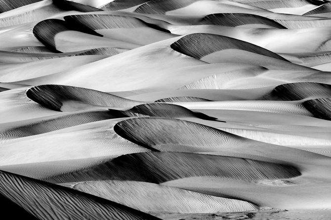
Dunes of Nude No. 227
In my last blog post I strongly suggested that people should not to listen to other people’s advice, and someone called me on that advice! He reminded me that one of the best lessons I’ve ever learned came from following someone else‘s advice (Ansel’s already done Ansel)
He’s right, sometimes you should listen to the lessons taught by others! I’d like to share five lessons I’ve learned from important people in my life.
Mr. Casey
Mr. Casey owned Casey’s Camera in Rochester, NY. Upon discovering photography at age 14, I visited the camera shop frequently…probably much too frequently. I was there all the time; talking, asking questions and buying old cameras which I would then trade in a month later. No matter how long I was there, how many questions I asked, how many times I traded in cameras…he was always patient and kind.
It wasn’t until some 40 years later that I came to appreciate how very kind and patient he had been with me.
And so I decided to track down Mr. Casey and thank him for his kindness, but I wasn’t even sure if he was still alive. I searched Rochester for Casey’s camera and came up empty but did find a Casey’s Camera in Las Vegas. I thought that was an odd coincidence and so I called the camera store and asked if they knew a Mr. Casey. The employee who answered said he had never heard of a Mr. Casey and didn’t know how their store had come by that name. Just as we were ending the call, I heard someone in the background yell: Mr. Casey, Dick Casey?
It turns out that this man had purchased the store from Dick Casey after he had moved it to Las Vegas and then retired. He didn’t know if Mr. Casey was still alive, but he knew that he had retired to Pennsylvania.
After a little research I found Mr. Casey and he was still alive. I spoke to him on the phone and told him my story and thanked him for his patience and kindness. He apologized because he had the beginnings of Alzheimer’s and could not remember me or those experiences. And it didn’t matter that he couldn’t remember, I was grateful to be able to thank him and register an important life lesson: be kind to the little people…figuratively and literally.
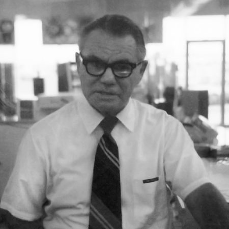
Joe Boyle
Joe ran Leonard’s Camera Department in Garden Grove where I worked. Joe had been a combat photographer in World War II and after the war, he worked for the Hollywood studios taking stills for promotional purposes. Joe became more than a boss to me, he was also a friend and a mentor.
Joe’s approach to photography was different than what I had seen and experienced: he learned photography in the depression era and practiced it in wartime conditions, where you had to make do with what you had on hand. This gave Joe the ability to solve any photographic problem with without heading to the camera store to purchase a solution. Joe’s solutions may not have been pretty or fancy, but they did the job.
Once Joe taught me how to remove telephone lines from an image, not in the darkroom, but in the camera. He put his camera on a tripod and composed the scene. He then mounted an 8X10 piece of glass a few inches from the lens and while looking through the camera, used a Q-Tip to paint Vaseline over the telephone lines on the glass. The Vaseline would blur the telephone lines, rendering them invisible. It was beautiful in its simplicity and effectiveness.
I learned two lessons from Joe: the first is that you don’t need the best equipment to create great images. And second, that if you have a problem, figure it out!
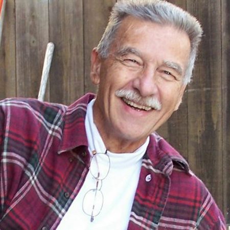
John Holland
John was my photo teacher at Loara High School and my friend for life. I skipped most classes in my junior and senior year (barely graduating) and held my own “independent study” in the photo department.
John was a “creative” and so much more than just a photographer. Besides photographing he painted, sculpted, designed and was an all-round creative person. The thing that I learned from John (although the lesson didn’t sink in until much later in life) was that photography was not really about photographing, but about creating.
John had a huge influence on my photography and my life. I created the image “John Holland Memorial” in his honor as we gathered in the High Sierra to spread his ashes.
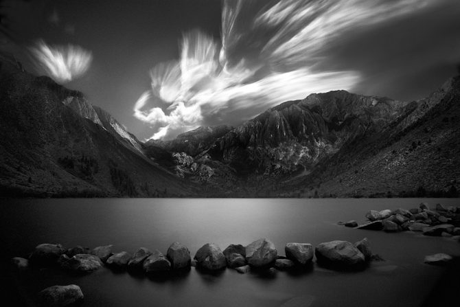
John Holland Memorial
I miss John, he died too young.

Mr. X
I call this next person Mr. X because I don’t know his name. For those of you who have read some of my blogs or attended one of my presentations, you will be familiar with this story:
A few years ago I was attending Review Santa Fe where over the course of a day my work was evaluated by a number of gallery owners, curators, publishers and “experts” in the field.
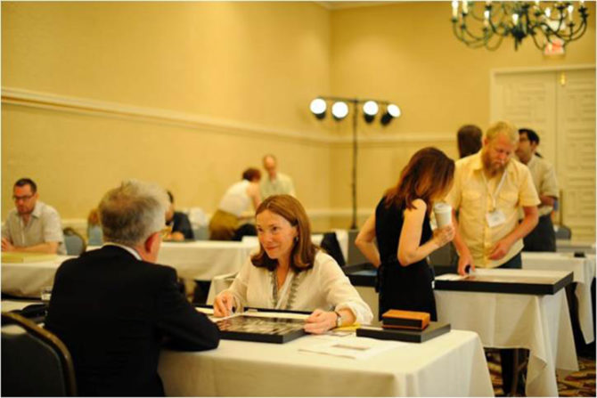
During the last review of a very long day, the reviewer quickly looked at my work, brusquely pushed it back to me and said “It looks like you’re trying to copy Ansel Adams.” I replied that I was, because I loved his work! He then said something that would change my life:
“Ansel’s already done Ansel and you’re not going to do him any better. What can you create that shows your unique vision?”
Those words really stung, but the message did sink in: Was it my life’s ambition to be known as the world’s best Ansel Adams imitator? Had I no higher aspirations than that?
That sent me on a journey to find out if I had a Vision. I did and it changed not only my photography, but my life.
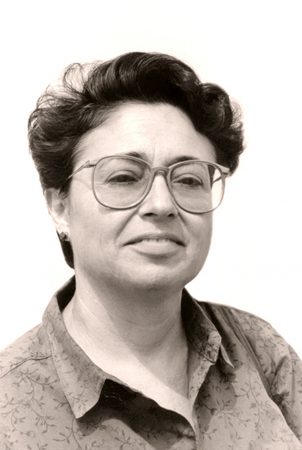
Vered Galor
Vered befriended me and became my mentor shortly after my return to photography in 2004.
She and I were exact opposites in one respect, she was an artist who used a camera and I was a photographer who used a camera. She created while I documented and we had many spirited discussions about that. I had grown up with a photographer’s mentality and for me there was no worse sin than to “manipulate” an image. Vered was an artist and tried to convince me to create, which I resisted.
I am grateful that Vered was even more stubborn than I was, and did not give up on me. This is the first image that I felt that I had “created” from my Vision, and not just documented:
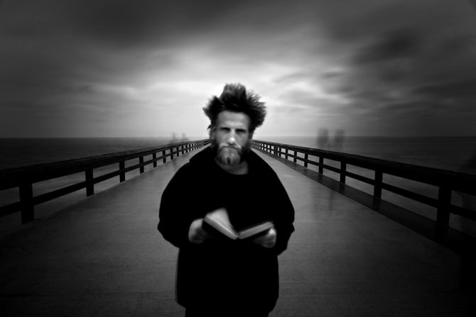
The Angel Gabriel
There are many great lessons to be learned from others, some come from advice given and others come from examples lived.
Cole
June 11, 2015
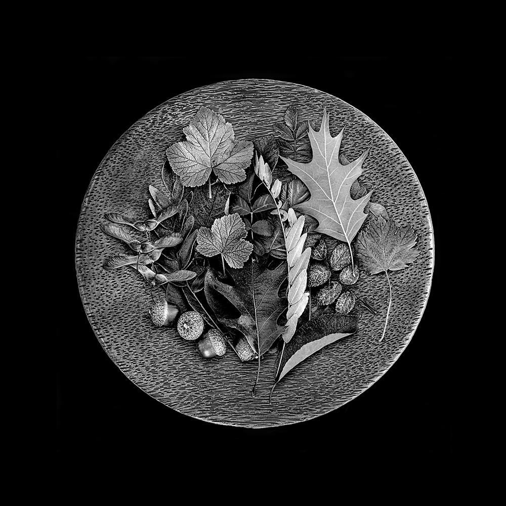
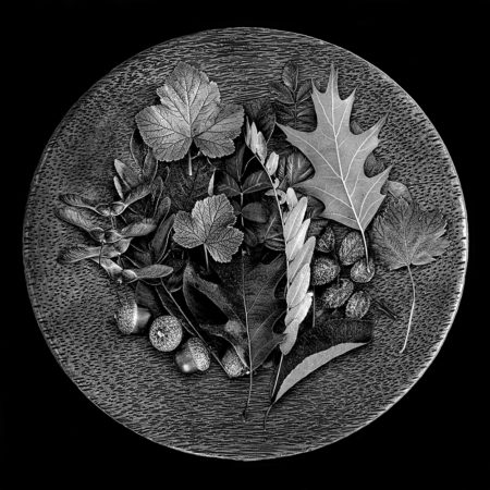
(Plate of Leaves)
It was a rainy day up in the Colorado mountains and I decided to shoot indoors. I collected some seeds and leaves and placed them on this great wooden plate that I had purchased for such an occasion. I was shooting on the kitchen table using available light, which was the kitchen ceiling lamp.
So how did the image look to my camera?
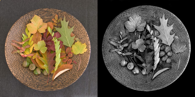
(click on the image to enlarge and compare)
I think the color image is rather boring and unremarkable. At first glance and without Vision, you might be tempted to throw it out. But I had a Vision of what it was to be.
A lot of this image’s “look” was obtained in the black and white conversion process, where I play with the color sliders to bring out or hide details. Click on the image above and look at the leaf just left of center, see how the veins have been brought out? The green slider had a lot of affect on this image.
For me, the step of converting the image to black and white is a critical part of fulfilling my Vision. That’s why I never accept the default b&w conversion or simply desaturate the image. I know what I want the image to look like, Photoshop does not.
Then after I had done as much as I could with the b&w conversion, I dodged and burned to bring out the contrast and highlights. I worked with a very small brush and worked every leaf, seed and nut individually. Sometimes it’s tempting to use a global tool such as the contrast adjuster, but that affects everything in the image equally and it rarely can produce a look equal to good dodging and burning.
The challenge was to take that boring color image and transform it into the black and white image that’s in my head.
For me, a black and white image is so much more interesting than a color one!
Cole
P.S. There’s something else interesting about the before and after image…it’s the sharpness. Did you notice that the b&w version seems so much sharper than the color image? It’s what I call “apparent sharpness” and it comes from contrast. This image has not been sharpened.

