January 23, 2015
Harbinger Vs. Auschwitz – What Do You Think It Means?

This is Harbinger No. 1 and it has 731 “favorites” on Flickr.
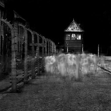
This is Auschwitz No. 14 and it has 20 “favorites.”
Harbinger has nearly 40 times more “favorites” than the Auschwitz image. Does this mean that it’s 40 times better?
What do you think it means?
Cole
The Auschwitz photo reminds us an uncomfortable part of our history. For many, this history was minimized in the rush to reconstruct Europe and for those “leaders” back in power to cover their roles in the Holocaust. For example, the restoration of stolen art has never really taken place, except in limited ways.
These are two wonderful examples my friend of what people think a “good” photo. I believe it is a matter of familiarity…in other words they are more relaxed/familiar to a beautiful cloud and a mountain than a ghost-like subject…
In a different perspective people don’t want to think when they see a photo. If the message is easily “popped out” and the image is good then everything is fine but if the message of a photo has to be discovered and the image needs some more careful study then usually this photo remains unexplored with no LIKES or FAVS..
Still your work is the most inspiring my friend and thank you for that!
Vassilis
First, I am not that familiar with Flickr so don’t know the profile of folks who post there and/or visit. Second, I assume that the images have appeared for roughly the same amount of time and in a way that they are equally accessible. I suspect there are a multitude of reasons for the difference in the numbers. I offer two: in general, for most viewers, the further the photographer/artist moves away from “reality” the smaller the number of viewers who are drawn to the work. In the U.S., I suspect (i.e., I don’t know) within the general public that there are far more folks who like a traditional landscape painting than like an abstract. The long exposure of Auschwitz #14 moves it away from “reality” and, thus, my theory would suggest there are fewer folks who will “like” it. Second, dare I say that if Flickr viewers are disproportionately young folks, many, sadly, may not even know what Auschwitz is and what it represents. The difference in numbers, no matter the explanation, is remarkable to me and something I would not have predicted. Have a third, related, possible explanation: The more serious, the more experienced, the more knowledgeable the photographer (and while, reluctant to use the word I will include the more “sophisticated”), the more likely the gap would close considerably – just a guess.
Cole, It’s not important how I feel about these two images. It’s about your vision and how YOU feel about them. 🙂
Cole, It seems to me that the definition of “favorite” is needed to determine if there’s any relevance to the disparity in numbers. Does it mean “like” or “well done”? Evaluating a good photo shouldn’t be such a black and white decision (pun intended). Good photos may not be a favorite of people, while bad photos might be. For example, pair Auschwitz with a nude, and I’m guessing — despite the quality of the image — the nude will win every time.
Cole:
As we can see above, it’s a loaded question and DS above hits the nail on the head, “It’s about your vision and how YOU feel about them.” That being said and as the owner of an “Auschwitz No. 14” print I am amazed by both photos as they present Cole Thompson’s unique visions. I wish my vision was as clear as yours.
Cheers!
In terms of composition and technique, both are exquisite images. Harbinger No. 1 has a serene, meditative quality to it, the kind of image I would love to hang on my living room wall. Auschwitz No. 14 is eerie and unsettling both for it’s content and the historical context that it harkens back to, which is not to say it isn’t great art. Great art is often highly emotionally charged. This is the kind of image that should be exhibited in a museum or printed in a book, I don’t think I would want to hang it in my living room though. As to the extreme divergence in the number of “favorites” on Flickr; well, Flickr is essentially a public forum so I think the reactions to different images is going to reflect the general tendencies in human nature. In other words: the average “Joe” doesn’t like to have his “feathers ruffled”.
I would agree with some of the comments so far, especially regarding the lack of desire to think about an image, the remove from reality of the long exposure, and the discomfort many would feel with the Auschwitz image….. Personally, I like a photograph to challenge me to think. But at the end of the day, Cole, they are your images – how do you feel about them? Did you succeed in putting your vision across?
It just tells me about the Flickr audience… as already remarked by several commenters before me.
I find both images powerful and very moving, each for its own reasons.
I am impressed by the way you managed to capture the feeling and emotions of Auschwitz, kudos!
Took at look on flickr.
Saw that ” Harbinger No. 1 ” has received flickr group acknowledgements. This could bring up the view count.
Are you using tags – I did see that Auschwitz photographs made by other photographers have higher “favorites”.
This is my take – acknowledgements and tags.
-Bobbie B.
Just a bit more – ” Harbinger No. 1 ” does appear first on your photostream at flickr.
I think it’s pretty simple, really. The Harbinger image is more accessible to the general masses because it’s a more familiar scene. It’s an image we can see ourselves taking and an image that, at first glance, seems to require less thought. The scene is relaxing and pleasant to our senses.
The Auschwitz image—which hangs on my wall—requires more up front thought and consideration. It’s not familiar and not comfortable. It’s an image few of us would ever try and make. It’s new and different and, in the minds of the zombie hordes, not pretty enough.
And, btw, Cole is not asking us which we like for his own sake. He is asking us in order to encourage us to THINK. Well played.
I think it simply means that the quality of art is not something that is ultimately determined by vote!
Lance, I do have Auscwitz #14 hanging on my wall. Well, not in my living room though.
This is a trick question isn’t it? The answer is “Who cares what they think?” One could argue that even looking at rankings of your photos on Flickr or elsewhere could dangerously taint your struggle to remain creatively pure so to speak, in a similar way that breaking your photo celibacy vow might.
It means 40 times as many people would hang Harbinger on their wall than Auschwitz.
It goes along with not letting the Internet be the judge of how good a photo is. It’s all about timing, who’s looking, and how many followers that you have. If I went by those standards, I would be a miserable failure. Of course, then again, I’m not a huge promoter of my work. I just don’t have the time or energy to spend on Photo sites. I’d rather be out shooting and creating!
The Question: Harbinger has nearly 40 times more “favorites” than the Auschwitz image. Does this mean that it’s 40 times better?
The Answer: NO.
The fact there is a 40 to 1 ratio does not surprise me in the least!
The ENGINEER side of me wants to know all the parameters of this analysis such as the same viewer sample, same tags, same size image in FLICKER etc etc, blah blah blah. Ouch I just hurt my brain.
The ARTIST side of me just says OK! I personally “LIKE” them both. What is LIKE anyway?
The ZEN side of me says Harbinger has nearly 40 times more “favorites” than the Auschwitz image because Harbinger has nearly 40 times more “favorites” than the Auschwitz image.
Human performance correlates to how situations occur to them and how a situation occurs arises in language. The reason Gandhi and King were so effective orators and leaders is that they spoke into the hearing of the people they were trying to reach. They spoke into the listening.
Not all language is the analog spoken human speech. We all have our visual language and the language in our “head” our voice, the “IT”. Viewing art and more specifically images is all based around our personal situational language.
The Harbinger is an image which can easily be recognized as to what “IT” is. An image in which one’s head can easily be wrapped around. It is less surreal than “Auschwitz”, thus the visual language of the viewer is more easily spoken into.
“Auschwitz” on the other hand is an image which is deeply noir-ish and is a completely surreal image. Noir-ism and surrealism takes effort to get one’s head around and it is a different visual language some just do not have, therefore there is less of a visual language pool to speak into.
This is neither good nor bad unless you are photographing on a commercial basis in which the client will have a visual language in which we must learn to speak into. Luckily I am retired from all that and I no longer have to match the popular bridal magazine images or what was deemed great images by the panel of judges at the last PPA meeting.
Surrealism and especially Noir-ish Surrealism will always be a more narrowly spoken visual language than less-surreal images. It seems that is the way we are wired and especially when it comes to Photography, due to the inherent appearance of our medium of choice. The initial expectation that a photograph is “REAL”. No photograph is “real” all photographs are surreal to some extent some are less surreal (or more real) than others but they are all surreal. It is a physical fact. We are taking an original object which resides in 4 dimensions (the 4th being time) and compressing it into a 2 dimensional graphic representation.
I think I like the ZEN side of me which says Harbinger has nearly 40 times more “favorites” than the Auschwitz image because Harbinger has nearly 40 times more “favorites” than the Auschwitz image.
Which would I pick first and which would spend more time viewing? It would be Auschwitz. Why? My visual language is more to the Noir-ish Surrealism dialect than not.
Namaste,
Michael Young
Houston,TX
Y2photo.net
Who cares which is better or not. The question is it stirs different emotions. Both are good photos, both stir completely different emotions. One is calm and one is horrific. People don’t want to remember the bad times. So the calming one wins over and we can forget those bad time…..for a moment! Mr. Young said it well, above.
First, the higher number of “favorites” obviously has nothing to do with the idea of “better”. In photography, as in most art forms, “better” is entirely subjective. It’s unmeasurable.
As to “what it means”, I think we’re missing an important point. When someone says that an image is a favorite on a social website it generally means that they like the content. There’s something there that resonates. They feel an emotional attachment to either the image itself or to the person who created the image.
In the case of Auschwitz No. 14, however, I personally don’t believe that too many people are going to admit that they feel a connection. Who’s going to admit that they “like” this particular content? How many people are going to publicly admit that this image is a “favorite”? Some will; most won’t. It’s roughly analogous to viewing pictures of war or violence or even erotic photographs. No matter how well done or how “artistic” they are, most will pretend that they don’t really like them. It’s psychological self-preservation. It’s a defense against guilt by association.
Put the two images side by side, however, and ask people which one has the “deeper” meaning or which one has more social significance or is more relevant with regard to human history and I guarantee you’ll get a different result. In this case, the question determines the answer.
Trying to figure out Flickr isn’t worth a minute of your time! The answer to your question is simple. It means it is time to step away from the computer, pick up the camera and go take some photographs!
I think it just goes to show you can’t let yourself be judged by the internet crowd. One never know the real reason why a someone have “favoured” a particular picture, in the end it may not mean anything, so what if a photo gets 731 “favourites” and the other only gets 20. I think it important that artists remains true to his or her own vision what ever that may be. I try to be authentic ( but don’t always achieve it ).
“That Auschwitz photo would be really good if it wasn’t for the blurry bit in the middle. Gotta be pin-sharp fella!”
In the vein of Michael Young’s comment “…spoke into the listening,” Harbinger is more iconic. I mean this in the sense that the lack of specificity & details allows the viewer to fill in the “meaning” to their own internal view. However an individual responds to light/dark, large/small, free floating/grounded, ill-defined/definitive, etc. variations that the graphics of Harbinger present are all facets that can reflect the viewer’s broad world view back to themselves.
Auschwitz on the other hand, while sharing some of the same opposites listed above, also has details that connect the viewer to a specific topic. An individual must respond to each & all of the graphic elements – the blurred group that is the people, but not any identifiable person, who endured Auschwitz, fences trapping, & watchtowers guarding. These are not open-ended.
“Listening” to Harbinger is easy & accessible to virtually any viewer, yet also ephemeral, real only in the viewer’s head. “Listening” to Auschwitz requires a willing viewer, represents a reality independent of our internal dialogues & landscapes, yet can connect deeply to fears most of us mere mortals carry with us.
I don’t think one can accurately analyze things like this. Too many variables. And besides, we’re dealing with human nature which is totally fickle, illogical, and unpredictable! This situation happens with music, books, etc. Even restaurants.
I think timing and luck have a lot to do with it. That is, if something “doesn’t hit” for some reason (which might be something mundane such as “what else was going on at the time”) it becomes a self-fulfilling fate. And it can be difficult to regain traction and attention. While on the other hand, if something takes off for some equally mundane reason, it can become viral, to a degree. And neither result is necessarily due to quality, purpose, significance, etc.
Why didn’t Van Gogh’s paintings sell during his lifetime while other works from that period (that we don’t know of today) did? When did his work suddenly become “better?” Who is to judge? Who can analyze?
“What do you think it means?”
Absolutely nothing… Can’t even imagine why you would concern yourself with the disparity in reaction.
I think the compiling of data and analysis is interesting. I believe the disparity is due both the the more surreal techniques used in Auschwitz and because people denote “like or favorite” with how much it makes them “feel good” based on immediate impact. A picture that makes them relax and feel “good” will get more likes or favorites. One that is associated with a negative event will not evoke as much of the positive feeling – even though it is probably a more powerful image.