October 21, 2011
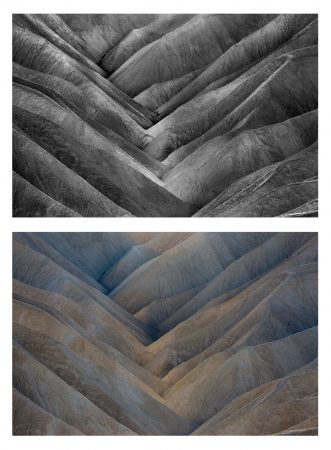
Time No. 2 – Before and After
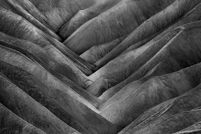
This is “Time No. 2” that I created at Zabriskie Point in Death Valley, perhaps the most photographed spot in the entire park. This image was created just before the sun went down and it’s amazing how Zabriskie Point can look so differently as the light changes from morning, to noon and to late afternoon.
Today I wanted to show a “before and after” so you could see what the original image looked and how your vision can change it. Sometimes vision takes place as you’re shooting and sometimes it occurs when you’re processing the image. And sometimes your vision changes over time and so you go back and change the image repeatedly (you should see how the The Angel Gabriel has evolved over time).
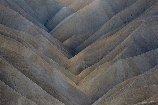
This original image is quite flat and muted, and so to make this a “Cole Thompson” image, I had to improve the contrast and separate the colors. I do this by adjusting the color channels in the black and white conversion tool of Photoshop CS5. By sliding each color’s adjustors in both directions, you can see how it will affect the contrast and separation. With the colors I had in this image, I was able to change the b&w version quite a bit by adjusting the color channels; the Red and Yellow channels brought out highlights, the Blue channels darkened certain parts of the image, and the green had no effect. When adjusting the channels, be careful not to go so far that you introduce unacceptable amounts of noise, particularly in the blue channels.
I then dodge and burn the image with my tablet to further enhance the contrast. In this image I used a very small brush to individually work each piece of the image so that I brought out the striations that separated each set of hills. I particularly paid attention to the ridge tops and brought out the highlighted edges.
One of the most important steps in my conversion process is to use the “Histogram” to check the blacks and white and then to adjust them using “Levels” if necessary (it’s almost always necessary). After you have established a good black and white, you can use “Levels” to adjust the midtones and really change the mood of your image, for my images I generally am pushing the midtones darker.
Once the image looks great on screen, I then use the global contrast adjustment to push the contrast even further so that it will print with the same “pop” that it has on screen. Remember that a monitor uses transmitted light and that always makes things look better than it will on a print. The reason for this is that a print uses reflected light which is quite dull and flat by comparison. By pushing the contrast further than you think you should, it will help ensure the printed piece looks good.
For me, the appeal of this image is it’s simplicity, it’s detailed contrasts and the compressed perspective. Death valley is really a spectacular place, especially in the winter. I go each January and just revel in the timeless solitude.
Cole
P.S. What I don’t like about side by side comparisons is when someone always writes and says “I like the color image better!” I’m just kidding of course, we all have our individual tastes and mine just runs to the black and white.
Great write-up, Cole. I agree wholeheartedly about how vision can come both in the field and in the processing part of image making.
Thanks for the tutorial. Beautiful image. Visual haiku.
Thanks for sharing, Cole. Love your insights into the process and into creativity. With that, time to jump into Photoshop and try out some of the things you’re talking about.
absolutely beautiful! I love it! Keep writing:::::::! xxxxx
Rather nice to read about the image that is hanging on the wall over my bed! I don’t always want to know what is in the photographers head of something that I love, or how they created it. But this was great to read. Just enough info. – Juliet
Cole:
Very generous of you to share your insights and methods.
Thank you much!
– Fred
Ditto. I have the same sentiments above. Thanks for your generosity.
This is a wonderful example of how clicking the shutter is really only the beginning. When I am in the field I feel that I am collecting the data necessary to complete my artistic vision in the digital darkroom. Very well written and a delightful read!
Not only is this extremely helpful, but I second the “extremely generous” comments.
I know some photographers prefer to keep how they process a big dark secret. However, your generosity proves photography is not a zero sum game, at least for those with the self assurance to share their methods without feeling threatened. Bravo! And thank you.
I appreciate the gratitude but seriously, I’m not revealing much as the key to a great photo is not the technique, but the vision.
We call can all copy a style or look, but what does that make us? A great copycat at best?
But learning techniques and then coupling them with your unique vision; now you have potential!
Remember the lesson from this blog?
http://www.photographyblackwhite.com/images-remind-ansel-adams-work/
Cole
What a great discussion and site!
Yes, it is an excellent point that it’s not copying someone’s technique that creates a great image, but rather it’s the expression of one’s own vision.
However, the history of art from cave paintings through the Renaissance until today, is some form of apprenticeship. Even when one’s own vision is identified, we all stand on the shoulders of others, who help us along the path that hopefully leads to individual style and mastery.
You were inspired by Adams, whose work helped you find your own voice and vision. I recently attended a Michael Levin workshop, who revealed that when he first saw a Michael Kenna image of a “stick in the mud”, he was moved and inspired to the point of channeling his life in a new direction, toward long exposure photography.
Is this copying, or is this standing on the shoulders of others, in order to search for our own, individual voice? I think it’s the latter.
Your revealing how YOU do it, allows us to see better. As artists have always done, we learn from that, are inspired from that, and use it as a foundation for building our own voice. As the saying goes, “imitation is suicide”. But seeing how others have done it is a vital part of learning, and you are indeed a generous, inspirational teacher.
More than learning your “how to” is the reinforcement I get for my “fooling around until I get what I like”. I have done several images from “flat and muted” and they turned out well. You have reinforced that flat and muted can work. I need to practice more with dodging and burning. With you kind coaching I know I will succeed. Dolce Visione!
It is always nice to see/understand how the top photographers process their work. As Chas said: Dolce visione!
Great tip on the Global Contrast Adjustment Cole….. I shall try that…
Great to see you here Sam……