Tag: b&w
July 4, 2014

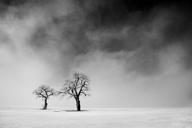
I was exhibiting my “Ancient Stones” portfolio when someone approached.
We both stood there looking at the images when he said: “You just cannot do b&w work like this with digital!”
I didn’t have the heart to tell him, but thought of this anecdote:
“A photographer went to a socialite party in New York. As he entered the front door, the host said ‘I love your pictures – they’re wonderful; you must have a fantastic camera.’ He said nothing until dinner was finished, then: ‘That was a wonderful dinner; you must have a terrific Stove.'” Sam HaskinsMay 2, 2014


I’ve spoken to a number of people who have assumed that I create my b&w images by putting my camera into monochrome mode or by simply desaturating my color images in Photoshop.
That’s not how I create my black and white images, but why not? Why not let the camera or Photoshop do the work for me?
Here’s why: If I let my camera create the black and white image, then all I’d have is a color image that had been stripped of color. A great black and white image is much more than that, it’s an image that I’ve added something to, my Vision.
I capture my images in color so that I can convert them into black and white myself. What can I can do that the camera or Photoshop cannot do?
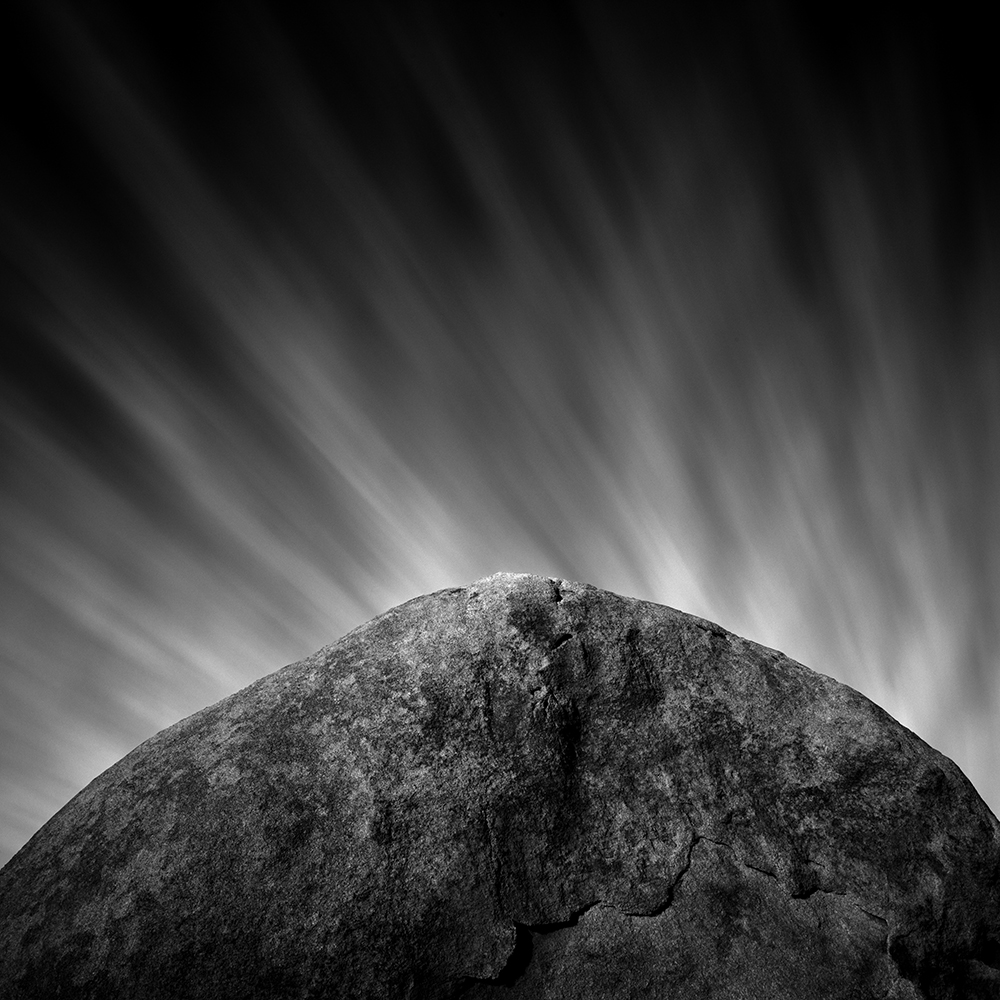
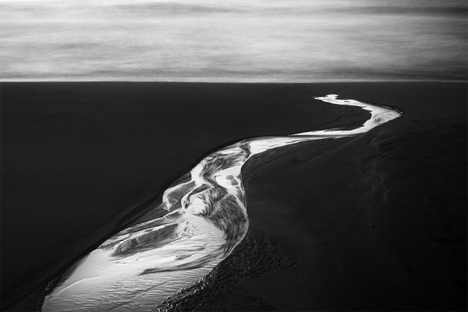
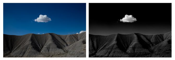
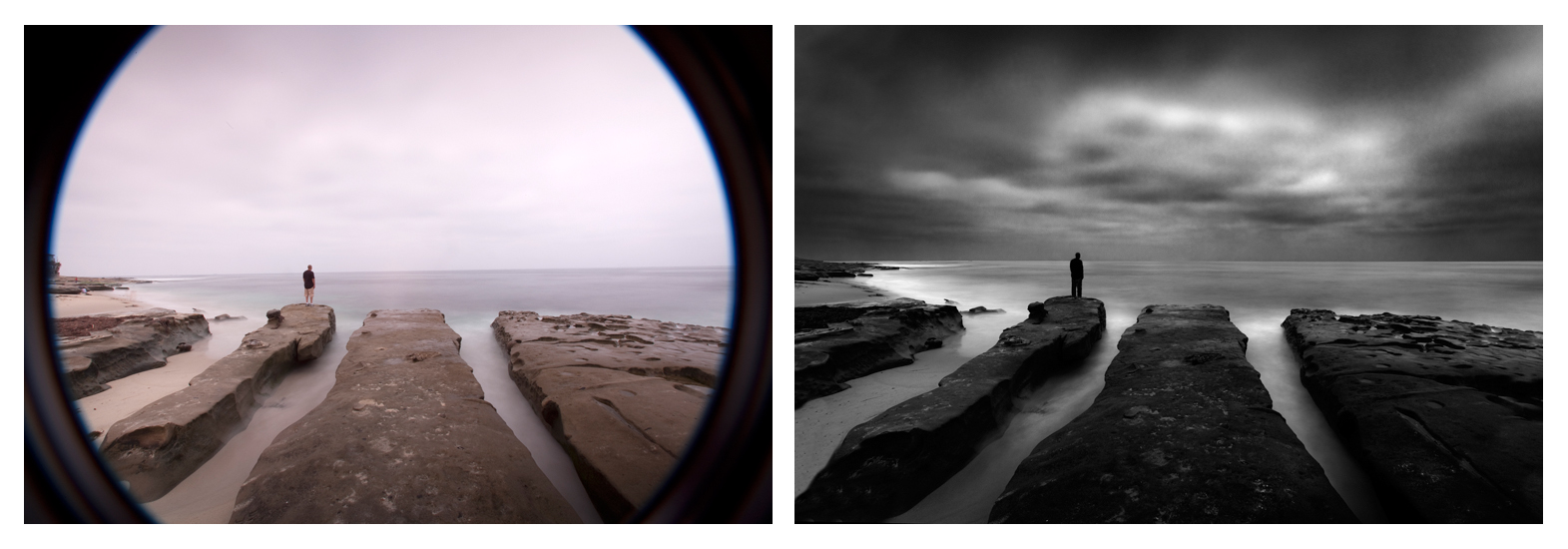
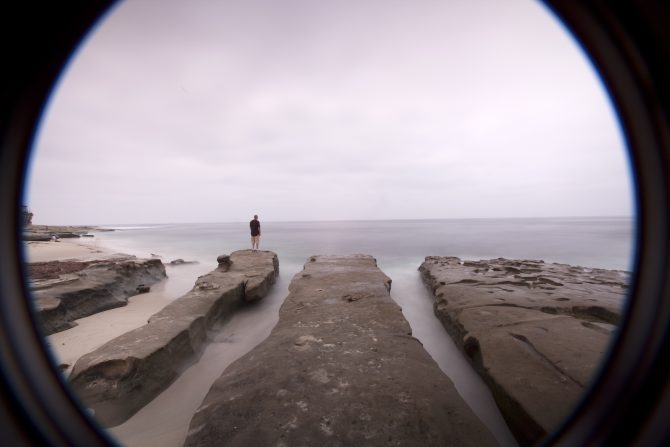
I know the potential of the image: the camera and Photoshop does not. I know what detail is in the image that can be brought out: the camera and Photoshop does not. I know how to create the look I want by manipulating colors into different shades of gray: the camera and Photoshop does not. I know how to dodge and burn to emphasize certain elements and to de-emphasize other elements: the camera and Photoshop does not. But most importantly, I have a Vision of what I want the image to look like: the camera and Photoshop does not.If you compare one of my original color shots to a desaturated image, and then compare both to my final image…you’ll see a world of difference. Here’s my Iceland No. 4 to illustrate:
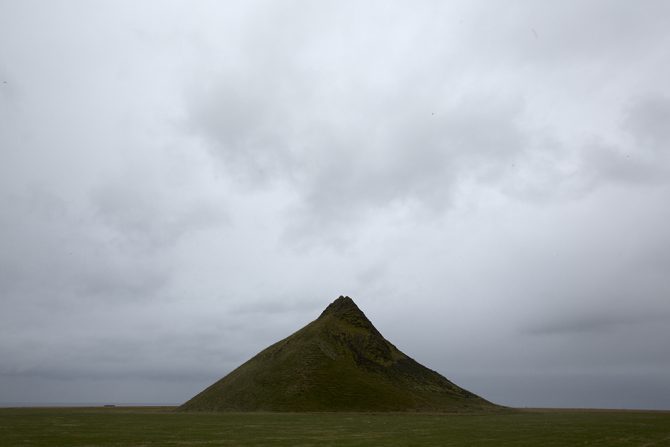
This is what the color image looked like right out of the camera.
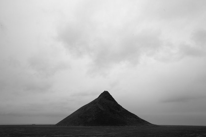
Here’s what the image looks like if you let the camera create the b&w image or you simply desaturate it in Photoshop.
And here’s what the image looks like through my Vision.
These three images all came from the same file! They represent what the camera saw, how Photoshop interpreted the b&w image and finally, how I saw it.
Letting the camera create the b&w image for me or simply desaturating it in Photoshop will never produce a great black and white image. But by processing the image myself, I’m adding to the image and leaving my mark.
Now I’ve talked to a lot of people who have seen my before-and-after images and I know how some people will react: they will conclude that the “secret” to my images are my processing skills and they will think that all they need to do to create better images is to improve their processing skills.
But that is exactly NOT my point!
Learning processing skills without the Vision to drive them, is not much different than letting the camera create the black and white image for you or simply desaturating it in Photoshop. If you don’t know what you want, then better processing skills will not improve your images.
Why don’t I let the camera or Photoshop create my black and white images? Because they are simply tools and cannot convey my Vision.
Cole
P.S. For those who might wonder: I convert my images to b&w using Photoshop’s b&w conversion tool. I do not use plugins or b&w conversion programs.
August 13, 2013
October 20, 2012

Many people assume that I’m working in film and others are surprised to learn that I photograph in color. Let me explain.
All of the work you see on my website (with the exception of the 1970’s portfolio) was created digitally. I switched to digital in 2004 after working 35 years in the darkroom. And I’ll be honest, while I have fond memories of those darkroom days, I do not miss them and I would not go back.
Why? Because my work is better since I began using digital.
I’ve often heard the assumption that digital is suitable for color but not for black and white. That has not been my experience. I’ll use whatever tools give me the results I’m looking for and I have absolutely no allegiance to the process; film is not sacred, digital is not sacred, old processes are not sacred…the only thing that is sacred to me is the image.
Perhaps more surprising to some is that I shoot all of my images in color. I’ve written that I shoot in B&W mode and so you might wonder how can that be? Shooting in B&W mode allows me to see the camera’s preview image in black and white, but I save my files in RAW which means they are really in color.
Confusing? When you shoot in RAW all of those settings such as B&W mode, sharpness, saturation, toning, color balance…are not recorded in the image. RAW means just that, it’s a raw capture without any of those tweaks and the image is recorded in color.
This is a wonderful thing! This combination of B&W mode and RAW allows me to preview the image in black and white but process from the color image. Why do that? Because I don’t want my camera or software to decide how my images should look in black and white, the black and white processing is what makes my images “mine!”
Sometimes I’ll show people the “before” color photograph to illustrate how my vision and processing has changed the image.
My vision drives my processing and I’ll happily use whatever tools and processes best helps me do that.
Cole
August 16, 2011

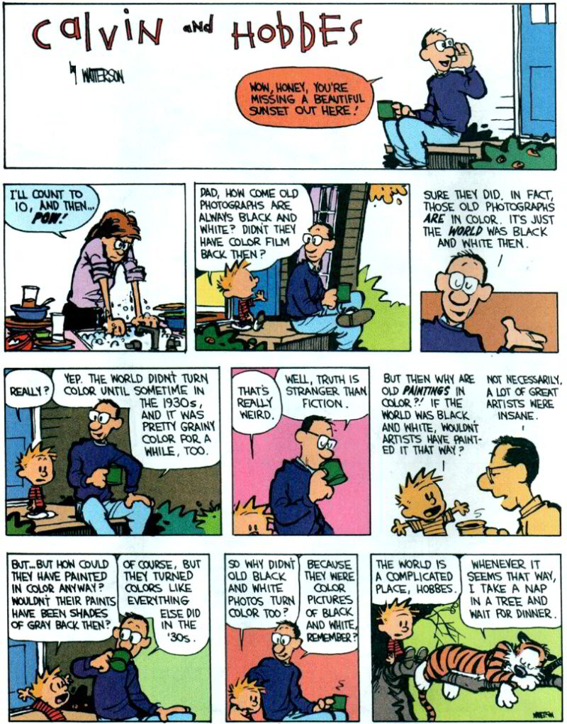
The truth about Black and White (according to Calvin and Hobbes).
http://www.reoiv.com/random.asp?img=dadbandwandcolour.jpg&page=2
Cole
P.S. Thanks to Ed Book for sending this to me.
June 15, 2011

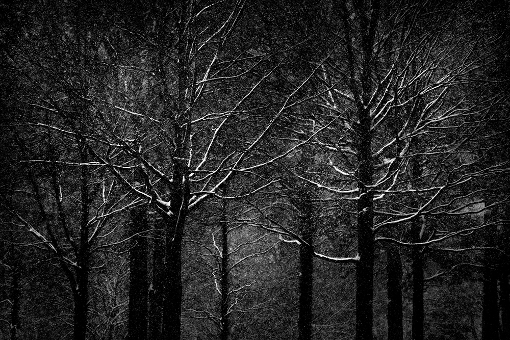
See my new video: “Trees“
Or see the images at: https://colethompsonphotography.com/portfolios/collections/trees/
I do enjoy working on portfolios, or cohesive bodies of work. There is something very satisfying about looking at your images on one subject, and see how the arrangement itself can become a new piece of art.
I know several people who have done the “photo a day” project and chose to focus on just one subject for an entire year. I think that’s a fun idea and my guess is that you’d create a very exciting portfolio!
Cole
June 1, 2011

I don’t know if you’re familiar with Joel Tjintjelaar, but he’s a good friend of mine from the Netherlands. He’s also an amazing B&W photographer AND owns and runs BWVision.com. Joel is really busy!
Joel just interviewed me for his blog and you can read it here: BWVision Interview with Cole Thompson
You’ll want to keep an eye on BWVision.com over the next several weeks.
Cole
P.S. This is an image from my trip to Hawaii last week. A few more to come in my next newsletter.
June 26, 2010

Printing is a very large topic, but it doesn’t need to be a complicated one. I keep my printing process simple because I’ve found that the fewer the steps, the fewer things there are to go wrong. As I said in a previous blog entry: “Let me oversimplify and summarize it this way; I produce my prints with a copy of Photoshop and an Epson printer, and that’s about it. You don’t need complicated or expensive extras to create great black and white prints.”
Here are my guidelines for great B&W prints:
1. Start visualizing the print the moment you look at the camera’s preview screen.
Have you noticed how great the image always looks on that little screen? One of the reasons it looks so good is because it uses transmitted light, or in other words the image is back-lit, and that produces an image that is very bright and contrasty. Unfortunately a print uses reflected light and that just cannot hold a candle to that little screen. I have to work very hard to get my print to look that good and I use preview screen image as my goal; it will not look exactly the same, but it will have that same pop and sizzle.
2. Make sure you have true blacks and true whites.
When people come to me with the complaint of flat and dull prints, I almost always find that it’s because they do not have true blacks or whites in their image. To know if you have a true black and a true white, you must look at the histogram because your eyes cannot judge this accurately by looking at the monitor. There are several ways to get a true black and white, such as using Levels, the contrast control (not recommended) and by dodging and burning. Whatever method you use, have that histogram open and let it be your guide.
3. Contrast is what makes the image pop.
Look at the image above, it has a great deal of contrast and that’s what makes my images pop. To increase contrast many people instinctively go for that nasty contrast control, I say nasty because it generally has nasty unintended consequences like blocking shadows and blowing out highlights. There are other ways to improve contrast such as Levels and my favorite; Dodging and Burning.
4. When you get the image to look good on screen, then you have to go further still.
An image that looks good on screen with transmitted light will look flat and dull when viewed as a print with reflected light. So once it looks good on screen, you must go further and increase your blacks, increase your whites and increase your contrast. While you’re pushing the image further, your instinct will be to stop because the image can start to look artificial, but with time and experience you’ll come to know how far you need to go and how far you should go.
5. Don’t Search for the “Perfect Paper.”
There are thousands of paper choices these days and you shouldn’t get hung up on finding the “perfect” paper, there’s no such thing! There are many great papers and you simply need to find one that is suited to your work. I use either Hahnemuehle Photo Rag 308 which is a matte paper or Epson Exhibition Fiber which reminds many of an air-dried “F” surface, reminiscent of the darkroom days. I find that these two papers work for 99% of my work.
Why choose a matte or a glossy? A lot of it has to do with your personal preferences and the vision you have for the image. The Hahnemuhle is a “fine art paper” that has a nice texture and works well with most of my images. I use the Epson Exhibition Fiber for prints when I want a more “traditional” look and when I want a bit more pop from the blacks. Glossy/semi-gloss papers will always give you better blacks than matte papers, but the differences between the two are minimal when they are put under glass. Another reason I prefer matte papers is that under glass there is no reflection off the paper surface, I find that reflection on glossy paper very distracting.
6. Spend good money and get a good printer.
Unfortunately this is an area where you must spend some good money to get a good print. General purpose home or office printers just cannot produce a great black and white print. I love the Epson printers and their K3 inks, but the other big names produce nice work too.
I am often asked about special inksets and profiles and RIP’s. I don’t use them, I find the Epson ink and “Advanced Black and White Mode” gives me everything I need and it keeps my workflow simple.
7. Avoid the extras.
I know that people swear by such things as profilers, calibrators, b&w converters, plug-ins and RIP’s, but from my experience they only add a little bit to the image and they really complicate the workflow. Another danger of using these extras is that you can lose sight of your objective and get caught up in the process. So my advice is; put those extras away until you can produce a great print using the basics, and then you might consider getting them out again (but I’m guessing you won’t!).
8. Look at the print the next morning.
Sometimes you can stare at a print for so long that you get a distorted view of it, so leave it for the morning and look at it with fresh eyes. You’ll often find that you’ll want to tweak it again. Fresh eyes are always good.
Producing a great print doesn’t have to be complicated, in fact “complicated” just gets in the way of a great print. Keep it simple, standardize your workflow and become very good at the basics and you’ll soon have a procedure that produces great prints and is reproducible.
Cole
June 11, 2010

I often receive requests to show some “before and after” images to help people understand how much of my work is done in camera and how much is done in Photoshop. I’d say it’s generally about 50/50 but that can vary by image with some images almost ready right out of the camera and many requiring extensive processing in Photoshop.
Lone Man No. 20 is a good example of a 50/50 image. As you can see, the image I started with and the final image are both quite similar and yet quite different. The original shot has all of the important elements; the composition, the long exposure of the water, the clouds and the lone man, but it doesn’t have the dramatic effect of the final image.
Probably the first change you’ll notice in the final image is that the severe vignetting has been repaired. I was shooting with an extremely wide angle lens and I had two stacked neutral density filters on my lens, as a result a great deal of the filter was included in the photograph. To repair this I first cropped the image and then I used the clone tool to fill in the missing corners.
Next you’ll notice that the sky in the original image has very low contrast and is quite bland. To bring out the sky detail I split the image into two halves, upper and lower, and converted them to b&w differently. In each conversion I used Photoshop’s “Channel Mixer” but in the upper half I used some blue channel to improve the contrast and detail in of the sky. Next I used some pretty aggressive dodging and burning to bring out the definition and detail in the clouds, this information was in the image but it was almost hidden to the eye. As a rule you can generally recover image detail as long as you have not over-exposed the image to the point that you have blown out the highlights.
Note: one of the side-effects of using blue channel in the conversion and dodging and burning is that the image can get very grainy. When using this technique you must carefully balance the good-effects with side-effects.
Next I converted the lower half of the image to b&w, darkened the image and greatly enhanced the contrast. This dark and contrasty approach is the look that I like and it often has the effect of making daytime look like night time. The March/April issue of Photo Technique Magazine featured an article on my work and they used the phrase “Darkness at Noon” to describe this look.
All of this produced a basic final image, but it still didn’t have the dramatic impact I was seeking and that I had pre-visualized before I captured the image. So my final step was to dodge and burn to bring out the highlights and selectively darken blacks to locally enhance contrast. As I did this I carefully monitored the histogram below:
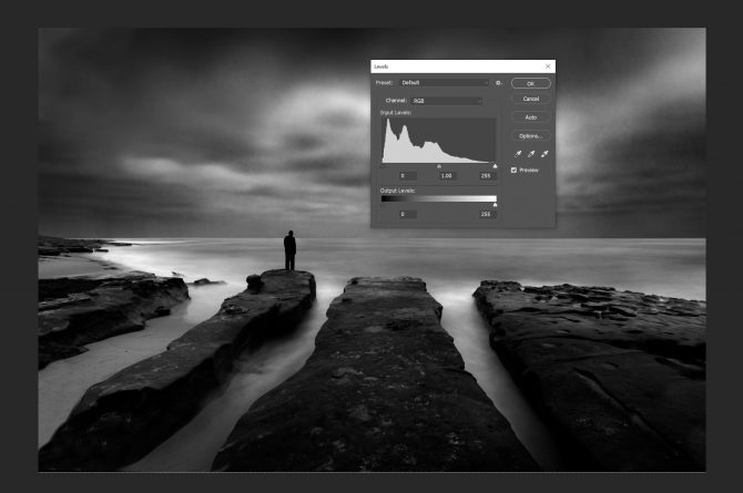
 This histogram shows that I have a good black and a good white, something your eye cannot always discern when looking at the image on the screen. Monitors are often out of adjustment and our eyes can be fooled, but the histogram never lies. People often complain to me that what looked good to them on screen, often prints flat and muddy. Generally the problem is revealed in their histogram; they lack a “true” black and good contrast.
As you can see from my final image, it does not represent reality. Reality is not my goal but instead I strive create images that reflect how I see the scene through my vision. That is why I advocate that photographers work just as hard on developing their vision, as they do on their technical skills and equipment. The image begins and ends in your mind’s eye.
September 16, 2009

Have you heard about the many tools designed to give you great black and white images? There are special b&w conversion programs, plugins to make your images look like a specific type of b&w film, monochrome ink sets, custom print profiles, hi-tech monitor calibrators and more.
Are all of these necessary to produce a great print? I don’t know, but I don’t use them. My philosophy is “keep it simple” and for me, these tools are just expensive distractions that might make a 2% difference in the look of my image, but it takes the focus off of the 98%, the things that really matter.
Here are the secret tools and techniques that I use to create a great b&w image:
1. Start with the right shot. Certain images tend to lend themselves to b&w more than others and I look for subjects with great blacks and contrast opportunities.
2. Shoot in RAW and B&W mode. This will allow you to see the image on the camera display in b&w (making visualization easier) but the RAW image will still be in color, allowing you to convert it how you like.
3. Do as much in the RAW conversion process as possible.
4. Convert to b&w in Photoshop using the B&W Conversion tool (never desaturate or simply remove the color). Play with the color sliders to see how each will change the image and produce better contrasts. These sliders are like adding color filters to the lens, but after the fact and can make a dramatic difference in the image.
5. Don’t overuse the global controls. I try to avoid them whenever possible because they apply the effect to the entire image instead of selectively. I use dodging and burning as my primary tool, which allows me to change the image just where it is needed.
6. When dodging and burning, work slowly! I typically set the dodge/burn tool exposure to 1-3% and hardness to 0. Then I work very very slowly and let the effect build.
7. Use a pen and tablet to dodge and burn. The pen gives you precise control and the tablet is pressure sensitive. A mouse cannot do a good job of dodging and burning like a pen and tablet can. And purchase the largest tablet you can afford, once you learn how to use it, you will become addicted and it will become your primary processing tool.
8. Use a decent printer. Like cameras, there are many good printers but I love the Epson series with their wonderful K3 inks, and the included “b&w print mode” gives fantastic results.
9. Use a good paper, but be careful not to get caught up in the search for the “perfect paper.” I have friends who have been searching for years and the truth is that there are many wonderful papers out there that will server you well. I personally use Hahnemuhle Photo Rag 308 and Epson Exhibition Fiber.
~
Let me oversimplify and summarize it this way; I produce my prints with a copy of Photoshop l, a pen and tablet and an Epson printer, and that’s about it. You don’t need complicated or expensive extras to create stunning black and white prints.
Now I’m not saying those extras cannot improve your prints, I’m just suggesting that the time to experiment with the extras is after you’ve produced the best print you can with the basic tools and can go no further. Until then, that 2% extra improvement will just be an expensive distraction.
This is just my opinion of course, and there are many who might disagree, but I’ll let my images speak for themselves.
Cole