Category: Tutorials
February 15, 2013
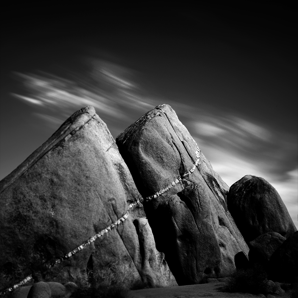

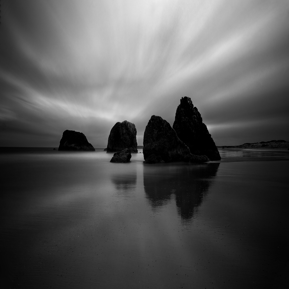
Ancient Stones No. 12 – Accidentally shot as a 8 bit JPEG
Thanks to all who have written to commiserate with me about my disaster last week, and to share your own stories of mistakes made. I should compile them into a book and call it “The Ghosts of Photo-Mistake’s Past.”
And thanks to those who offered technical advice on how to salvage my JPEG’s, because of this advice I was able to save more of my files than I thought possible. I thought I’d share what I found worked best.
To bring everyone up to speed, I accidentally photographed Death Valley with no RAW and only JPEG files. Because I was shooting in Monochrome Mode, the JPEG’s were in black and white and not in color like the RAW files would have been. The reason for this is that when you are shooting in RAW, all of the settings you make to the camera such as the mode, saturation, sharpness and etc, are ignored by the RAW file. However the JPEG file is affected by all of those settings. So because I had JPEG’s files, I was unable to convert them to black and white myself.
Why does this matter? Because much of “my look” comes from this conversion process as I adjust the color channels.
The JPEG files are also more grainy and the grain seems to clump together more than the RAW file. Lastly, the JPEG file is an 8 bit file while the RAW is a 16 bit file. This matters because I do a lot of dodging and burning and an 8 bit file will not produce smooth gradients, it’s subject to banding and posterization.
There is nothing I can do about not having a color file to work with, that ship has sailed. But, there was something I could do about the 8 bit files, I thought I’d simply go into PhotoShop and converted the file to 16 bit. However my friend (and master printer and great photographer) Adrian Davis pointed out that this approach is not ideal and offered a better way.
His suggestion was to use HDR to create a true 16 bit file as opposed to taking a 8 bit JPEG and simply converting it to 16 bits. You do this by making a copy of the original file and then using Photoshop’s HDR to merge together the two identical files which resulted in a file with 16 bits of data. Note: it does not produce that “HDR” look in this process.
Now this did not solve all of my JPEG problems, but at least by having a 16 bit file, I was able to do my dodging and burning on a 16 bit file which provided me with smooth gradients. I compared the JPEG image to the converted 16 bit image and it looks better in a three ways. First there is no banding, second the grain looks smoother and third the edges on high contrast transitions are smoother.
The improvement was enough that with a little extra work, I’ll be able to salvage 10-15 of those “lost” Death Valley images. I’m very happy about this!
So my thanks to all for your support and suggestions, and I hope that my mistake and this technical tip will be beneficial to you.
Cole
P.S. Please take a look at Aline Smithson’s L E N S S C R A T C H entry for 2/14/2013. She invited people from all over the world to submit their self-portraits and there are some amazingly creative images here! But there’s a twist, she tells the story about how I got to know someone who wrote me and how it led to a friendship and an exhibition. She then invites all of the self-portrait artists to contact the person who comes before and after them in the exhibit. Aline’s a pretty clever woman.
May 24, 2012


Last year I wrote an article entitled “Ten Tips from Cole Thompson for Long Exposure Photography” which you can read below. However I recently discovered there’s a very important “11th Tip” that applies to long exposures over 30 seconds.
When I was shooting with very long exposures (1, 2, 4 and 8 minutes) I kept getting odd exposure results that I just couldn’t explain. Sometimes my exposure would be right on, but more often the image was drastically under or over exposed. I knew from Long Exposure Tip #3 that I needed to use an eye cup to stop stray light from entering the the eyepiece and affecting the metering, and I was very careful to do that. I’d also check and recheck my long exposure calculations, but they were correct. Nothing seemed to explain this odd behavior.
And then I accidently figured out what was going on. It turns out that my camera does something odd, something I didn’t expect it to do that was causing the problem, and so here is Tip #11.
Tip #11. When Shooting in Bulb Mode, Always Check Your Aperture
When I am shooting long exposures that go beyond 30 seconds, I meter in manual mode, extrapolate the settings for the longer time and then I switch to Bulb mode for the shot. Because I had set my aperture in manual mode and then switched to Bulb mode, I assumed that the aperture stayed the same…but that was a wrong assumption!
It turns out that the aperture setting does not transfer over from Manual to Bulb mode. Bulb mode holds the last aperture setting you were using when you last used Bulb mode.
So, after you meter in Manual mode and then switch to Bulb mode, always check your aperture!
Ten Tips from Cole Thompson for Lo-o-o-o-ong Exposure Photography
I have been doing long-exposure work for a number of years now, and I’ve explored many different techniques and methods. Here are 10 of my fundamental tips to make your long exposure experience easier and better:
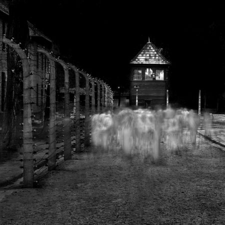
(Auschwitz No. 14 – Photographed in Bright Daylight)
1. For extremely long exposures, have at least 13 stops of neutral density available.
I have been using the Singh-Ray Vari-ND Variable Density Filter for a number of years now, and it revolutionized the way I work by allowing me to rotate the filter to minimum density for composition and focus, then immediately dial in maximum density so I don’t miss the shot. However, if you want to obtain exposures of 30 seconds and longer in bright daylight, you may need more than the 8 stops of density offered by the Vari-ND. I stack a Singh-Ray Mor-Slo 5-stop ND filter onto my Vari-ND which gives me a range of 8 to 13 stops of added density. By the way, 13 stops of density transmits only about 0.01% of light — that’s one percent of one percent. This is generally enough to allow a 30-second exposure in bright daylight.
The shot above of “ghosts” at Auschwitz was made in bright daylight — having sufficient additional density allowed me to simulate nighttime, as well as blur and obscure the movement of the visitors for the ethereal effect I was shooting for.
Lone Man No. 20 – Created with 3 Stacked Filters
2. Purchase the largest size filter you can afford.
I use the 82mm Vari-ND (the largest offered by Singh-Ray) which allows me to avoid vignetting when stacking filters and using very wide angle lenses. The 77mm will work in many situations, but will vignette in others. Use step-up rings on your lenses so that you can use the 77mm or 82mm filters on all of them.
The Lone Man image above was made with 3 stacked filters, and using larger filters helped prevent corner obstruction and vignetting. In situations where you are seeing some obstruction or vignetting on wide-angle shots, consider adjusting your composition to allow for cropping — square or panorama, or see if you can take a step or two back and use a slightly longer focal length.
3. Use an eye cup for your camera’s viewfinder.
To meter your long exposure you’ll be in manual mode and using the camera’s internal meter, but it can give a false reading because stray light leaks into the camera from the eye piece. This can cause your images to be underexposed. You can eliminate this problem by using an eye cup, which helps seal out stray light. Eliminating the light leaks will also help your eye adjust to the darkened image in the viewfinder when using the Vari-ND — even at minimum density, it’s blocking over 80% of the light entering the lens.
4. Use a sturdy tripod.
A good tripod is a must for serious landscape photography, but it’s even more important when doing long-exposure work. The enemies of a long exposure are vibration and camera movement, and so you’ll want to use the sturdiest tripod that you can find (or at least the sturdiest one you are willing to carry), as well as a tripod head that locks down for rock solid support. I find that the carbon fiber tripods soak up vibrations better than the metal ones. And of course, find the most solid footing possible when positioning your tripod so it doesn’t sink into the sand or wet ground or wobble during the exposure. Some tripods have a hook on the bottom of the center post to allow you to hang “ballast” such as your camera bag or weights for added stability.
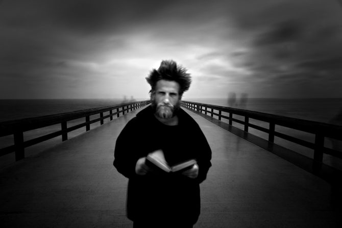
(The Angel Gabriel – Photographed with hundreds of people walking by)
5. Turn OFF your image stabilizer!
When shooting from a tripod, leaving your image stabilizer turned on can often work against you, especially if there is motion in the scene, such as moving water or wind in the leaves. The image stabilizer attempts to stabilize these movements, which results in blurring the overall image. I cannot tell you how many images I’ve ruined because I’ve forgotten to turn off the image stabilizer! Canon has just announced improvements to their image stabilizing, including a “tripod mode” that may help alleviate this problem, but that’s still a ways (and an upgrade) down the road.
My photo of “The Angel Gabriel” is filled with movement — the many tourists wandering by (most disappearing entirely), the clouds, the water, the pages of the book, and some slight blurring of the subject despite his effort to stay perfectly still. However, the railing and planks of the pier are tack sharp, which adds to the impact of the image, as the rails lead the viewer’s eye directly to the subject’s face. If I’d left image stabilizing ON for this shot, all the movement in the frame would have “confused” the IS and it would have blurred the parts of the image that I wanted to be sharp.
This image brings up one other side note: another benefit of long exposures is that it can make unwanted “intruders” disappear from your shot, as long as they keep moving. For instance, in one of my segments in the new Singh-Ray video, there are kayakers paddling through my shot of some rocks on the shore — a long exposure effectively eliminated them without requiring retouching.
(Isolated No. 7 – Photographed at 30 seconds in bright sunlight)
6. Place your finger over the eyepiece to help the autofocus.
In very low light situations (eg: using a lot of ND filters) the autofocus may “hunt” and not let the camera fire. You can manually focus or you can simply place your finger over the eye piece, which stops stray light from entering the rear and allows the camera to find focus. You don’t need to hold your finger over the eyepiece for the entire exposure, just for a very brief moment to allow your autofocus to focus.
The open eyepiece can also allow light leaks in through the viewfinder, especially during a long exposure with the sun behind you. This isn’t a problem normally, because your head (and your eye cup) blocks stray light. But often when doing long exposures, you step back to avoid vibrating the camera, allowing light to enter. If you’re seeing odd glare or reflections in a shot done in this manner, try blocking the viewfinder for the next one, or use the viewfinder shutter if your camera has one.
7. Use a hood loupe and carefully check every image!
A hood loupe allows you to more closely inspect your images and avoid costly mistakes. It shields the LCD from light and glare, plus it magnifies the image, allowing you to be sure that your details are sharp and that you remembered to turn off the image stabilizer! There is nothing worse than coming home from a big trip only to find that your images were not right. Closely check each image and you can make corrections right on the spot. It’s much better to get the shot right in the field than it is to attempt to fix it back at your computer.
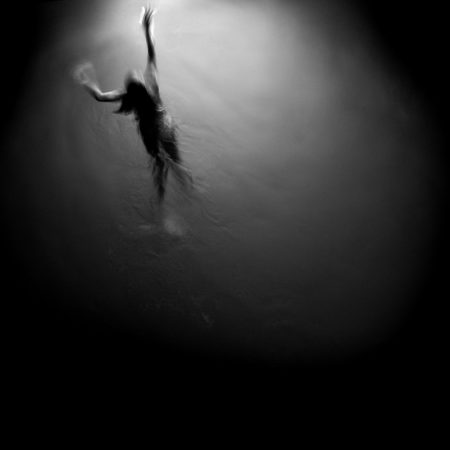
(Swimming Towards the Light – photographed with a one quarter second exposure)
8. Try different exposure times when photographing water.
For long exposures, the only rule on exposure times is that there is no rule on exposure times. When shooting water you’ll be amazed at how different a half second exposure can look compared to 2 seconds, and how completely differently 5, 15 or 30 seconds will look. So try different exposures until you find the one that you like for a given scene. With practice you’ll get a feel for what shutter speed would be a good place to start, but I still suggest experimenting while you’re at it.
The shot of the swimmer was made at a relatively fast shutter speed (for me) of 1/4 second, which allowed me to capture details in the surface of the water and have parts of the subject appear sharp, while still getting the motion blur of her arms and legs. Of the various exposure times I tried, I felt this was the best result in this situation.
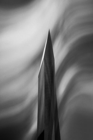
Monolith No. 10 – 120 Seconds
9. Skies often require a much longer exposure.
If you’re looking to create those long streaking clouds, start at 30 seconds and then try 60 and 120. Since most cameras will only meter to 30 seconds, you’ll have to do a little extrapolating to figure the correct exposure for 60 or 120. To do this, set your meter to one f-stop underexposed and then shoot for 60 seconds. For a 120 second exposure (as used on the image above), set your meter to two f-stops underexposed and expose for 120 seconds. Remember that for each f-stop you underexpose, you double your exposure time.
Once you’ve set your camera’s meter to underexpose the image, put it into “bulb” mode and use your watch to time your 60 or 120 second exposure. Bulb mode requires the shutter button to be held down for the entire exposure, so you’ll need a remote shutter release that can be locked “open” for the exposure.
(The Fountainhead No. 93 – 30 second exposure in high winds)
10. There are no rules — experiment and try different things!
To create the image above from my “Fountainhead” series, I photographed the building reflected from a flexible ferrotype plate — a chrome-plated steel sheet with a near-perfect mirror surface. By just gently twisting and bending the plate, I achieved these otherworldly distortions, and I also feel they have an “organic” quality to them that would be difficult to achieve in Photoshop without hugely compromising the image quality. With this technique, I was able to achieve the effect in camera, so the pixel data doesn’t need to be unduly “stretched” or compromised.
And, once again, I was able to view the images in the field to see the effect and make sure I was getting what I wanted, rather than taking standard photos of buildings and hoping to find a creative way to manipulate them back at my computer. I suppose that would be another tip that always applies — take a little time to make the best possible image in camera on the scene, and you’ll always know you got the shot.
You can see other examples and read more about the Fountainhead series in my prior blog story.
So, there really are no “rules” for long exposure photography, and while long exposures are most often applied to water and skies, they can be used in many different and imaginative ways. So experiment, try new things, and get creative!
February 17, 2012


This image is titled “Wrenches” and was created shortly after I returned to photography in 2004, I had been absent for a very long time as I raised a family and built a career. Upon my return I converted to digital and so I was learning both how to use this new tool as well searching for my own unique vision. It was a time of learning, exploration and self discovery.
I had been photographing in a local greenhouse for several weeks, it was a family business and they were kind enough to give me free access to the entire operation. One day I discovered this small workshop but I was unable to find the lights, and so I improvised. I had a penlight and by using a long exposure and outlining each wrench with the light, I was able to create this image. I also burned down the detail in the background so it would not compete with the wrenches for attention, and with dodging and burning increased the contrast and brightness on the wrenches.
This image showed my preference for dark images and high contrast, a style I still love and frequently use. But remember that a style or technique cannot replace vision, but once you’ve found your vision you can use it to drive your style and techniques.
Cole
August 4, 2011
Are people using your images without your permission? It’s quite possible, I’ve found mine in books, on blogs, in news articles and even being used commercially on business websites. It was usually quite by chance that I’d find this out, perhaps because a friend would see my image and tell me about it. With the advent of Google Alerts I could find a few more, but this searches for key words and so it was pretty ineffective for unattributed uses of images. What’s really needed is a search engine for images and just today I learned that Google has given us such a tool!
But before I talk about how to search for images, you should first decide if you care if others use your images without permission. For example, many people reproduce my images on their blog without my permission, but they do give me full credit and provide my web address. This serves to introduce new people to my work and I really appreciate it. But I’ve also had an online news organization use my images in several of their stories, without permission or attribution, and I was not okay with that! It’s good to think about what unauthorized uses, if any, you’re okay with.
I’m pretty tolerant when it comes to unauthorized use if I’m given credit and my web address is provided. I’m not okay with unauthorized use if I don’t receive credit or my images are used in a commercial way. However others feel differently and do not want their images used in any way without permission. They insist that if you don’t protect the use of your images, you actually lose your image rights over time. If you’re concerned about this, please do some research or seek some legal council.
Once you’ve decided where you stand on this issue, the next step is to find out who might be using your images. Here’s how you do it:
1. Go to Google.com and click on “images” at the top left of the page.
2. On the right hand side of the search box there is a camera icon, click on this to search by providing an “image” instead of a “search phrase.”
3. Select “Upload an Image” to supply the photo you want to search for and then hit the search button. You’ll then be given search results showing you where on the Internet that image has appeared. Very cool!
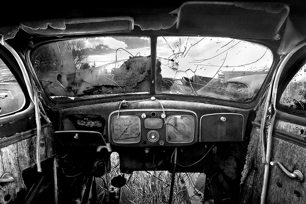
It’s fascinating to explore these links and see where you images have appeared. Today in just 10 minutes I discovered that I had won 2nd place in a Russian photo competition (that I hadn’t even entered) and found an auto parts company using my “Old Car Interior” image without permission or attribution!
Google has provided a great tool that is perfect for photographers and artists. But as important as knowing where your images are, is knowing what your policy will be for unauthorized use.
My thanks to Harold Ross for teaching me about this new tool via his blog; http://haroldrossfineart.wordpress.com/
Cole
P.S. My next blog will be a follow up on the Facebook issue. I’ll tell you what I’ve learned from all of the comments you’ve provided, and I’ve learned a lot!
February 9, 2011

SEO or Search Engine Optimization; what is it and why do you need it?
Put simply, SEO allows you to Google Search “black and white fine art photography” and have people find your website, on the first page if possible and in position 1, 2 or 3 would be the best. What’s so hard about that? Keep in mind that there are 2,700,000 hits for that search and all of those other websites would like to be on page 1 also. So the competition is fierce.
The good news is that you don’t have to be smarter than those other 2,700,000 pages, just more consistent! Most people do nothing to improve their SEO, so if you’ll work on it just a little, then you’ll be ahead of most of them.
When I started working on my SEO I was on page 64 for the search “black and white fine art photography.” Now what are the chances someone will ever find my website on page 64? Zero, hence the need for SEO. After two years of minimal work, I am on page 1, position 1. Keep in mind that I’m only on page 1 with this specific search phrase, and if you search for “black and white photography” I’m only on page 7, which is okay but not good enough.
So how do you get to page 1, position 1? You can hire someone to do your SEO but most of us don’t have the money for that. The great news is that there are some fairly simple things that you can do, that over time will put you ahead of the pack. I’m going to keep these steps very simple for two reasons; first I’m not an expert at SEO and second, if it’s too complicated most of us will never get around to it.
Okay, here goes:
1. First determine what search phrases you want to go after. What do people search for when looking for your “product?” I wanted to go after “black and white fine art photography.” Now that I’ve accomplished that, I’m going to work on “black and white photography” and see if I can do better than page 7!
Your search phrase should not be overly broad as in “photography” which produces 498,000,000 results, or too specific such as “Yellow Daffodil Photography” which had only a few results (877,000) but will have very few people searching on that phrase. So strike a good balance and consider using Google Analytics to help you analyze possible search phrases (more below).
2. Choose your URL wisely because it affects your SEO and it is difficult to change later. One approach is to put your key search phrase in your URL (eg: www.BlackAndWhitePhotography.com) which is very helpful when people search for “Black And White Photography.” Another approach is to put your name in the URL (eg: www.ColeThompsonPhotography.com) making it easier for people to find you when they search for “Cole Thompson Photography.”
So, do you go for “BlackAndWhitePhotography.com” or “ColeThompsonPhotography.com?” From a practical standpoint, you may want to go with the latter and use your name simply because most of the good key phrase URL’s have been taken, and sometimes they are just too long to be practical. For example, I might have been able to get “www.ColeThompsonBlackAndWhiteFineArtPhotography.com” but it would have been a bit “unwieldy!”
3. Tag your web pages, which simply means that your key phrases are put into special places on your website. For example every photo should be tagged with your key search phrases, and there are also meta description tags, title tags and keyword tags. Now you may not know anything about tags and could feel a bit overwhelmed right about now. Relax and trust me that it’s fairly simple to learn and believe me when I tell you that you don’t have to know programming to create these tags. I use Microsoft FrontPage to build my website and I never see a bit of HTML code, it’s all drag-and-drop and there are tools built in to help me create these tags.
4. Use your search phrases in your page copy. The more often you use these phrases, the better, especially on your home page. You might also include them in your artist statement, your bio, about page and contact page.
5. Have lots of inbound links. An inbound link is your URL posted on other websites and you can get these by trading links with others, by posting articles on other people’s blogs, having your work featured on other sites and etc. The more links there are there pointing to your website, the better.
6. Start your own blog, this helps a lot!
7. Create and post YouTube videos. This really has a big impact, and be sure that you use your search phrase in the YouTube title and put your full link in the video’s description (including the http://). Most Windows computers comes with MovieMake which is easy to use. It takes me only about an hour to produce a 3-1/2 minute video of my work.
Here are a couple of extra tips; Sign up for Google Alerts and get a free daily report when your name or website (or anything else) is found on the web. I search daily for “Cole Thompson” and “Cole Thompson Photography.” You’ll be amazed at how often your work and website get mentioned.
A great data tool is Google Analytics. Analytics helps you analyze what phrases are being searched most often, and more importantly, which of those phrases are the most “effective.” Our natural instinct is to go for search phrases that will bring the most traffic to our site, but what if you could find a different phrase that had less traffic but more “results?” Analytics can help you figure this out and you might consider using it to determine your search phrases in step 1 above.
One last tip; don’t try any “funny stuff” to improve your SEO. The web-crawlers that go out and investigate your site are very sophisticated and cannot be fooled by writing “black and white photography” 1000 times in white type on a white background. They’ll soon learn your tricks and get you blacklisted!
These are pretty simple things that you can do and if you’re consistent, you can get on page 1 with just a little patience.
Cole
October 23, 2010
This blog appeared on the Singh-Ray site on Tuesday, October 19, 2010
Cole Thompson explains how he uses long exposures to create his mystical black and white images

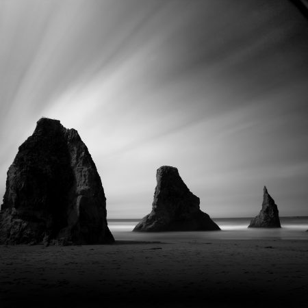
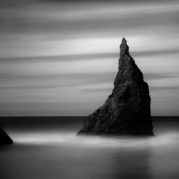
Fine-art photographer Cole Thompson creates his images and visual essays in dramatic black and white. His images involve the use of very long time exposures of 30 seconds to several minutes. “I have always been intrigued by monoliths, first by the statues on Easter Island, then by the monolith in the film 2001: A Space Odyssey and most recently by Stonehenge in England. In each case, seeing these monoliths prompts the question; Who built them and for what purpose? I’ve always loved visiting Bandon Beach in Oregon because of the natural monoliths strewn along the coastline. Randomly placed, it is as though the earth were God’s chessboard and the monoliths the pieces from an unfinished game. I’ve included several images of these Bandon Beach monoliths to illustrate my use of long exposures for my various monochrome print portfolios.

“I have often created my monolith images using long exposures of 30 seconds, but recently I found myself experimenting with daytime exposures of up to 5 minutes. In each case, whether 30 seconds or up to 5 minutes, the Singh-Ray Vari-ND filter was essential to creating these images. If you’ve ever tried such exposures with a fixed ND filter, you know the challenges. First, to compose you have to remove the filter because the filters are so dark you cannot see through the viewfinder. Second, when removing and replacing these filters you can accidentally change the focus or the focal length of your lens. Often you’re not even aware of these lens movements until later, when it’s too late.
“When I mount the Vari-ND filter on my lens, I dial it to the minimum (Min) setting. At this point the filter has already added about 2 f-stops of density which is just enough to darken the image in the viewfinder a bit, but I can still see clearly enough to compose and focus accurately. I then rotate the front ring to increase the density by as much as 6 additional f-stops. When I need even more density, I stack the Singh-Ray Mor-Slo 5-stop ND Filter in front of the the Vari-ND to achieve up to 13 stops of density. This allows me to use very long exposures, even in full daylight.

“Here are some of the things I’ve learned about using very long exposures. First a tripod is a must and a remote shutter release is desirable. While it’s true that slight camera movements do not seriously affect the very long exposure, it’s best to eliminate vibrations as a “best practice” and because camera movement can ruin an image with a 5 second exposure or less. I shoot at ISO 50 at F22, put my camera into RAW/monochrome mode and set the exposure mode to manual.

“The most frequent question I am asked is how I determine my exposure. I use the in-camera meter for exposures up to 30 seconds, and beyond that I find I must extrapolate because the digital SLR’s I use only meter up to 30 seconds. With my camera set to F22 and 30 seconds, I dial my Vari-ND’s density ring until my exposure is correct. To extrapolate for exposures longer than 30 seconds, I do the same thing but set the exposure to 2 f-stops below ideal and then quadruple the exposure in my head. If 30 seconds is what I’m metering for, then quadrupling brings me to a 120-second exposure.
“But strange as it seems, if I expose at 120 seconds, the image will be very underexposed. So I’ll generally expose at 300 seconds for a good exposure. I’m not sure why the 120 seconds doesn’t produce the correct exposure, but it could be due to some kind of digital equivalent to ‘reciprocity failure,’ which is a phenomenon experienced when shooting extra long exposures with film. The reason for such reciprocity failure with film is that the longer the exposure, the less effective the film is in recording the light and so the exposure length needs to be increased. In the case of my digital camera, when the meter says I need a 120 second exposure I extrapolate that reading and give it 300 seconds. It works for me.

Something else that is very important when using the in-camera meter is that I must completely isolate stray light from coming into the viewfinder and affecting the meter reading. To do this I use a Hoodman eye-cup which allows me to seal the viewfinder with my eye. This is essential for a correct exposure.
“Shooting long exposures at the beach creates a couple of additional challenges. Waves hitting the tripod legs will cause them to sink into the sand, ruining the exposure. I can either move out of the water line or build wide feet for my tripod that give it a larger footprint. The beach also has strong winds and a lens makes a great wind sail. I combat this by using a heavy tripod that allows me to hang a weight onto the center column to steady it. I also position myself between the wind and the camera and often turn my jacket up above my head and use it as a wind shield.
“Lastly, let me repeat that camera movement is the primary enemy of long exposures. Even the slightest movements can ruin the image. Sometimes it’s just not easy to detect this movement by checking the camera’s display. For this reason, I check every image with a hooded loupe which enables me to see the image clearly even outdoors.
I have found extra-long exposures to be especially appealing to me, perhaps because they help convey nature as timeless. I’ve come to a point where the technique has become part of the message in my work. Choosing the length of the long exposure will control how that movement looks in both water and sky. Exposures from 2-30 seconds can give a completely different look in water while the longer exposures measured in minutes are usually needed to produce dramatic skies.
There is no better tool than the Vari-ND to produce these types of images. As I’ve said before in my other Singh-Ray posts, this filter not only makes it easier for me to create these images, in many cases I could not have produced them without the Vari-ND.”
To learn more about Cole’s work check out his previous stories on this blog and pay a visit to his website.

Labels: Cole Thompson, Mor-Slo, Vari-ND
June 26, 2010

Printing is a very large topic, but it doesn’t need to be a complicated one. I keep my printing process simple because I’ve found that the fewer the steps, the fewer things there are to go wrong. As I said in a previous blog entry: “Let me oversimplify and summarize it this way; I produce my prints with a copy of Photoshop and an Epson printer, and that’s about it. You don’t need complicated or expensive extras to create great black and white prints.”
Here are my guidelines for great B&W prints:
1. Start visualizing the print the moment you look at the camera’s preview screen.
Have you noticed how great the image always looks on that little screen? One of the reasons it looks so good is because it uses transmitted light, or in other words the image is back-lit, and that produces an image that is very bright and contrasty. Unfortunately a print uses reflected light and that just cannot hold a candle to that little screen. I have to work very hard to get my print to look that good and I use preview screen image as my goal; it will not look exactly the same, but it will have that same pop and sizzle.
2. Make sure you have true blacks and true whites.
When people come to me with the complaint of flat and dull prints, I almost always find that it’s because they do not have true blacks or whites in their image. To know if you have a true black and a true white, you must look at the histogram because your eyes cannot judge this accurately by looking at the monitor. There are several ways to get a true black and white, such as using Levels, the contrast control (not recommended) and by dodging and burning. Whatever method you use, have that histogram open and let it be your guide.
3. Contrast is what makes the image pop.
Look at the image above, it has a great deal of contrast and that’s what makes my images pop. To increase contrast many people instinctively go for that nasty contrast control, I say nasty because it generally has nasty unintended consequences like blocking shadows and blowing out highlights. There are other ways to improve contrast such as Levels and my favorite; Dodging and Burning.
4. When you get the image to look good on screen, then you have to go further still.
An image that looks good on screen with transmitted light will look flat and dull when viewed as a print with reflected light. So once it looks good on screen, you must go further and increase your blacks, increase your whites and increase your contrast. While you’re pushing the image further, your instinct will be to stop because the image can start to look artificial, but with time and experience you’ll come to know how far you need to go and how far you should go.
5. Don’t Search for the “Perfect Paper.”
There are thousands of paper choices these days and you shouldn’t get hung up on finding the “perfect” paper, there’s no such thing! There are many great papers and you simply need to find one that is suited to your work. I use either Hahnemuehle Photo Rag 308 which is a matte paper or Epson Exhibition Fiber which reminds many of an air-dried “F” surface, reminiscent of the darkroom days. I find that these two papers work for 99% of my work.
Why choose a matte or a glossy? A lot of it has to do with your personal preferences and the vision you have for the image. The Hahnemuhle is a “fine art paper” that has a nice texture and works well with most of my images. I use the Epson Exhibition Fiber for prints when I want a more “traditional” look and when I want a bit more pop from the blacks. Glossy/semi-gloss papers will always give you better blacks than matte papers, but the differences between the two are minimal when they are put under glass. Another reason I prefer matte papers is that under glass there is no reflection off the paper surface, I find that reflection on glossy paper very distracting.
6. Spend good money and get a good printer.
Unfortunately this is an area where you must spend some good money to get a good print. General purpose home or office printers just cannot produce a great black and white print. I love the Epson printers and their K3 inks, but the other big names produce nice work too.
I am often asked about special inksets and profiles and RIP’s. I don’t use them, I find the Epson ink and “Advanced Black and White Mode” gives me everything I need and it keeps my workflow simple.
7. Avoid the extras.
I know that people swear by such things as profilers, calibrators, b&w converters, plug-ins and RIP’s, but from my experience they only add a little bit to the image and they really complicate the workflow. Another danger of using these extras is that you can lose sight of your objective and get caught up in the process. So my advice is; put those extras away until you can produce a great print using the basics, and then you might consider getting them out again (but I’m guessing you won’t!).
8. Look at the print the next morning.
Sometimes you can stare at a print for so long that you get a distorted view of it, so leave it for the morning and look at it with fresh eyes. You’ll often find that you’ll want to tweak it again. Fresh eyes are always good.
Producing a great print doesn’t have to be complicated, in fact “complicated” just gets in the way of a great print. Keep it simple, standardize your workflow and become very good at the basics and you’ll soon have a procedure that produces great prints and is reproducible.
Cole
May 29, 2009

James wrote and asked:
“Can you tell me how to get better at dodge and burn. I try and try, but I overdo the blacks and whites and get an image that’s too contrasty. Any tips you can give me would be great.”
This is a very common question and issue, and one that can easily be addressed.
First a little background, for those who don’t follow my workflow, it’s a very simple one. I primarily adjust brightness and contrast and then dodge and burn the image in a fairly detailed and intricate manner.

To successfully dodge and burn you must own a pen and tablet, a small 4X6 Bamboo tablet can be purchased for about $100 and a larger one is very nice if you can afford it. I like Wacom tablets.
When you dodge and burn there are four basic controls you want to be aware of; Diameter, Exposure, Hardness and Range.
The “diameter” of the brush is simply how large the brush is and choosing a brush size is generally obvious; big brushes for big areas and little brushes for little areas. The larger the brush is, the easier it is to blend in your work and make it look natural. So for big areas such as skies, use a very large brush. Obviously for bringing out the highlights on tree branches you want a brush about the size of what you’re dodging.
The “exposure” or strength of the brush is perhaps the most critical setting and the easiest to abuse. I generally use an exposure of 4% and work the dodge/burn very slowly, building up the areas with many passes of the pen. I often see people going at it with 50% and this where things get overdone and artificial looking. Think of dodging/burning as painting the image, you must work slowly and carefully.
The hardness is how hard of a edge you want on the brush. I generally work with a 0% brush for areas such as skies. When you are working in very small areas with very sharp detail, you might choose a small and hard brush, so that you can confine the dodge/burn to a very tight area.
The “range” of the dodge/burn refers to the range of values you’re affecting, either the highlights, midtones or shadows. This is the hardest technique to describe (it’s much easier seeing it being done). If you set your dodge to highlights, then your brush is brightening the highlights and ignoring the midtones and shadows. While this three setting separation works pretty good, you have to be careful because the highlight dodge will tend to bleed over to the lighter midtone areas as well. So you might choose to use a smaller brush and confine your dodging to just the highlights that you want to brighten. Likewise with the burn tool, if you set it to shadows you can generally darken just the shadows, but again be careful not to affect those darker midtones.
In general, I’ll dodge my midtones to bring out detail in shadow areas and my highlights to increase contrast and make my images pop. I’ll generally burn my midtones and shadows to darken down my images. I rarely will dodge shadows or burn highlights.
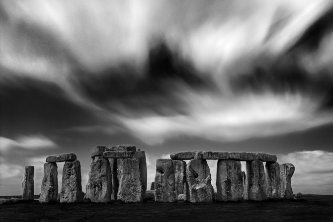
An example: The image above was created recently at Stonehenge; I wanted to darken the blue sky, increase the contrast in the clouds, darken the foreground and stones and bring out the highlights in the stones.
I started with the sky, if I had tried to darken the sky with a big brush, I’d have also darkened parts of the stones I didn’t want to. If I had tried darkening the sky with a smaller brush, I’d have done a blotchy job of it and I’d have created halos where the stone and sky met. So instead, I masked out the sky so that I could process it separately without affecting the stones, and then I reversed the mask so that I could process the stones without affecting the sky. I’ll address my masking techniques in another article.
First I took a midsized midtone brush and burnt the blue sky and some of the darker parts of the clouds. Then I used a medium sized midtone brush to dodge the highlights in the clouds and then did the same with a midsized highlight brush. Going back and fort between dodging and burning, and working slowly, I created a dark sky and contrasty clouds.
All along this process I keep careful eye on my histogram. Your eye doesn’t always accurately tell you if your blacks are dark enough or when your whites get blown out, so the histogram is my constant companion.
Then I reversed the mask so that I could work the foreground and not affect the sky. I burned the grass almost to black with a large brush set to shadows. Then I burn the stones down, first with the midtones and then the shadows and finally I brought up the highlights on the stones with a stronger dodge.
The result is my preferred dark image, with strong contrasts. lots of 100% blacks and 100% whites.
So summarizing; get a tablet, set your exposure low to 1-4% and work slowly, alternating between the dodge and burn. When necessary, mask and work each part separately. Paint and caress your image like a painter would a canvas!
I know this is a quick overview, but a lot of what you need to learn will come from doing, not reading. So get out and do!
Cole
May 23, 2009
Many people ask me to tell them the “secret” of my black and white conversion. Here is the secret: great black and white images are not made in the conversion process. You can buy the most expensive plug-in’s and execute the most complicated processes to convert your images, and it will not guarantee a great image. There are no shortcuts or simple procedures.
Okay, so what is the “secret?”
It’s that you must plan for a great black and white image starting with the selection of the scene and then all the way through the processing. I tell people that it’s 50% the shot and 50% the post-processing.
Taking the Shot:
My style relies on dark images with bright subjects. It’s this contrast that creates an image that can really jump out at you, so when I go out shooting, I’m looking for these types of scenes. While there will be many scenes that catch my eye, if it doesn’t have this potential, then I know the shot will not work for me.
Post-Processing:
When I create an image, I have a vision of what it’s going to look like, and generally the original shot doesn’t look anything like my vision of final image. That’s where the post-processing comes in; using very simple techniques I “create” the image. I do not use curves, profiles, layers, plug-ins or any sophisticated techniques. I simply adjust the brightness and contrast and then dodge and burn the image like a painter would paint a canvas.
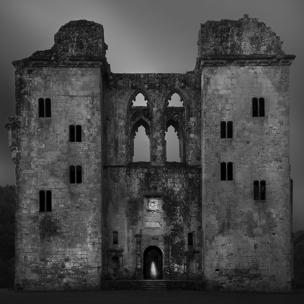
Above is one of my latest images from England; the Old Wardour Castle. While it appears to have been shot at night, it was a 30 second daytime exposure. The key is that I knew in advance what I wanted the image to look like and this vision was realized by underexposing the image and then extensively dodging and burning it to create a night-like scene.
So while the conversion process is important, it’s not really the key to a great black and white image. What’s most important is that you visualize the image in advance and then take control by creating the image along the way.
Cole
P.S. For those of you who are still interested in my conversion process, here it is: First, I shoot in b&w mode and RAW which produces a color image that I convert using the “channel mixer” method. In Photoshop you choose Image/Adjustments/Channel Mixer. Check the “Monochrome” box and then adjust the Source Channel color sliders to see how adjusting each color changes the image (note: some prefer the “Black and White” converter over the “Channel Mixer” method as it offers slightly more control and is a bit easier to use). That’s it!