Category: Tutorials
October 13, 2017
I’ve been home from the Faroe Island for several months now and I am still working on my new images. I was there for a month and took 1600 images. So far, on my first pass through the images, I have about 80 keepers. Once I go through those a second time, I expect to lose about two thirds of those. If I end up with 25 solid images, I will be very happy.
The last time I demonstrated the processing of an image, I duct-taped my iphone to a tripod and simply recorded my computer screen. Well, I’ve gotten a little more sophisticated and have now purchased a screen recording program. It was easy to use and the quality is good.
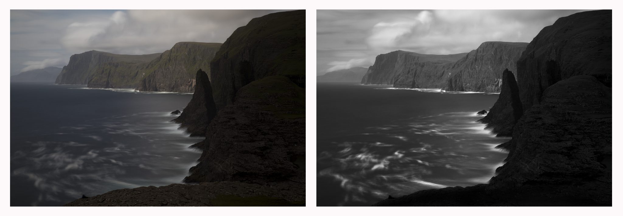
For this demonstration I’ve chosen a fairly simple image, No. 71 above with a before and after.
As always, I follow my “Photoshop and Six Tools” processing format. You can read about this approach here: Photoshop and Six Tools (it’s a very short read and it will help the video demonstration make more sense).
Each time someone watches me process, it becomes quickly apparent that I am not Photoshop expert. Invariably people will tell me either what I’m doing wrong or how I could do it differently.
I know that I am not an expert and the thing is, I don’t want to be! I have found a very simple method of post-processing that allows me to translate my Vision into an image. That’s all I care about, and the simpler the better.
So here is the video, I hope it gives you some ideas for your post-processing.
Cole
September 10, 2015
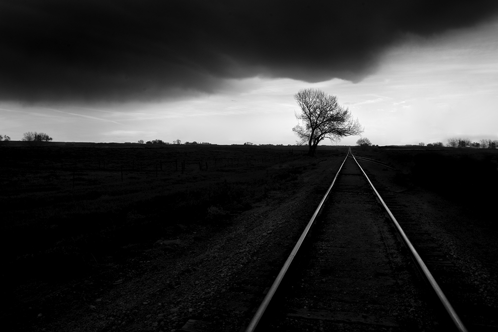

Several years ago a friend of mine, Greg McKean of Master Photo Workshops, shot a video featuring me in Death Valley. And through a series of unfortunate events, we were never able to finish it…until now.
This video is entitled “Discovering Your Vision in Black and White.” It’s a two CD set: one shot in the field and the other at the computer showing my very simple Photoshop techniques including dodging and burning with a pen and tablet.
My biggest concern while shooting was: What if I don’t see any good images, I’ll be documenting myself failing! Fortunately we found a few including “The Road to Nowhere” above. This video will show you how I saw it, shot it and processed it.
To kick start the introduction of this set, Master Photo Workshops is offering a 15% discount between 9/16/2015 and 9/23/2015. Just use the promo code “masterblackandwhite” when ordering. Here’s where you can learn more:
http://masterphotoworkshops.com/catalog/discovering-your-vision
This video an honest representation of what I believe, how I see and the way that I work. I sincerely hope that you will find it interesting and helpful.
Cole
June 11, 2015
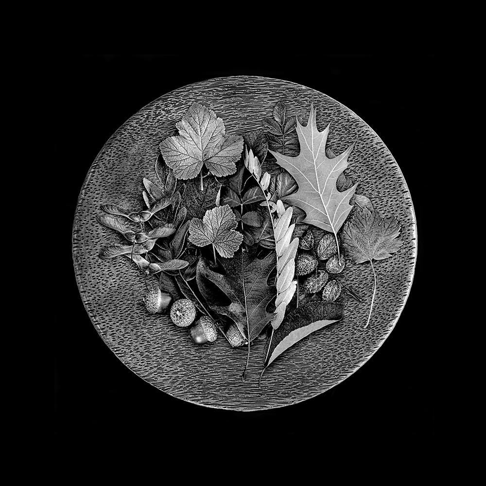

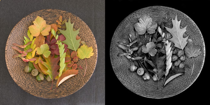
(Plate of Leaves)
It was a rainy day up in the Colorado mountains and I decided to shoot indoors. I collected some seeds and leaves and placed them on this great wooden plate that I had purchased for such an occasion. I was shooting on the kitchen table using available light, which was the kitchen ceiling lamp.
So how did the image look to my camera?
(click on the image to enlarge and compare)
I think the color image is rather boring and unremarkable. At first glance and without Vision, you might be tempted to throw it out. But I had a Vision of what it was to be.
A lot of this image’s “look” was obtained in the black and white conversion process, where I play with the color sliders to bring out or hide details. Click on the image above and look at the leaf just left of center, see how the veins have been brought out? The green slider had a lot of affect on this image.
For me, the step of converting the image to black and white is a critical part of fulfilling my Vision. That’s why I never accept the default b&w conversion or simply desaturate the image. I know what I want the image to look like, Photoshop does not.
Then after I had done as much as I could with the b&w conversion, I dodged and burned to bring out the contrast and highlights. I worked with a very small brush and worked every leaf, seed and nut individually. Sometimes it’s tempting to use a global tool such as the contrast adjuster, but that affects everything in the image equally and it rarely can produce a look equal to good dodging and burning.
The challenge was to take that boring color image and transform it into the black and white image that’s in my head.
For me, a black and white image is so much more interesting than a color one!
Cole
P.S. There’s something else interesting about the before and after image…it’s the sharpness. Did you notice that the b&w version seems so much sharper than the color image? It’s what I call “apparent sharpness” and it comes from contrast. This image has not been sharpened.
May 21, 2015

Yesterday my friend John Evans Jr. and I were talking about how I process my images. He shoots these great color shots of the St. Louis Gateway Arch and recently showed me the image above. He was trying it in black and white and called with a few questions about my processing techniques, and I was trying to describe some of my techniques over the phone.
It is difficult to convey some things with words and so I told him that I’d make a quick and dirty video of me processing an image.
For years I hid my workflow from others because I thought it simple and backwards. As I listened to other photographers talk about their sophisticated processes, I was embarrassed to let them see my rudimentary ones. What if they started asking me about layers…I don’t understand or use them!
Fortunately with time I came to the realization that it’s not about my processes, it’s about my images. Nothing else matters.
There are many ways to use Photoshop and I doubt many photographers use more than a small percentage of its many tools. There is no right way or wrong way to use it and not one workflow will be right for everyone.
My procedure works for me and I’d like to share it to illustrate a point: that you don’t need to know a lot about Photoshop or have a complicated workflow to produce beautiful images.
Here are the six tools that I use to process most of my images:
1. RAW Converter – I use Photoshop’s RAW converter to convert my RAW image into a 16 bit, 300 ppi TIFF file. There are also a number of image controls in the RAW converter and I try to do as much work here as possible.
2. B&W Conversion Tool – I like Photoshop’s b&w conversion tool and play with each color channel to see how it affects the different parts of my image. I tweak everything to taste. But be careful about changing the blue channels too much, they make your skies look great but add a lot of noise to the image.
3. Levels – One of the most basic secrets to a great b&w image is to have a good black and white in the image. You cannot trust your eye and how the image looks on the monitor, you must look at your histogram to accurately determine this. I use “Levels” to set a true black and white point, then I adjust the midtone slider which can radically change the look of my image.
4. Dodging and Burning – This is where I do most of my processing and where I have the most fun! I feel most at home with dodging and burning because that’s how I did things in the darkroom. However the primary difference today is that I can take my time and exercise minute control over every part of the image.
I use a Wacom tablet to dodge and burn because you CANNOT do a good job with a mouse. It is difficult to describe with words how I dodge and burn and so I hope the video helps illustrate this.
5. Contrast Adjustment – Once the image looks great on the screen, experience teaches me that it will print flat, and so I add some contrast. A monitor uses transmitted light and a print uses reflective light, so that means it will take a lot more work to get your print to look as snappy as it does on the monitor. Contrast helps.
6 Clone Tool – I use the clone tool to spot my images. Cloning is so much better than the old days when you had to spot every spot, on every single print and your mouth would taste like Spotone all day!
In sharing these six steps, my point isn’t that you should imitate my workflow, but rather that a workflow need not be complicated. Did you notice that I didn’t make mention of special b&w conversion programs, plug-ins, curves or layers? I also don’t use monitor calibrators, profiles, RIP’s or special inksets.
I use Photoshop and six tools. Ofttimes there’s beauty in simplicity!
Here is a quick and dirty video demonstration of my Six Steps.
Cole
P.S. My apologies for such an amateurish video, but I knew that if I waited until I learned to do it more professionally, it would never get done.
August 3, 2014
 Monolith No. 27
Here are two new short video tutorials that have been released by my friend Greg McKean over at Master Photo Workshops. These are a part of a larger comprehensive DVD tutorial we are putting together on how to shoot long exposures.
Shooting a 30 Second Exposure with the Singh-Ray Vari-ND and Mor-Slo 5 Stop ND Filter:
https://www.youtube.com/watch?v=rbepMMhVc7w
Fixed Vs. Variable Filters
https://www.youtube.com/watch?v=BQE2kxONJds
The other DVD we were working on, which is about how I create in black and white on location in Death Valley, is nearing completion.
Cole
May 2, 2014


I’ve spoken to a number of people who have assumed that I create my b&w images by putting my camera into monochrome mode or by simply desaturating my color images in Photoshop.
That’s not how I create my black and white images, but why not? Why not let the camera or Photoshop do the work for me?
Here’s why: If I let my camera create the black and white image, then all I’d have is a color image that had been stripped of color. A great black and white image is much more than that, it’s an image that I’ve added something to, my Vision.
I capture my images in color so that I can convert them into black and white myself. What can I can do that the camera or Photoshop cannot do?
I know the potential of the image: the camera and Photoshop does not. I know what detail is in the image that can be brought out: the camera and Photoshop does not. I know how to create the look I want by manipulating colors into different shades of gray: the camera and Photoshop does not. I know how to dodge and burn to emphasize certain elements and to de-emphasize other elements: the camera and Photoshop does not. But most importantly, I have a Vision of what I want the image to look like: the camera and Photoshop does not.If you compare one of my original color shots to a desaturated image, and then compare both to my final image…you’ll see a world of difference. Here’s my Iceland No. 4 to illustrate:
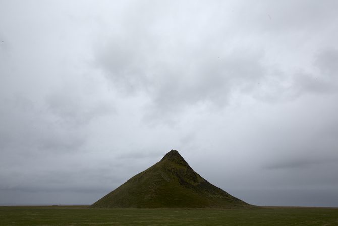
This is what the color image looked like right out of the camera.
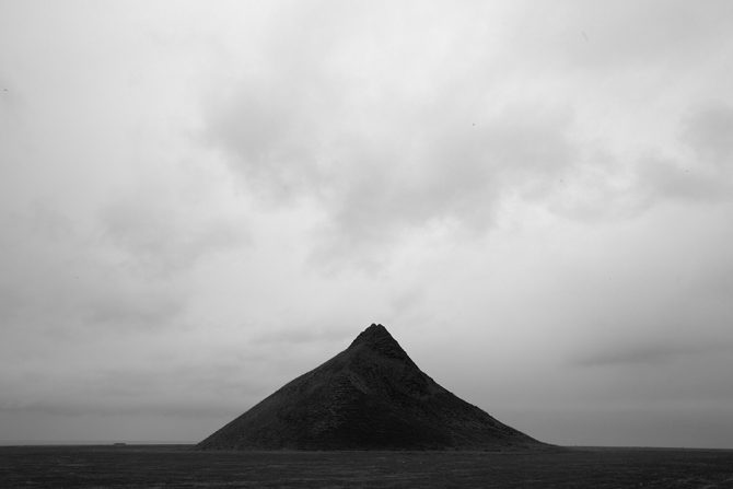
Here’s what the image looks like if you let the camera create the b&w image or you simply desaturate it in Photoshop.
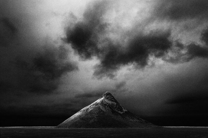
And here’s what the image looks like through my Vision.
These three images all came from the same file! They represent what the camera saw, how Photoshop interpreted the b&w image and finally, how I saw it.
Letting the camera create the b&w image for me or simply desaturating it in Photoshop will never produce a great black and white image. But by processing the image myself, I’m adding to the image and leaving my mark.
Now I’ve talked to a lot of people who have seen my before-and-after images and I know how some people will react: they will conclude that the “secret” to my images are my processing skills and they will think that all they need to do to create better images is to improve their processing skills.
But that is exactly NOT my point!
Learning processing skills without the Vision to drive them, is not much different than letting the camera create the black and white image for you or simply desaturating it in Photoshop. If you don’t know what you want, then better processing skills will not improve your images.
Why don’t I let the camera or Photoshop create my black and white images? Because they are simply tools and cannot convey my Vision.
Cole
P.S. For those who might wonder: I convert my images to b&w using Photoshop’s b&w conversion tool. I do not use plugins or b&w conversion programs.
April 25, 2014

A story…
Every autumn I go to Bandon, Oregon to photograph Monoliths. I have very specific conditions that I prefer; clear skies with wispy clouds that allow me to use long exposures on the Monoliths.
Unfortunately this last October I had not called ahead and made this request with Zeus, the god of clouds, rain, thunder and lightning. What I encountered was fog and lots of it, and unfortunately there is nothing for me to shoot in the fog.
So I decided to go up the coast and check out Cannon Beach, I heard they had some great Monoliths and I was hoping that the weather would be better there. Unfortunately it was just as foggy and so I decided to give up and head home where I would rent some movies and veg out.
Because as long as the fog was obscuring my Monoliths, there was nothing for me to photograph there.
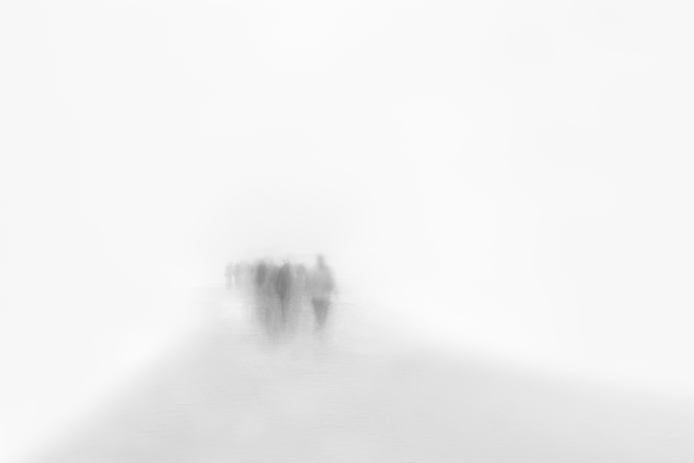
But something inside of me said: Wait a minute, there is always something great waiting to be discovered…in every light, in every weather and in every location. It may not fit into your preconceived ideas of what you want, but there is something here for those who can “see.” And so I stayed.
Through the fog I faintly saw people walking towards me and it reminded me of spirits. A title immediately came to mind as I imagined the image: “They Walk Among Us.” Using the fog, a long exposure and by over-exposing, I created this very high-key image…in the fog.
It reminded me that having preconceived ideas (knowing what I want) might sometimes be a strength, but at other times it may make me blind to unexpected opportunities.
Whenever I’m at a location and feeling that there’s nothing for me to see, I’ll ask myself this question: If I had a time machine and could transport all of the great masters of photography here, could they find a great shot?
Of course they could!
So what is the lesson for me? That sometimes I need to look beyond my preconceived ideas of what I want…and see what is being offered.
Cole
April 12, 2014
Last weekend my wife and I stopped at a garage sale that was hosted by three very old ladies who were selling some very old things (both the ladies and their items were “vintage”).
Amongst their knick knacks I spotted a leather camera bag with a post-it note that said “make offer.” I didn’t need a bag but decided to look inside.
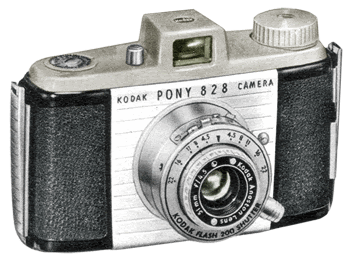
What I saw inside made my heart flutter! It was an old 1950’s Kodak Pony camera, identical to one that I had owned as a boy.
I went over to the three women and asked “who should I make an offer to?” and the two pointed to the one in the middle. I had no idea how much the camera was worth, but I wanted it and so I said “will you take $20?”
Call 911! I thought the woman was going to have a heart attack right then and there, it was clear that she would’ve taken much less for it. But the truth is I would’ve paid a lot more because it brought back a particular childhood memory:
I was 14 years old and I had purchased a used camera just like this from Casey’s camera in Rochester, New York. I quickly put it to use on a still life that I had assembled on my mothers prized dining room table, using two eggs and a goblet.

I knew what I wanted the image to look like, but there was a problem because the camera wouldn’t focus close enough. So I disassembled the lens and removed the focusing stop so that the camera would now focus very close, but how would I focus it? It was never intended to focus like this and so I took a piece of ground glass, put it on the film plane and manually focused it like a view camera. I then loaded the film back into the camera and created this image.
I jokingly tell people that “Egg in Glass” was my first fine art image, and as I have reflected on this experience from some 45 years ago, I’ve come to appreciate what this image represents to me.
It is important because I had exhibited a simple Vision and then sought the technical skills I needed to pull it off. As I look back on my photographic life, that’s how a great many of my images have come about: I had the Vision first and then developed the second.
Let me give another example:
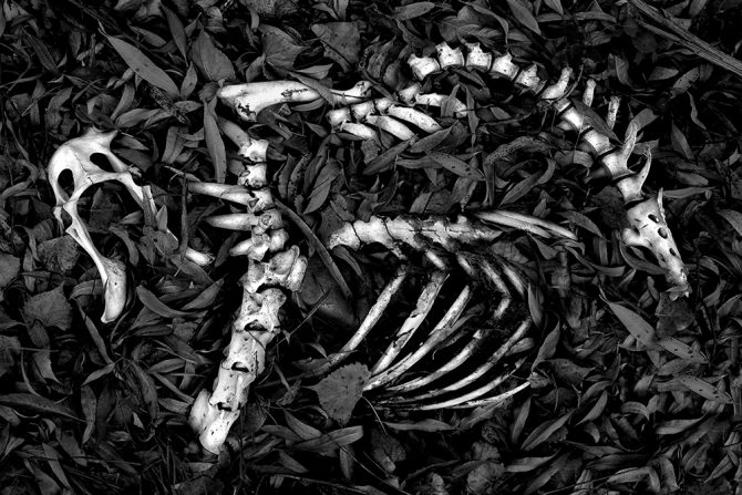
This is “Skeleton” and this is exactly how I found these bones.
Well, not exactly, here’s how the camera saw the scene:

When I stood over those bones that autumn day, I didn’t see the image the way my camera saw it, but rather the way that my Vision saw it. I knew exactly how I wanted this image to look: I wanted those bones to really stand out against dark leaves.
But the problem was that I didn’t know how I was going to do this, I had just converted to digital and I didn’t know how to use PhotoShop. So I just jumped in and starting trying things, and in the process I learned how to dodge and burn with a tablet. The Vision came first and the skills were developed as needed.
Here’s another image where I had to develop the skills on the run:
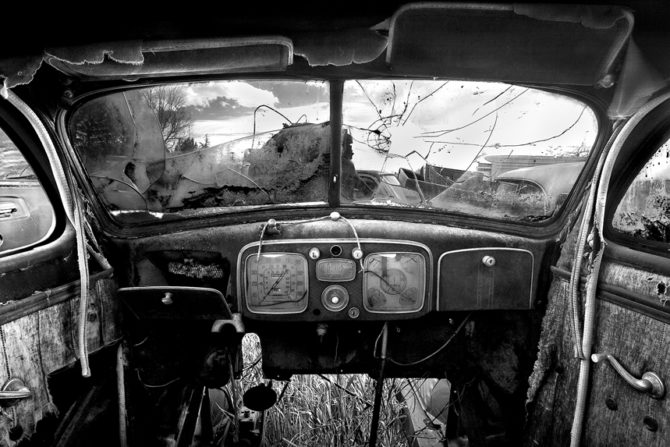
This is “Old Car Interior.” When I stuck my head in the back window of that car and looked at that wonderful old dash, I knew how I wanted it to look. But again I was faced with a technical challenge that I had no experience with: the interior was very dark and flat while the exterior was very bright and contrasty.
The dynamic range in this image would have been a challenge with film, but it was impossible with digital. I didn’t know how to go about fixing this and so I just tried something.
Here’s the original shot:
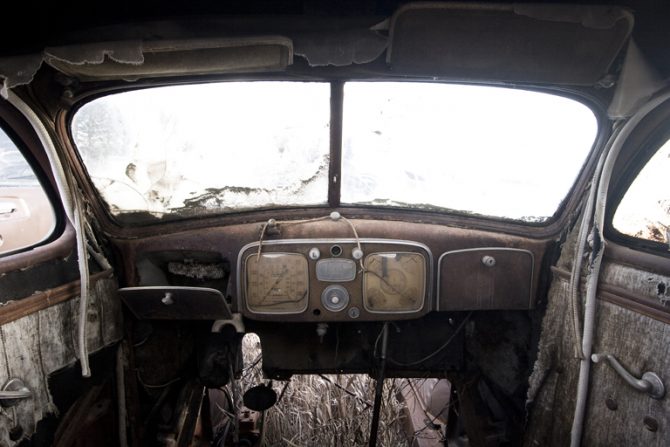
I exposed one image for the interior and one for the exterior. I then processed each one separately, cut out the window from the exterior shot and pasted it into the interior image.
Might there be better ways to have created this image? Probably, but all I care about is that it worked and I was able to create the image that I had imagined.
A final example:
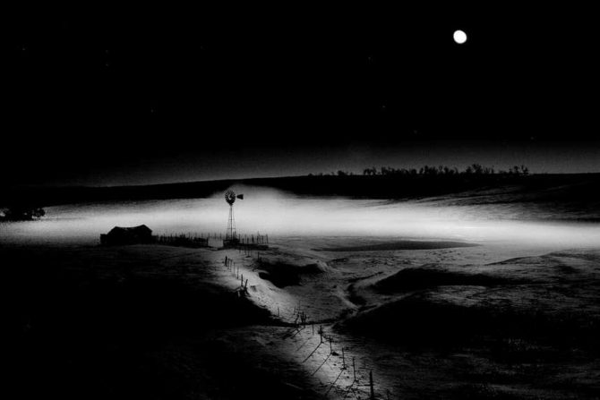
This is “Windmill in Moonlight” and this is how everyone knows this image.
But this is how the camera recorded this night scene:
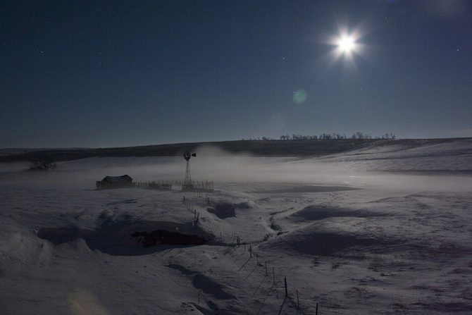
When I saw this scene on that cold winter night in Nebraska, I was inspired and excited with its potential! But when I saw the RAW image, I had doubts that I could manipulate it to match my Vision. I made several attempts and failed, but I didn’t give up because I so believed that this could be a great image.
I know that my philosophy of “Vision first, skills second” runs contrary to common wisdom. There are many who believe that skills must come before the vision can be executed.
I respectfully disagree. Everything in my photographic life (both the good and the bad) has reinforced my belief in Vision first.
When skills comes first, then images are limited by what you can do. But when Vision comes first, then you are only limited by your imagination and determination.
Cole
P.S. I researched the price on that Pony 828 camera and you can buy them all day long on eBay for $10. That old lady got a great deal…but so did I!
July 9, 2013
Tech Report: Cole Thompson explains how to determine correct exposures for long exposure images
An acknowledged master of long-exposure photography, Cole Thompson shares his techniques for finding his “correct” exposure, and extrapolating that to dramatically longer exposure times.
| Balance – Split, Croatia – 2013 (2 minute exposure) |
Getting the correct exposure when using one or more neutral density filters can be challenging. I use up to 18 stops of ND with exposures ranging from 30 seconds to 8 minutes. At first finding the correct exposure was very frustrating and my images were often underexposed and I’d have to resort to guessing at the correct exposure, which often meant I missed the shot.

| Miss Danielle – Guanaja, Honduras – 2010 (4 minute exposure) |
It took a while to figure everything out, but now I have a very simple system for setting the correct exposure and it usually works right the first time. Most of it is straightforward, but there are a couple of “secrets” that could make your long exposures a bit easier.

| Lake Erie – Cleveland, Ohio – 2013 (1 minute exposure) |
I use a Canon 5D digital camera for most of my work. While I could use a film camera, getting the right exposure would take much longer because film doesn’t have the immediate feedback that’s provided by a digital camera. I mention that I use Canon because one of my “secrets” applies only to Canon cameras.
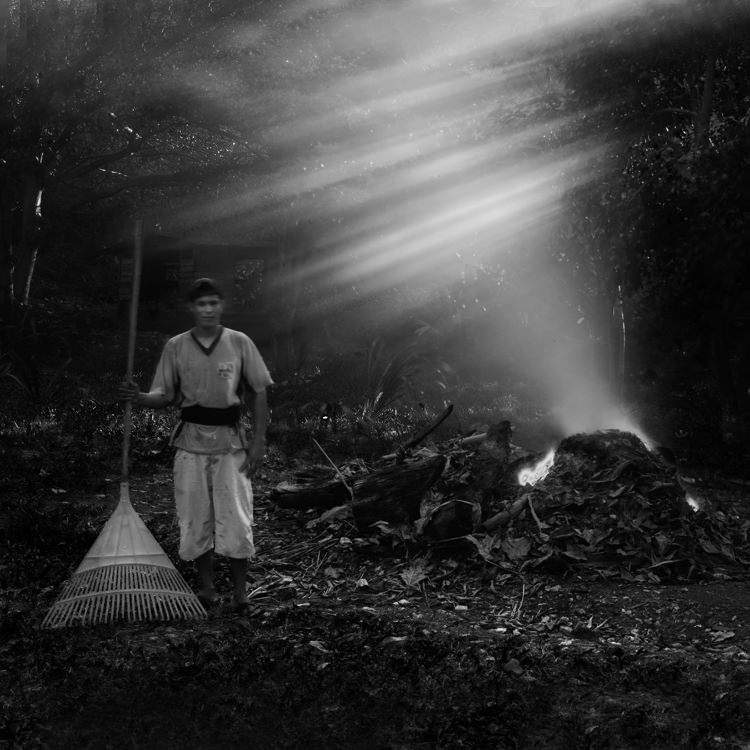
| Honduran with Plastic Rake – Guanaja, Honduras – 2010 (30 second exposure) |
Let me give you an idea of how much 18 stops of neutral density is. If my correct exposure for a scene on a sunny day is 1/500 at f8, then using 18 stops of ND would allow me to shoot a 4 minute exposure with that same sunny scene! That is a lot of light reduction and that means only a tiny fraction of the light is making it through the filters and onto the sensor.
But even with this small amount of light, the camera’s meter is up to the task! I have never needed to use a handheld light meter or long-exposure calculator.
To start off I set my ISO to 50 (typically the lowest ISO available on a digital camera) and set my shutter speed to 30 seconds (typically the longest exposure setting on a digital camera) and then take a meter reading of the scene.
And now for my first and most important secret:
 Secret number 1: To get a correct exposure reading at these low light levels I must completely seal off the viewfinder so that no light enters the camera from the rear.
At these low light levels even the smallest amount of light entering the camera from the viewfinder will give an incorrect exposure reading. How do I seal off the eyepiece? I use an eyecup, such as this one offered by the Hoodman Corporation (see photo).
When using the eyecup I take extreme care to seal my eye completely so that no light enters the viewfinder, otherwise my image will be underexposed.
Once the eyecup is sealed, I simply match my exposure needles for a “correct” exposure and I’m all set for a perfect 30 second exposure.
Now what if I want to use a longer exposure, say 1 minute? How can I calculate my exposure for 1 minute when my camera will only meter to 30 seconds? Simple!
I do everything the same as I did for the 30 second exposure, but now I set the exposure needles to under-expose by 1 f-stop so that my meter looks like this:

Now I switch my camera to Bulb mode and I expose for 60 seconds.
What did I just do here? By using the exposure compensation scale, I underexposed by 1 stop when I metered and then I made up for it by doubling my exposure time.
What is Bulb mode? In Bulb mode the shutter stays open as long as you hold down the shutter. It’s not practical for me to hold the shutter button for one minute because it would shake the camera, so I use a remote switch that allows me to lock the shutter button down for the duration of my exposure. You can use your camera’s official “branded” shutter lock, but there are “off brand” ones available at a fraction of the cost that do the job just fine.

| Monolith No. 27 – Oregon Coast – 2010 (5 minute exposure) |
Now for secret number 2 for Canon users: When I first used this approach, the images would sometimes turn out okay and sometimes they’d be very dark. I couldn’t figure out what was causing my calculation to be so far off. Was it some sort of reciprocity failure, a phenomenon we experienced in the old days of film that required extra exposure time beyond what the meter said? Or was it something else?
My research found nothing on reciprocity failure for digital cameras. And then one day I accidentally discovered why my longer exposures were not working out the way they were supposed to. This is due to a quirky feature of Canon cameras.
When I metered and set my aperture to f8 in Manual mode, I expected the aperture to still be at f8 when I switched to Bulb mode. It was not. It was set at f22 and that explained why my images were grossly underexposed. The aperture setting does not carry over from Manual mode into Bulb mode; you must manually set it each time.
So secret #2 is to be sure that I reset my aperture once I switch to Bulb mode, every time!
So how do I determine the correct exposure for a 2 minute exposure? I do everything the same again, except I set my meter to underexpose by two stops. My meter now looks like this:

I then switch to Bulb, re-set my aperture and expose for 2 minutes.
And for a 4 minute exposure I set my meter to underexpose by 3 stops so that my meter now looks like this:

I switch to Bulb mode, change my aperture and expose for 4 minutes.
What I am doing with this approach is to underexpose when metering, and then I compensate by increasing my exposure time. For every 1 stop I underexpose, I double my exposure time.
Here are the settings to remember:
| Meter for a 30 second exposure, and then adjust as follows: | |
| Meter for correct exposure | 30 second exposure |
| -1 stop underexposed | 1 minute exposure |
| -2 stop underexposed | 2 minute exposure |
| -3 stop underexposed | 4 minute exposure |
At first this system seemed complex, but once I used it a few times it was very easy to remember.

| Ancient Stones No. 2 – Joshua Tree, CA – 2012 (5.5 minute exposure) |
When I’m going to use a very long exposure (over 30 seconds) I’ll start off by first exposing at 30 seconds to check the exposure and composition. If everything looks good, then I’ll expose at the longer exposure time. This saves a lot of wasted time when I’m doing a four minute exposure and then I discover that something wasn’t right!

| Wedding Day – La Jolla, CA – 2013 (20 second exposure) |
When I’m using a 30-second exposure, the camera times the exposure for me. But my camera doesn’t time for over 30 seconds and I must time these exposures myself. At first I used my wristwatch, but I frequently forgot where I started from and I wasted the exposure. So now I use my iPhone timer because I always have it with me, and because I cannot ignore that obnoxious Marimba alarm! There are also various smartphone apps that can help time your exposure, some are free, others cost a couple dollars.
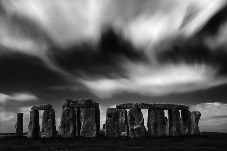
| Stonehenge – England – 2009 (90 second exposure) |
To create my long exposures images I use a Singh-Ray Vari-ND filter and stack a second 5-stop or 10-stop Mor-Slo fixed ND filter on top of that. There are two reasons why I use the Vari-ND.
First, I can open up the Vari-ND filter for easier composing. At 18 stops it’s almost impossible to see anything even after my eyes have adjusted. With the Vari-ND I can allow more light to enter the viewfinder so that I can compose the image, and then I stop down for the exposure.
The second Vari-ND advantage is that I can use the variable feature of the filter to adjust my exposure instead of using the aperture. This allows me to set my aperture to where I want it, to control my depth of field.
Both of these advantages are significant and I always use a Vari-ND when shooting long exposures.

| Little Corona – Corona del Mar, CA – 2010 (3 minute exposure) |
Conclusion: Setting the correct exposure for long exposure photography is pretty easy, it’s all based on accurately metering at 30 seconds and extrapolating from there. Using an eyecup is a must to seal out any extraneous light and the Vari-ND makes composing easy and offers me more control over the scene.
Use the links below to check out Cole’s website, blog, and social media for more information and news updates.
June 20, 2013
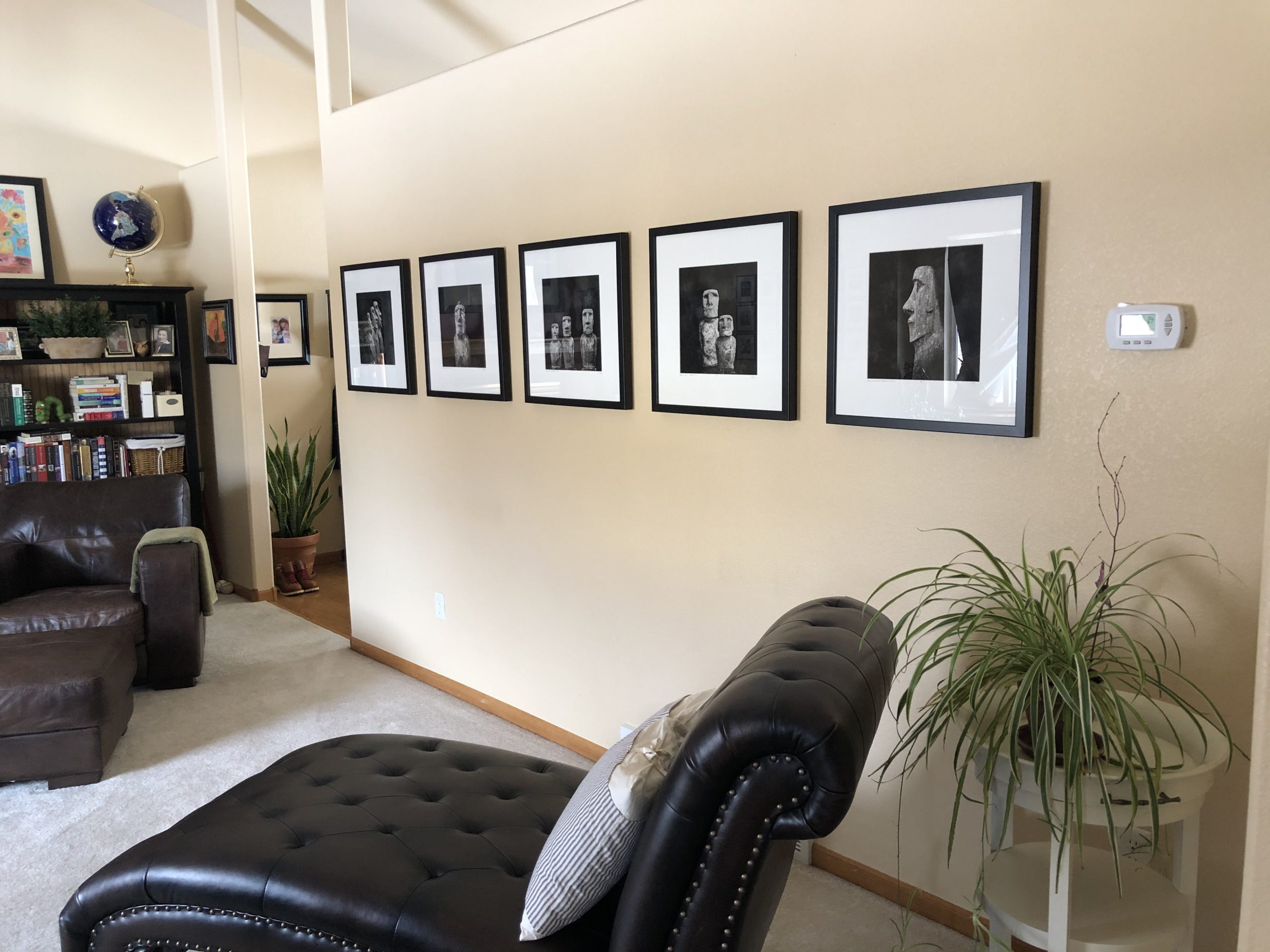
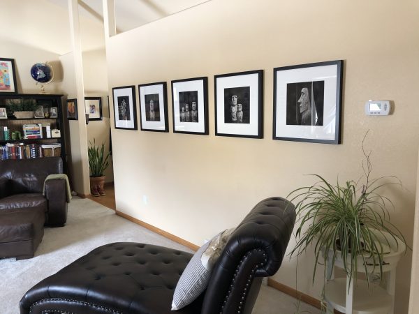
My Moai portraits on a my friend’s wall (Finn Kingman)
I’ve received some requests to explain my simple approach to matting and framing. I like things simple, but I also like quality, efficiency and cost effectiveness.
Sending your work to a framer will produce high quality work, but it can be expensive. Matting and framing yourself can be time consuming and if it’s not done perfectly, can detract from your art. My goal is to make the matting and framing process simple, professional and cost effective.
There are many different ways to matte and frame, some of it’s a matter of taste and preference, and so here’s how I do it.
Matting:
To keep things simple, I only offer four sizes of matted prints:
- Horizontal 8×12 matted to 16×20
- Horizontal 10×15 matted to 20×24
- Square 8×8 matted to 16×16
- Square 12×12 matted to 20×20
Initially I offered any size print and then would hand cut each matte to order; but this was slow and tedious work that I didn’t enjoy doing. By standardizing on these four sizes I was able to streamline my process and bring my costs down.
One way I brought my costs down was to obtain a resale license which allowed me to open an account with an art supply distributor. Now I purchase my materials in bulk for the best prices, for example I purchase a case of matte board and backer board.
I then have my framer bulk cut the windowed mattes for these four sizes. He has a computer controlled matte cutter and therefore every window is perfect every matte looks professional. Cutting the matte windows by hand is time consuming and they never looked quite as good as those cut by the computer.
By having them cut in bulk I get a discount and always have inventory on hand.
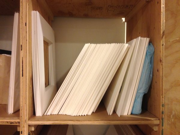
My inventory of pre-cut mattes and backer boards
When I need to matte a print all I do is assemble them using my print, the pre-cut matte, a pre-cut backer board and two pieces of archival tape. With this system it takes me only 10 minutes to have a print ready to ship.
Here is how my matting system works: the print is “hung” from the back of the matte (not the backer board) with one small piece of tape. This is a very simple and secure method of attaching the print and it allows the print to hang distortion free.
To mount the print, I lay it face down and position a 6″ piece of tape along the top center edge with half of it on the print and half off the print. And here’s an important step: I stick the tape down at one end and from that point I slowly press the tape down along the six inches, allowing the tape to position itself stress free. This ensures that the tape is not warped and will not warp the print.
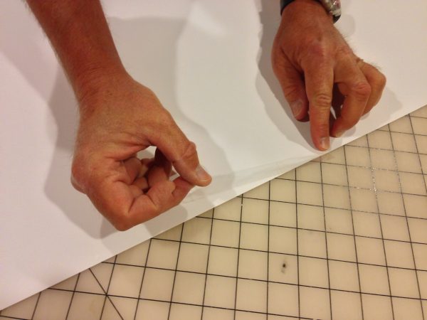
Positioning a 6″ piece of tape on the top backside of the print
IMPORTANT: I do not stick the tape to the print at both ends and then press it down towards the center. This can warp the tape which will end up warping the print. This sounds like such a small and silly point, but if its done the wrong way it will distort the print (especially glossy prints) and will look terrible.
Now I put the print face up with the sticky side of the tape facing up. I properly position the matte over the print and then affix them together by pressing down along the top of the matte.
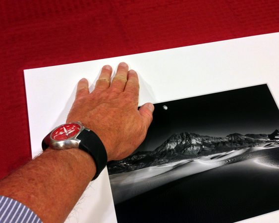
Pressing down on the front of the matte to affix the taped print to it
My print is now attached to the matte by a single piece of tape. It’s secure and it allows the print to lay flat and undistorted.
Next I attach the matte board to the backer board by taping them together with a single piece of tape. I lay the matted print face down, butt the backer board to the top edge and tape the joint together. This piece of tape now acts like a simple hinge.
This shows how the print is taped to the matte board, and the matte board is taped to the backer board
Now fold the backer board and matte in half.
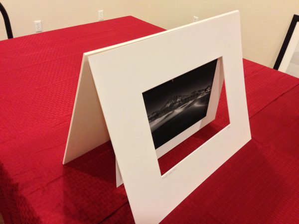
This gives you an idea of how the entire system works: the matte and backer board hinged at the top, and the print hanging from the matte by a single piece of tape
I then attach a business card to the back with double sided archival tape.
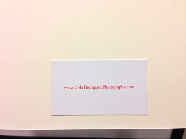
My business card goes on the back of every print
Finally I put the matted print into a clear bag to protect the print, but it also has another benefit: it acts like a piece of glass and makes the blacks on my matted prints look really good. I want my print to make a good first impression when the customer opens the box!
Caution: there are two types of adhesive bags available. The CORRECT type has the adhesive on the bag, the WRONG type has the adhesive on the flap.
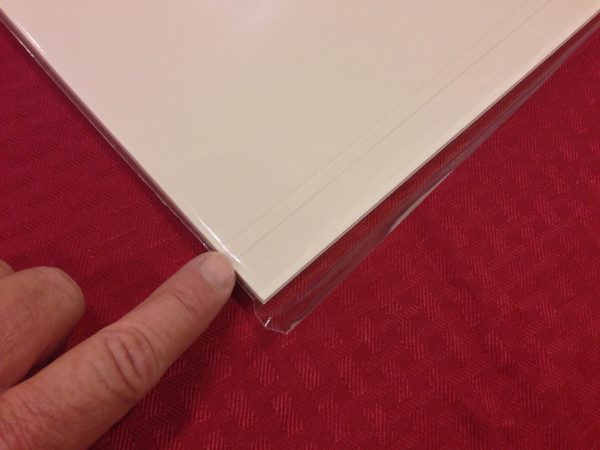
Notice the the adhesive is on the bag, not on the flap. This is the Clear Bag that you want to use.
Please do not make the mistake that I made and purchase the bag with the adhesive on the flap, because it will ruin your print. You will get the print into the bag safely enough because the protector strip is over the adhesive, but when you or the buyer takes the print out, the exposed glue on the flap will touch the print and ruin it.
You now have a simple, classy and perfectly presented print.
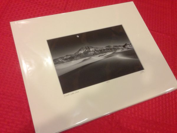
The final product.
Framing:
This is going to be a very short discussion: after many years of offering framed prints to my buyers, I have concluded that the best way to frame a print…is to have the buyer to do it themselves! Seriously, framing takes a lot of time, there is little profit in it and choosing a frame is a matter of taste, which is best left to the buyer.
A Couple of Other Tips That Might Be Useful:
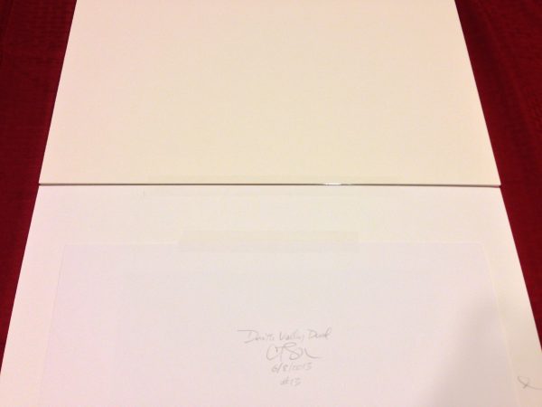
Overmatting Vs. Undermatting: I like the look of an over-matte with the signature on the matte board, but it’s a matter of personal taste. There is one legitimate criticism people raise about over-matting: if the matte is ever damaged and replaced, the artist’s signature will be lost. How I get around this is to also sign the print so that if the buyer does need to re-matte, they can under-matte and reveal the signature on the print.
Signature: I sign with a fine point mechanical pencil on the front of the print, the back of the print and the matte.
Print Surface: I generally use a matte surface because I like how it looks, but there’s another advantage: it’s non-reflective surface hides print warping. When I do use a glossy paper, I use a heavy weight stock to minimize this warping.
Archival Materials: I use archival matte board, backer board, tape, double-sided tape and clear bag. Yes, I could save money by using cheaper materials, but they will eventually cause damage to the the print and this will reflect poorly on me and my work.
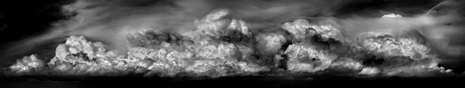
Standard Sizes Means Standard Crops: Using standard sizes for my prints means that I generally do not use odd crop sizes. If I do, such as with my Clouds panorama below, then I’ll not offer a matte for those prints, but sell them as a “Print Only.” Cutting special mattes for a few prints is a lot of work.

Dust: dust is my number one enemy when matting and framing! One of the most common mistakes that I see people make is to matte and frame on a piece of carpet. Carpet is one of the worlds best dust magnets and so why would I collect all of the dust and pet hair in the room and concentrate it right where I’m working?
I work on a large plastic cutting sheet that I purchase from a fabric store, and then I use a drafting brush to keep it clean. This works extremely well and I have five cats and two dogs in the house.
Materials:
- Matte Board: I use Crescent 2253 white (32X40 size) and Crescent 2262 white (40X60). Both are the same off-white color, but Crescent uses different part numbers for the different size boards.
- Backer Board: I use Elmer’s 3/16 Acid Free foam core.
- Archival Tape – The tape I use to affix the print to the matte and to create my hinge is Framer’s Tape II from Specialty Tapes.
- Double Sided Tape – 3M ATG-700
- Clear Bags can be purchased at: http://www.clearbags.com/bags/clear-bags (get the adhesive on the bag, not the flap!!!)
When a buyer opens the box and sees my print for the first time, I want them to be impressed. I want the matting and presentation to be simple and professional so that it doesn’t distract from the image.
My system accomplishes this.
Cole