June 11, 2010
Before and After – Lone Man No. 20

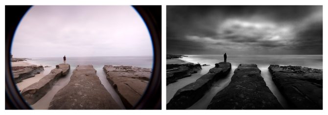
I often receive requests to show some “before and after” images to help people understand how much of my work is done in camera and how much is done in Photoshop. I’d say it’s generally about 50/50 but that can vary by image with some images almost ready right out of the camera and many requiring extensive processing in Photoshop.

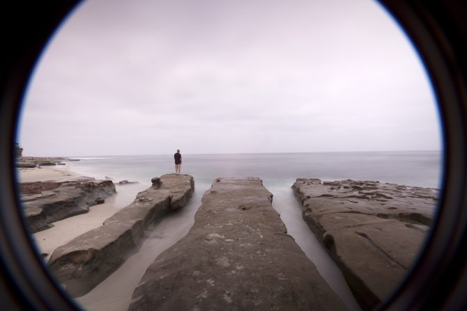
Lone Man No. 20 is a good example of a 50/50 image. As you can see, the image I started with and the final image are both quite similar and yet quite different. The original shot has all of the important elements; the composition, the long exposure of the water, the clouds and the lone man, but it doesn’t have the dramatic effect of the final image.
Probably the first change you’ll notice in the final image is that the severe vignetting has been repaired. I was shooting with an extremely wide angle lens and I had two stacked neutral density filters on my lens, as a result a great deal of the filter was included in the photograph. To repair this I first cropped the image and then I used the clone tool to fill in the missing corners.
Next you’ll notice that the sky in the original image has very low contrast and is quite bland. To bring out the sky detail I split the image into two halves, upper and lower, and converted them to b&w differently. In each conversion I used Photoshop’s “Channel Mixer” but in the upper half I used some blue channel to improve the contrast and detail in of the sky. Next I used some pretty aggressive dodging and burning to bring out the definition and detail in the clouds, this information was in the image but it was almost hidden to the eye. As a rule you can generally recover image detail as long as you have not over-exposed the image to the point that you have blown out the highlights.
Note: one of the side-effects of using blue channel in the conversion and dodging and burning is that the image can get very grainy. When using this technique you must carefully balance the good-effects with side-effects.
Next I converted the lower half of the image to b&w, darkened the image and greatly enhanced the contrast. This dark and contrasty approach is the look that I like and it often has the effect of making daytime look like night time. The March/April issue of Photo Technique Magazine featured an article on my work and they used the phrase “Darkness at Noon” to describe this look.
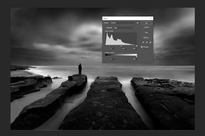
All of this produced a basic final image, but it still didn’t have the dramatic impact I was seeking and that I had pre-visualized before I captured the image. So my final step was to dodge and burn to bring out the highlights and selectively darken blacks to locally enhance contrast. As I did this I carefully monitored the histogram below:

 This histogram shows that I have a good black and a good white, something your eye cannot always discern when looking at the image on the screen. Monitors are often out of adjustment and our eyes can be fooled, but the histogram never lies. People often complain to me that what looked good to them on screen, often prints flat and muddy. Generally the problem is revealed in their histogram; they lack a “true” black and good contrast.
As you can see from my final image, it does not represent reality. Reality is not my goal but instead I strive create images that reflect how I see the scene through my vision. That is why I advocate that photographers work just as hard on developing their vision, as they do on their technical skills and equipment. The image begins and ends in your mind’s eye.

Nice one Cole.
Cole:
This is an excellent summary of methods and philosophy in actualizing your vision in your images.
Most generous of you to share this. Very helpful.
Thank you!
Best regards,
– Fred
Hi,
In response to a photo series I was working on, John Frenzel sent me a link to your web site, and said I would love your photography. He was so right. So gracious of you to share some of your technique with your readers. The vision we have to figure out for ouselves, and very wise words on your part.
I look forward to seeing your prints sometime.
LauraM
Cole;
Thank you for sharing your technique. Very much appreciated. I would like to see the final prints. When you print do you print in dyes, pigments or charcoal.
Regards
I think I’ll cover printing in a future blog Clayton, thanks for the reminder. I print myself (an oft asked question) on an Epson 7900, generally using Hahnemühle Photo Rag 308.
Hi Cole:
This is a very creative approach. Along with what you go over here how much dodge and burn did you do on this shot?
Jeff
I pretty extensively dodge and burn, but as an alternative to more global actions which have unintended consequences on the image. I use dodging and burning to increase contrast locally.
I tend to use Photoshop as I worked in the darkroom.
I will eagerly look forward to when you discuss printing. I have been wondering if you ever teach a workshop or class, or if you would consider a portfolio print critique?
I look at my copy of Loneman No 20 (print #1 !!)with renewed understanding and appreciation.
A duscussion of your printing will be of interest to us all.
Laura, I do not teach workshops but am working with a company to produce an instructional video on B&W Photography. I’ll keep you posted!
I’m also going to do a blog entry on why I do not do portfolio reviews and why you may want to consider NOT having people review your work!
A thought in process…
Vielen Dank, dass Sie meine deutsche Freundin!
Hi, very helpful post! thank you for sharing…
Thank you for sharing your process! It was fascinating to see how you achieved your vision for that image and it does increase my appreciation for not only that piece, but your other ones as well. Looking forward to the printing info too! Thanks.
I loved your post on Lone Man No. 20. Thanks for sharing some of your ideas. Do you ever use Nik Silver Efex Pro to convert your images or just Photoshop?
I simply use Photoshop to convert my images. I find the more tools I use or the more complicated the process, the more things there are to go wrong or to distract!
See my blog that touches on this: http://www.photographyblackwhite.com/special-tools/
Thanks for sharing your techniques. It certainly is very helpful
Cole,
Do you have a previous post on how to use the histogram, or a recommendation as to where to find a good reference to using this as a tool.
thanks,
Don
Don, I don’t have a previous post on the histogram. But I think that’s a good future subject though!
WOW I love ya work, that image on you home page the man with the beard….simply perfect. Thanks so much, truely inspiring
Thank you for sharing your process! It was fascinating to see how you achieved your vision for that image and it does increase my appreciation for not only that piece, but your other ones as well. Looking forward to the printing info too! Thanks.
Joanna, you are most welcome!