I’m heading out for Easter Island Sunday morning and I’m both excited nervous.
Excited because I’ve wanted to visit Easter Island ever since I was 17 and read the book Aku Aku by Thor Heyerdahl. It really captured my imagination and I would dream of the Moai and those unknown peoples who created them. Going to Easter Island has long been a dream of mine.
But I’m also nervous because when I go on a trip like this I worry that I’ll come home empty handed and not meet people’s expectations. And each time someone says “I can’t wait to see what you get!” I become even more apprehensive.
And the more apprehensive I get, the more pressure I put on myself. And the more pressure I put on myself, the less creative I am because I’m focused on what others expect and not my own Vision.
So here’s what I have learned to do, to minimize that apprehension and maximize my creativity:
First: I remind myself that I’m visiting one of the most exciting places on earth and a top destination on my bucket-list. That alone is enough to make this a successful trip, no matter what.
Second: I tell myself that if I create just one image that I love, I’ll be happy.
Third: I will not look at anyone else’s work from Easter Island. I do not want to have any preconceived ideas of what I should create.
Fourth: I’ll spend a lot of time alone contemplating the Moai. I am confident that if I can relax and spend time with them, my Vision will appear.
And Fifth: I will keep reminding myself that I am creating for myself and I’ll put out of my head any internal or external expectations.
What I have learned is that worrying is not only ineffective, it’s actually harmful to my creative process. I just need to relax, enjoy the trip and have faith that something will come to me.
I don’t believe in “good art” or “bad art.” There is only art that I like or dislike and like everyone, I have my opinion.
But sometimes someone voices an opinion as though they were “the expert” and their opinion, “fact.” Here is an essay by Jonathan Jones and he does just that.
.
Flat, soulless and stupid: why photographs don’t work in art galleries
Photographs can be powerful, beautiful, and capture the immediacy of a moment like nothing else. But they make poor art when hung on a wall like paintings
Jonathan Jones
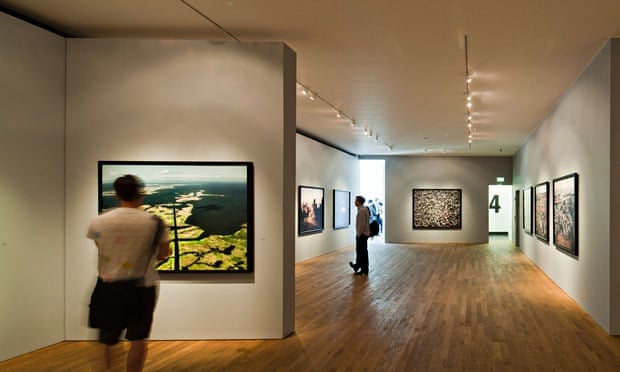
On the surface: visitors study pictures on show at the Photographers’ Gallery, London. Photograph: Alamy
Photography is a miracle of the modern world. It gives us instant visual information from all over the planet and far beyond. It is a unique documentary record of our own lives, a simple source of creative pleasure and fun. I just wish people wouldn’t put it in art galleries.
Let me be clear: photographs on the page or screen are fascinating. Who can fail to be entranced by the first-ever pictures from the surface of a comet that were taken this week? The power of photography to show and to tell has never been greater, as modern technology takes it simultaneously to the far reaches of the solar system and ever deeper into the heart of daily life.
But that does not make it sing on a gallery wall.
It just looks stupid when a photograph is framed or backlit and displayed vertically in an exhibition, in the way paintings have traditionally been shown. A photograph in a gallery is a flat, soulless, superficial substitute for painting. Putting up massive prints is a waste of space, when the curators could provide iPads and let us scroll through a digital gallery that would easily be as beautiful and compelling as the expensive prints.
I try to suppress these thoughts, for photography exhibitions are taken desperately seriously. I recently joined the crowds at the Natural History Museum’s wildlife photographer of the year. It’s amazing how long some people can look at a photograph. I observed the observers, rapt before illuminated images that I really can’t look at for more than a few seconds.
That is because when you put a photograph on the wall I cannot help comparing it with the paintings whose framed grandeur it emulates, and I can’t help finding photography wanting.
Paintings are made with time and difficulty, material complexity, textural depth, talent and craft, imagination and “mindfulness”. A good painting is a rich and vigorous thing. A photograph, however well lit, however cleverly set it up, only has one layer of content. It is all there on the surface. You see it, you’ve got it. It is absurd to claim this quick fix of light has the same depth, soul, or repays as much looking as a painting by Caravaggio – to take a painter so many photographers emulate.
But we are encouraged to give it the same, or more, attention. Today’s glib culture endlessly flatters photography’s arty pretensions. The winning picture in the Taylor Wessing prize at the National Portrait Gallery “has clearly been inspired by Caravaggio”, raves the Evening Standard, as if this meant it was somehow as rewarding as the 17th-century master’s works. Sorry, but it ain’t.,
Why not try this experiment? Go to the National Portrait Gallery’s Taylor Wessing exhibition, then pop around the corner to see the National Gallery’s late Rembrandt show. If you can really see even a millionth of the vitality of a Rembrandt portrait in any of the NPG’s photos, we’ll just have to agree to disagree.
.
Here is another opinion, a rebuttal by Sean O’Hagan.
.
Photography is art and always will be
Do Jane Bown, William Eggleston and Diane Arbus not sing on a gallery wall? Photography critic Sean O’Hagan hits back at Jonathan Jones’s damning claim that photographs cannot be considered fine art
.
Sean O’Hagan
Still intensity … Samuel Beckett. Photograph: Jane Bown
Imagine, if you will, the following scene. I pop into the National Gallery to view the 2014 BP National Portrait Award and look in bemusement at the exhibition, which is mostly comprised of rather old-fashioned paintings. It’s an uninspiring show, a hotchpotch, as are most exhibitions drawn from open submissions. Inexplicably enraged by this, I rush home and pen an article claiming that painting is dead and that it looks anachronistic, indeed stupid, on a gallery wall in the 21st century. Not only that, but I then extrapolate that all painting is dull and stupid – Caravaggio, Rubens, Picasso, Hockney, Richter, the lot.
Iowa, 1956. Photograph: Robert Frank
In November, our art critic Jonathan Jones went to see the wildlife photographer of the year show at the National History Museum and the Taylor Wessing prize at the National Portrait Gallery – an open submission award known for its eccentric shortlist, usually featuring people with their pets. Quite why he chose to visit these two shows eludes me. Did he think they were art photography exhibitions? He castigated both, as I, a photography critic, would probably have done had I the energy to kick a few dead horses.
I did not respond back then for two reasons: the “photography is not art” debate is so old it’s hardly worth revisiting, and the idea of using a wildlife award show as a yardstick just seemed bizarre. But, alas, he has repeated his claims this week,discussing a rather boring photograph by Peter Lik, which sold for £4.1m, becoming the most expensive photograph in the world. To which my response is: so what? It’s global capitalism – obscenely rich people with more money than sense. Or taste. For Jonathan, though, “This record-setting picture typifies everything that goes wrong when photographers think they are artists”. No it doesn’t. Here are a few artists who use photography: Cindy Sherman, Jeff Wall, Gillian Wearing. Here are a few photographers, off the top of my head, whose work is art: Julia Margaret Cameron, Edward Steichen, William Eggleston, Nan Goldin, Robert Frank, Stephen Shore, Diane Arbus, Paul Graham, Hiroshi Sugimoto. Their work sings on the gallery wall. Their work makes you look at the world differently.
Several things are wrong about Jonathan’s reasoning, not least that he still thinks painting is in some sort of competition with photography. How quaint. He also seems to think that all photography is derivative of painting. This is plainly not so. A great photograph by William Eggleston, though he claims to be influenced by abstract painting, occupies its own space, makes its own rules.
A group of Kalutara peasants, 1878. Photograph: Julia Margaret Cameron/Royal Photographic Society
Jonathan writes that photographs look better on a computer screen than in a print. Some do, but most do not. Has he never stood in wonder in front of a Julia Margaret Cameron portrait? I doubt it. Has he ever seen a painting or drawing of Samuel Beckett that possesses the stillness and intensity of the great photographic portrait of Samuel Beckett by John Minihan or Jane Bown? I expect not.
He makes no distinction between types of photography, and seems unaware, that photography has changed utterly since Henri Cartier-Bresson. Look at the politically charged conceptualism of Broomberg and Chanarin, the playful invention of a fictional series by Joan Fontcuberta, the wonderful artists books made by the likes of Cristina de Middel or Viviane Sassen. Photography is as vibrant as it has ever been – more so in response to the digital world, which Jonathan mistakenly thinks has made everyone a great photographer. It hasn’t. It has made it easy for people to take – and disseminate – photographs, that’s all. A great photographer can make a great photograph whatever the camera. A bad one will still make a bad photograph on a two grand digital camera that does everything for you. It’s about a way of seeing, not technology.
Why damn photography because of the excesses of the auction houses and mega-rich collectors? Do we measure the health of contemporary art by the price paid for Hirst’s vulgar diamond skull? Or a Jack Vettriano? I have seen some idiotic installation pieces over the years, but that doesn’t mean that all artists who make installations are idiots and their work dull and stupid.
If anything is anachronistic, it’s the “photography is not art” debate. Warhol’s Polaroids and Ruscha’s deadpan photography books put it to bed years ago. I wish Jonathan had come with me to a group show I saw at Purdy Hicks this year called Natural Order. There were some good paintings and uncannily detailed drawings, but Awoiska van der Molen’s nightscapes made on long exposures in the volcanic islands of La Gomera and La Graciosa were breathtaking in their stillness and sense of mystery. So strong that everything on the walls around them seemed muted. I think that’s what art does, right?
~~~
In truth I have no interest in such discussions and I don’t care what the “experts” have to say about photography, art or anything inbetween. These opinions have no bearing on my life or my art.
For some time now I have been developing the “opinion” that there are those who create and those who pontificate. I’m committed to doing more of the former and less latter.
I was dropping off an image to be framed at Lloyd’s Art Center here in Fort Collins when I noticed an old 1955 issue of Popular Photography sitting on the counter. The owner Alan Kinney had a stack of them and let me choose one for myself.
As I looked through that magazine, I marvelled at how much photography had changed in thee last 60 years. Let me share a few pages with you:
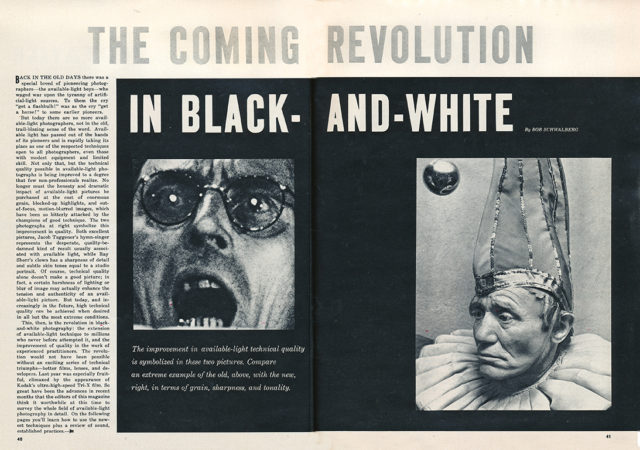
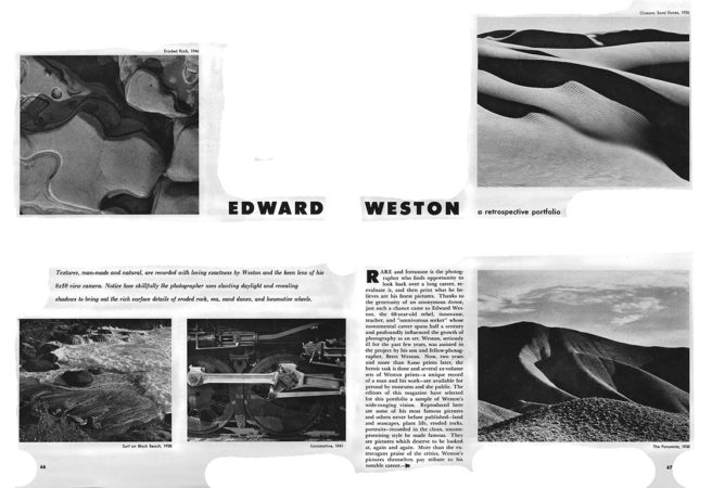
I chose this February 1955 issue because it had a special feature on Black and White and another on Edward Weston.
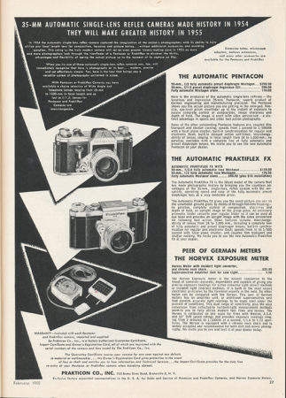
I enjoyed looking at the ads as much as I did reading the articles. Equipment was so cheap by today’s standards, but of course a dollar went MUCH further back then! (I won’t bore you with how much I could buy with a nickle)
What I would give to have a new Exacta VX for $189.50, or an Omega enlarger for $72.95!
I’ve owned many of these East German cameras and their variations: they were basic, cheap and reliable.
These ads remind me how convenient modern cameras are. I remember the days when every shot required a handheld meter reading, manually setting the shutter and aperture and then manually focusing (often on a moving subject) before you took the shot.
No auto focus, no auto exposure, no auto white balance…no auto anything.
Modern equipment is so much better and convenient in every respect, except for perhaps one. The old cameras were durable and built to last several generations. I cannot imagine handing down my digital camera from generation to generation. If I get 5 years out of a modern camera, I count myself lucky.
This article is about the coming revolution in black and white due to advances in available light photography. A prominent development was the introduction of Tri-X film in 1954. Tri-X was very fast with an ASA of 400 which we often pushed to 1600 and sometimes even 3200, but the grain was terrible at that speed!
Could 1955 photographers ever believe that one day we could shoot at 25,600?
In 1955 Edward Weston was 68 years old, was seriously ill with Parkinson’s disease and would leave this world in less than three years. Popular Photography dedicated 12 pages to his images.
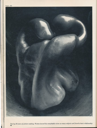
A favorite image of almost everyone is Pepper No. 30, which they oddly identify as Pepper, 1930.
There were a lot of helpful tips and news items in this issue:
Kalart introduced a new flash unit that automatically ejected hot spent flashbulbs.
Coating your Kodachrome glass slide holders with talcum powder will keep them from sticking together.
You can use tungsten film outdoors with the help of a No. 85 filter.
They explained how to adjust contrast when using Kodak Medalist paper by varying exposure and development times.
Instructions were provided on how to convert an ASA film speed index to a Weston speed number.
Tips were given on how to “push film” using D-23, D76 (my developer of choice, diluted 1:1) and Promicrol developers.
I’m sure this is Greek to anyone who is under the age of 50!
Kodak really ruled the world back then with many of the articles clearly written to promote their products. Kodak also had several large ads including this one on the back cover.
I wonder how this ad would sell today? Can you imagine Canon marketing a “Man’s Camera?” (I had never heard of the Chevron camera, does anyone remember it?)
~~~
Looking through this issue of Popular Photography was so much fun! The ads reminded me how much things have changed in the last 60 years and the article on Weston reminded me how much remains the same.
And despite my wonderfully nostalgic feelings for the good old days of 1955 photography, I’d never go back.
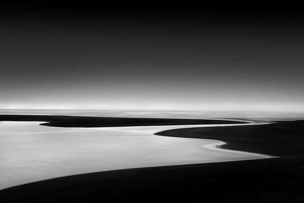
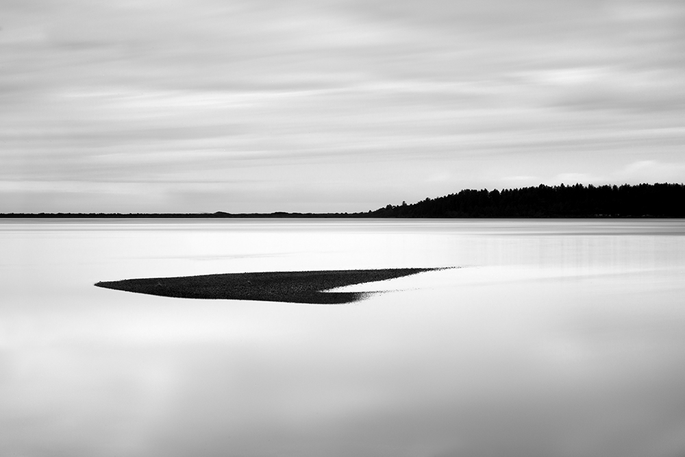
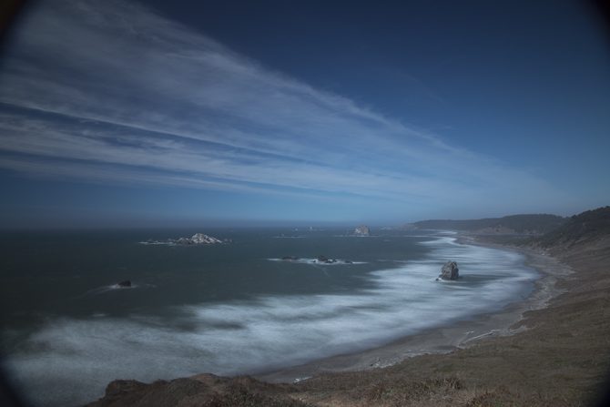
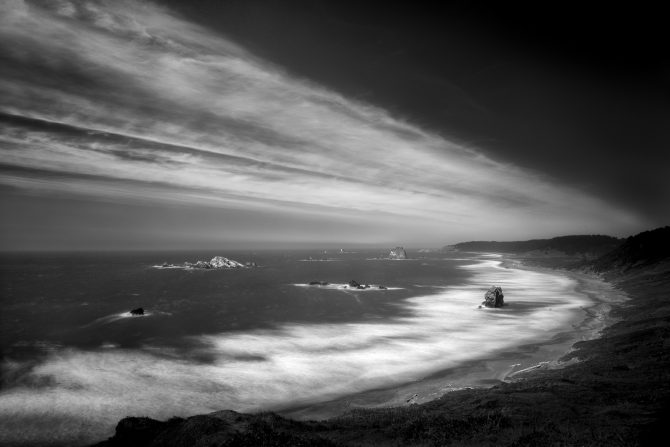
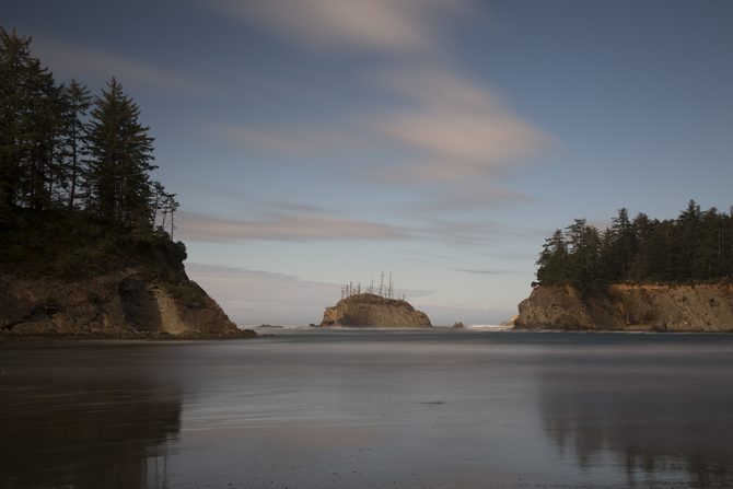
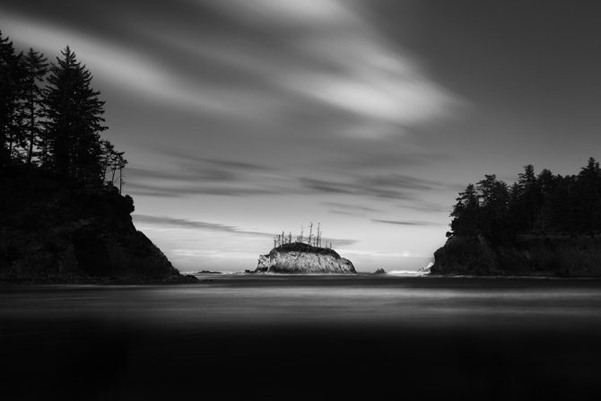
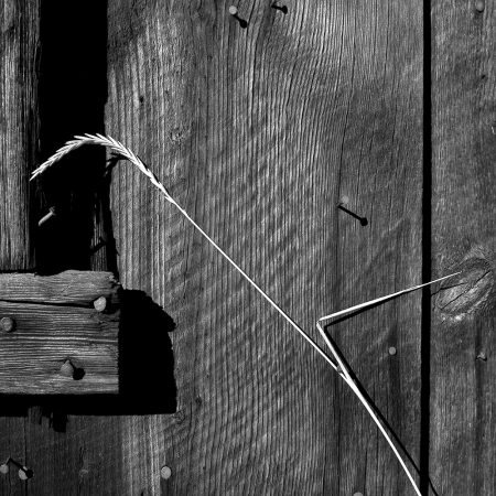
Sometimes the strangest things can catch your eye and make for a nice image.
I was driving down the Oregon coast when I saw this sandbar. I liked its shape and how it contrasted against the water, and how it provided balance to the land in the background. It was a simple image and I further simplified it by using a long exposure to mute the detail in the clouds.
When I compose an image, I compose simply by how it feels and when it feels right, it is done. I never give a thought to the so-called rules of composition.
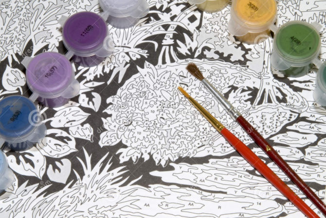
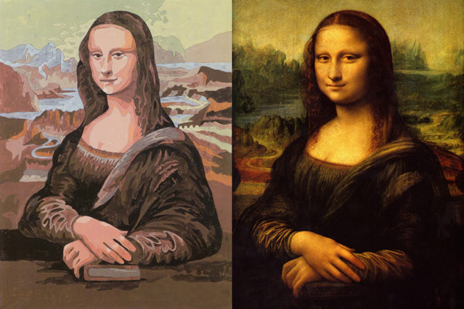
Thinking that following rules will produce a great image is like believing that following the instructions and staying within the lines on a paint by number kit will produce a masterpiece.
Following those rules may produce a “competent” image, but not a masterpiece!
I have no doubt that Apple will one day program the rules of composition into an iPhone so that every image we take is a competent image, but it will never create a great image. Great images are created by feeling people whose images cause others to feel.
Remember the wise words of the philosopher Yoda:
“Feel the force. A photographers strength flows from the Force. But beware of the dark side.”
Feel the image and beware of the dark side (rules).
I’ve had a number of people ask if I’d do some more “before and after” shots. So here are five from my recent Oregon trip.
~~~~~
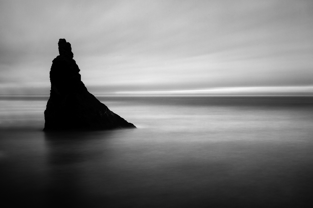
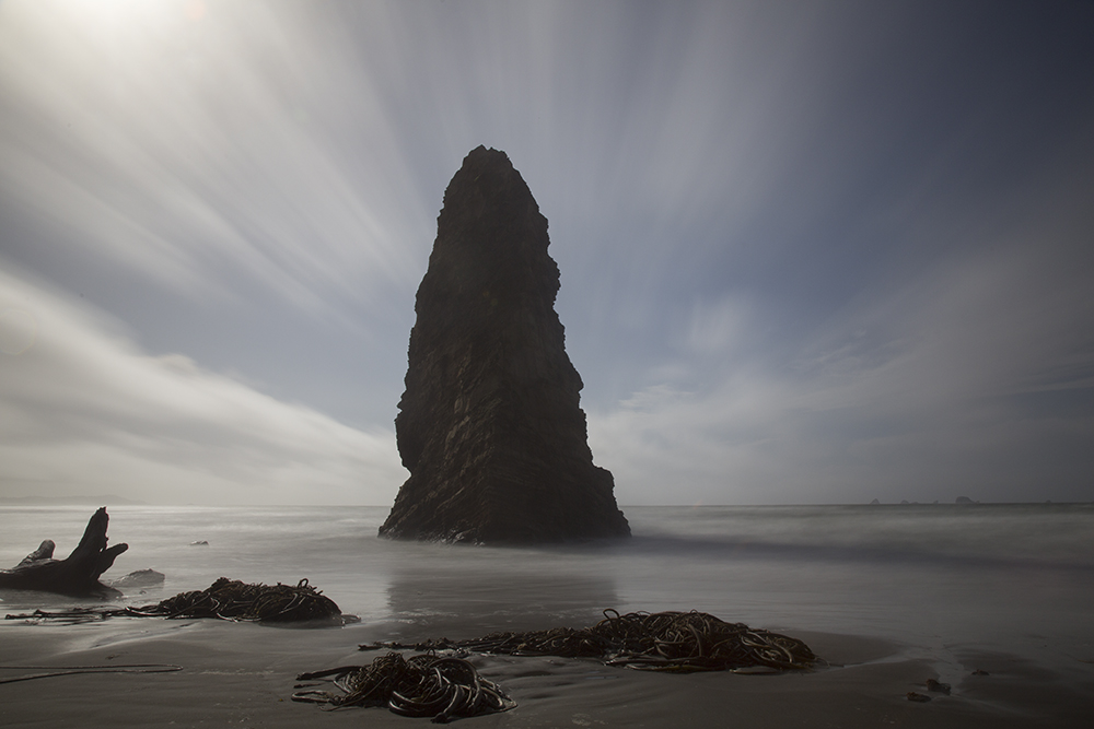
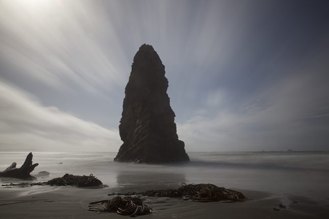
I had my eye on this Monolith by Cape Blanco for several years, but I had never found an easy way to get down to the beach. On this trip I found one.
At the hour I get there (never early!) the monolith is backlit and so it’s a difficult shot. I was fortunate to have these great delicate clouds that streak well with a long exposure and I envisioned them becoming an important part of the image, if I could deal with the backlight.
The sun was in the upper left corner and it was washing out the clouds and giving me a big flare. I used my hand as a sunshade for the 30 second exposure, properly placing it by watching where my hand’s shadow fell on the lens. I knew that later in Photoshop I’d have to even out the sky, because it was bright on the left and darker on the right.
Then there was the debris on the beach from the last few days of big storms and high tides, but I knew that I could deal with that in post processing.
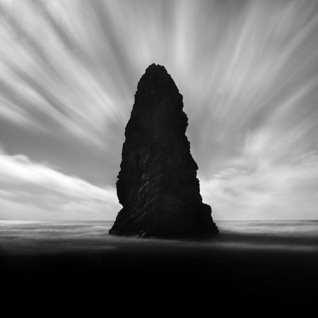
Monolith No. 78 – After
To deal with the debris I cloned out the tree stump and burned down the foreground to remove the rest. I don’t like anything that distracts from the main subject.
For the sky I burned down the upper left corner to bring out detail in the clouds, then I dodged up the right to balance the sky out. I also used a very small dodging brush to follow the cloud streaks to bring them out more. Adding contrast also helped the clouds stand out against the sky.
The backlighting didn’t hurt me as much as I feared it would. There’s not much shadow detail in the Monolith, but I generally don’t prefer a lot anyway.
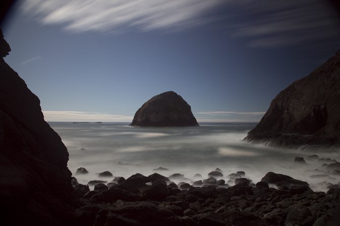
Monolith No. 77 – Before
This is one of my favorite images from this trip. I envisioned this Monolith framed by the very dark hills on the sides, the rocks below and the clouds above.
This was a pretty simple image and an easy one…I thought…until I got home and found out that my Vari-ND was doing the dark pattern thing on me. It’s one of the quirks of all variable ND filters, sometimes at wide angles and when the sun angle is just right, you get these weird dark patterns across the image. And here’s a heads up: the cheaper the variable ND filter the more it will do this. That’s why I use the Singh-Ray Vari-ND, it happens much less frequently and when it does, there are a couple of workarounds.
If I had noticed the patterning in the field I could have switched lens and probably have avoided it. This was shot with my 24-105 at 24 mm, which is where the problem can happen, when you’re shooting at the wide end of your lens. If I had switched to the 16-35 and used 24 mm the pattern probably would have gone away, because 24 mm is mid focal length for that lens. And of course another option would have been to simply switch to a fixed ND filter for this shot.
This image also had some vignetting in the corners and I didn’t like how the clouds were thin on the right side of the image.
You might notice that I underexpose my images, usually by about 1 stop. I do this for a couple of reasons. First, I like the look of a dark image with pronounced highlights. Second, it makes it easier to deal with the wide dynamic range in these types of scenes where the sky is important to the image. If I had opened up another stop, that sky would have easily washed out and I’d have lost the cloud detail. Shadow detail is not very important to my images, so underexposing works for me.
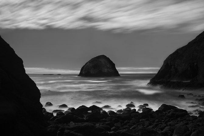
Monolith No. 77 – After
I fixed the dark pattern in the sky with vey some careful and slow dodging (it’s easy for a sky to look blotchy if you use a small or hard brush or you work too quickly) I’m typically dodging and burning between 1-3% strength and for skies I’m generally using 1%. I used the clone tool to fix the vignetting and I also cloned in some clouds from the left to the right for a more balanced look.
I also used dodging and burning to bring out the water detail. I call it local contrast enhancement when I go back and forth between burning and dodging to increase the contrast in just one area.
I was happy with how this image turned out, especially after finding out about the dark pattern in the sky.
Something I noticed in the image above: there’s a thin highlight separating the sky from the monolith. I went back to the original TIFF and it’s not there, but it appears when I convert it to a JPEG for the web. I’ll have to do some work to figure out what that is and how to fix it.
Cape Blanco – Before
People are naturally drawn to lighthouses, as are photographers. But the lighthouse shot is soooooo overdone that I almost didn’t create this one. But I thought I’d see if I could put my twist on it. I love to put the subject small in a large frame and then added a long exposure for a bit of movement. I underexposed and used a polarizer because I wanted black skies.
Cape Blanco – After
In the final image, I further isolated the lighthouse by burning down the foreground and the sky. Looking at this image now, a few weeks after I last worked on it, I think I’ll remove those trees on the far right because I find them distracting.
This illustrates how I work to refine an image. I’ll let it sit for a few weeks and then look at it with fresher eyes. I’ll then perhaps modify it again and then put it to bed for a few weeks more before I look at it again.
Now that I’ve removed those trees, I’ll come back in a week to see if I want to keep this change or not.
Isolated No. 7 – Before
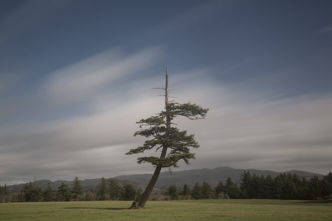
I was driving on the road to Cape Blanco when this tree just jumped out at me! I love centered images and struggled if I should center the tree where it hits the ground or the upright of the tree. Centering the upright portion of the tree looked more centered and that’s what I went with.
It was a windy and hazy day which made the shot a little challenging. I took about 20 long exposures trying to get the clouds just right and ended up using this one. I didn’t underexpose as I usually do, because I didn’t want to lose the tree detail. It was still a processing challenge and I started over 4 times before I got it right.
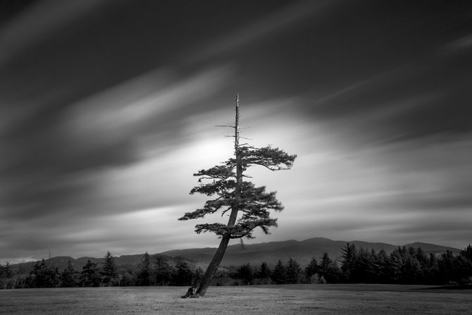
Isolated No. 7 – After
Again, I did a lot of dodging and burning on this image. Many people feel that they can do this with a mouse, but I certain cannot! I use a pen and tablet and the control is so much better than with a mouse. I never like to be adamant, but you cannot do what I do with a mouse. Period.
I got rid of the shadow of the tree, that bothered me for some reason, and left a highlight around the tree. I darkened the sky and left it bright behind the tree. As I look at the image today, I think that I may go back and open up the trees a bit on the right side.
As I make decisions about my images, it reminds me of how I’ve seen some others make those decisions. They will show the image to someone and say: What do you think I should do to this image? I am very opposed to that approach, I think one should have a Vision and not adulterate it with someone else’s opinion.
Isolated No. 6 – Before
I was lucky on this trip to have constantly changing weather conditions. Some days it was raining hard, others were sunny and others were constantly changing as on this day. The sun was coming and going and what I was trying to get was the sun hitting the island and the land left and right bits of land in shadow.
I was here for several hours trying to get the clouds and lighting just right. Sometimes the clouds were perfect, but not the foreground. At other times I’d get the shadowing how I wanted it but the clouds were no good.
I didn’t get exactly what I wanted in the shot, but I was confident that I’d be able to create the effect I was looking for in post processing.
Isolated No. 6 – After
I burned the land down on the left and right to put the focus on the island. Then I dodged up the island to make it brighter. Then I went to work on the clouds, lightening the upper ones and darkening the smaller ones just above the island. Then I darkened the foreground to hide the detail and to bring the eye to the island.
~~~~~
So after seeing these “before and after” shots, I hope that you’ll not conclude that you need to learn more about Photoshop. It is not my intent to focus on post processing as the key to an image because that is exactly what I don’t believe.
Instead my approach is to have a Vision of the image and then let that drive the processing. When you have Vision, your processing then has purpose: to bring the image into compliance with your Vision.
And armed with that Vision, you don’t need to ask others what to do with your image, you already know how it’s going to look in your head!
I’m often asked: what’s the best camera, lens or paper?
My answer is always the same: there is no “best.” Most cameras are excellent, almost all lenses are better than their masters and choosing a paper is simply about personal preference.
It’s easy to buy into the notion that the right equipment: camera, lens, accessories, plug-ins, printers or paper will transform our ordinary work into extraordinary images. However from my perspective great images are rarely great because they are technically perfect or printed on the right paper.
Or put more bluntly: I don’t think it really matters which equipment or paper you choose because they are not the critical component in a great image!
If you find yourself spending a lot of time researching the “best” (fill in the blank)…let me suggest another approach to improve your images.
Focus on the Image
Focus on your Vision
Focus on Composition
I believe a great image is created mostly from Vision and composition, and that technical skills plays a much smaller supporting role.
Where do you spend most of your time? Are you out of Balance?
But some will say: Can’t I seek both a great composition and technical perfection?
Yes, of course you can. But what I found in myself (and what I often see in others) was a tendency to spend the majority of my efforts on equipment, processes and technical issues, and very little time was spent working on my Vision or improving my composition.
I think the primary reason I did this was because I was insecure about my creative abilities, and I thought that I could compensate by excelling at the technical. And also let’s be honest, playing with equipment and learning new processes is just plain fun!
But Vision and composition is where the action is, and it’s how great images are created.
When I was 14 and discovered photography, I created images for just one reason: for the pure joy of creating and personal satisfaction.
But over time I found that my motivations changed and I started to create for others and for praise.
Then I found myself creating to build a resume. I thought that I needed to prove, by the length of my resume, that I was a good photographer.
Then came the desire for fame. I created because I wanted to become famous and to be known as a great photographer.
Now at age 60 I have come full circle and it’s like I’m 14 years old again.
Once again I am creating simply for the joy of creating and for the satisfaction that comes when I craft an image that I love.
How ironic that a 46 year journey would take me to the same place where I started from.
I am so glad that I found my way back.
Cole
P.S. The above image was created a couple of years ago and it has always been a favorite of mine, but only today while writing this blog post did I understand why. It reminds me of what it was like to be 14 years old again, when I created for myself and didn’t care what anyone else thought.
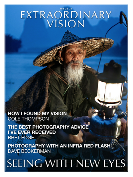
I’m so happy to learn there’s a new magazine out about Vision! It’s great that more and more people are focusing on Vision and less and less about equipment.
I know about this publication because they asked to publish my blog post on “How I Found My Vision.” They did a wonderful job with the article and even gave me a full page ad!
It’s a free publication and here’s where you can find it for Apple and Android:
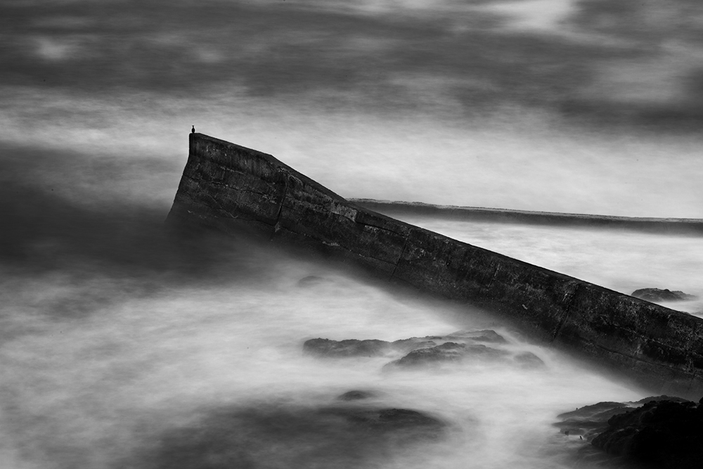
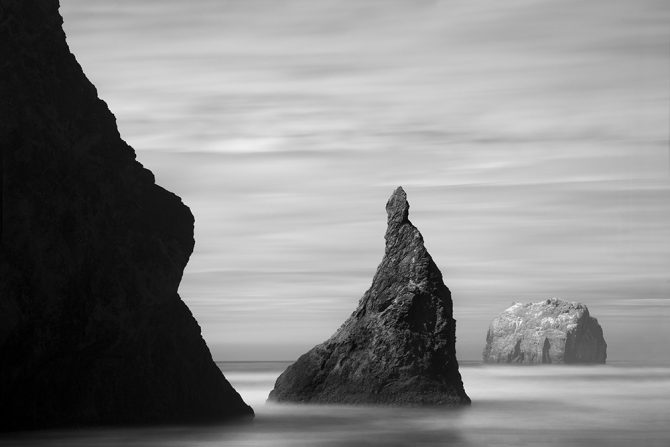
I’m having a great time in Bandon. The weather is wildly mixed, hard rain one day and beautiful sun the next. I’m working hard to look for the image that presents itself…yes even in the rain.
Today I solved a small but persistent problem: how to get a long exposure when it’s raining. Raindrops on the ND filter are in focus enough to ruin the image. I’ve tried shielding the lens with my hat, but the driving rain still got through.
Finally I came up with a crazy but effective solution: during the exposure I would look for any drops that landed on the filter and then quickly and gently wipe them off with a microfiber cloth. A fast 1/3 of a second swipe has no effect on a 30 second exposure and I do not press on the filter, just lightly brush the surface with the absorbent cloth.
Crazy, but effective.
I think this allowed me to get a couple of images that might not otherwise have been possible.


Still intensity … Samuel Beckett. Photograph: Jane Bown
Imagine, if you will, the following scene. I pop into the National Gallery to view the 2014 BP National Portrait Award and look in bemusement at the exhibition, which is mostly comprised of rather old-fashioned paintings. It’s an uninspiring show, a hotchpotch, as are most exhibitions drawn from open submissions. Inexplicably enraged by this, I rush home and pen an article claiming that painting is dead and that it looks anachronistic, indeed stupid, on a gallery wall in the 21st century. Not only that, but I then extrapolate that all painting is dull and stupid – Caravaggio, Rubens, Picasso, Hockney, Richter, the lot.
In November, our art critic Jonathan Jones went to see the wildlife photographer of the year show at the National History Museum and the Taylor Wessing prize at the National Portrait Gallery – an open submission award known for its eccentric shortlist, usually featuring people with their pets. Quite why he chose to visit these two shows eludes me. Did he think they were art photography exhibitions? He castigated both, as I, a photography critic, would probably have done had I the energy to kick a few dead horses.
I did not respond back then for two reasons: the “photography is not art” debate is so old it’s hardly worth revisiting, and the idea of using a wildlife award show as a yardstick just seemed bizarre. But, alas, he has repeated his claims this week,discussing a rather boring photograph by Peter Lik, which sold for £4.1m, becoming the most expensive photograph in the world. To which my response is: so what? It’s global capitalism – obscenely rich people with more money than sense. Or taste. For Jonathan, though, “This record-setting picture typifies everything that goes wrong when photographers think they are artists”. No it doesn’t. Here are a few artists who use photography: Cindy Sherman, Jeff Wall, Gillian Wearing. Here are a few photographers, off the top of my head, whose work is art: Julia Margaret Cameron, Edward Steichen, William Eggleston, Nan Goldin, Robert Frank, Stephen Shore, Diane Arbus, Paul Graham, Hiroshi Sugimoto. Their work sings on the gallery wall. Their work makes you look at the world differently.
Several things are wrong about Jonathan’s reasoning, not least that he still thinks painting is in some sort of competition with photography. How quaint. He also seems to think that all photography is derivative of painting. This is plainly not so. A great photograph by William Eggleston, though he claims to be influenced by abstract painting, occupies its own space, makes its own rules.
A group of Kalutara peasants, 1878. Photograph: Julia Margaret Cameron/Royal Photographic Society
Jonathan writes that photographs look better on a computer screen than in a print. Some do, but most do not. Has he never stood in wonder in front of a Julia Margaret Cameron portrait? I doubt it. Has he ever seen a painting or drawing of Samuel Beckett that possesses the stillness and intensity of the great photographic portrait of Samuel Beckett by John Minihan or Jane Bown? I expect not.
He makes no distinction between types of photography, and seems unaware, that photography has changed utterly since Henri Cartier-Bresson. Look at the politically charged conceptualism of Broomberg and Chanarin, the playful invention of a fictional series by Joan Fontcuberta, the wonderful artists books made by the likes of Cristina de Middel or Viviane Sassen. Photography is as vibrant as it has ever been – more so in response to the digital world, which Jonathan mistakenly thinks has made everyone a great photographer. It hasn’t. It has made it easy for people to take – and disseminate – photographs, that’s all. A great photographer can make a great photograph whatever the camera. A bad one will still make a bad photograph on a two grand digital camera that does everything for you. It’s about a way of seeing, not technology.
Why damn photography because of the excesses of the auction houses and mega-rich collectors? Do we measure the health of contemporary art by the price paid for Hirst’s vulgar diamond skull? Or a Jack Vettriano? I have seen some idiotic installation pieces over the years, but that doesn’t mean that all artists who make installations are idiots and their work dull and stupid.
If anything is anachronistic, it’s the “photography is not art” debate. Warhol’s Polaroids and Ruscha’s deadpan photography books put it to bed years ago. I wish Jonathan had come with me to a group show I saw at Purdy Hicks this year called Natural Order. There were some good paintings and uncannily detailed drawings, but Awoiska van der Molen’s nightscapes made on long exposures in the volcanic islands of La Gomera and La Graciosa were breathtaking in their stillness and sense of mystery. So strong that everything on the walls around them seemed muted. I think that’s what art does, right?
~~~
In truth I have no interest in such discussions and I don’t care what the “experts” have to say about photography, art or anything inbetween. These opinions have no bearing on my life or my art.
For some time now I have been developing the “opinion” that there are those who create and those who pontificate. I’m committed to doing more of the former and less latter.
Cole