Year: 2011
December 3, 2011

Receiving another rejection notice can be discouraging at best, and at worst can cause you to lose faith in your abilities and cause creative paralysis.
I have submitted my work to hundreds of shows, exhibitions and magazines; and while I have gotten in some, I have also received many rejections. What is one to make of a rejection? Does it mean your work is not good enough or are there other reasons why it might have been rejected?
To put a rejection into perspective I first ask myself “why did I submit to this event?” Understanding your motives can be useful in understanding your reactions. For example there was a time when I submitted my work to receive validation, to have someone say “your work is good.” And of course when my work was not accepted I interpreted this to mean that my work was not good and perhaps I was not a good photographer.
But over time I have come to understand that my opinion of my work should be based on what I think of it and not what others think, and certainly not if it gets accepted into exhibitions! One of my favorite quotes is: “What others think of you is none of your business” and likewise what others think of my art is none of my business; my opinion is the only one that matters. That is not to say that I do not enjoy exhibiting or receiving compliments about my art, but there is a difference between enjoying compliments and needing them to feel good about oneself and ones art.
So back to the rejection letter and what it might mean. The first possibility that I had to face was that my work was not good enough. It is very difficult to objectively evaluate your own work and even harder still to admit that it may not be good enough, but we must do that if we are going to improve. Rejection can be a good thing if it leads to change and improvement.
But from my experience, a rejection can often mean something else much more innocent. Juror’s like anyone else have their own tastes, likes and dislikes. They tend to choose images that they personally like and that’s not a statement about your work. To increase the odds of my work being accepted I would research the juror’s own work and exhibitions they had juried to see what type of images they liked. If my images were in stark contrast to their preferences, I would skip that submission.
For example I used to regularly submit to Shots Magazine even though their selections were “younger” and more “hip” than my work. I never got in and that bothered me so much that I irrationally set a goal of submitting until I got in, which I never did. It took a while before I realized that this was simply not the right venue for my work and it was not a reflection on the quality of my work. It simply wasn’t a good fit.
Another selection factor is how your image fits in with the other images in the exhibition. A juror doesn’t just choose the “best” images but actually creates a new body of work by combining the individual images into a purposeful and intentional grouping. Sometimes images are chosen because they tie in with other of the juror’s selections, which is again not a reflection on the quality of your work.
And then there is the “different” factor. I’ve had jurors tell me that they see so many images that they end up looking for ones that are simply different. If “different” is not your style and you’re more of a traditional photographer, your work may not be selected by that juror.
There are so many reasons why an image may not be selected and so many of them have nothing at all to do with the quality of your work. That is why it’s so important that you believe in your work and continue to improve and persevere. Everyone has rejections and the people who win in the end, are the ones who do not give up.
Strategies for Improving the Odds:
Over time I devised a strategy that allowed me to improve my odds of getting my work selected, here is what I did:
1. You must have good work, and “good” is more about the composition and feeling your image evokes rather than its technical quality. From my experience a juror will almost always pick an emotional image with poor technical quality over a technically perfect image that has no feeling or soul.
2. Research the juror and their personal tastes. Does your work fit in? Can you select images for submission that seems to be more in keeping with their preferences? Are there jurors that have similar tastes as you, if so submit to shows that they are jurying.
3. Focus on the smaller exhibitions that are likely to have fewer submissions and less on the really big exhibitions. I’d rather submit five images to a show with 500 submissions than submit five to a show with 5,000. Also look for shows that extend their deadlines, that often means they have received fewer entries than they expected. Let the numbers work in your favor.
4. Submit as many images as you can afford. Submitting five images versus one dramatically increases your odds. Look for shows that are offering discounts, this will allow you to enter more images and improve your odds even more.
5. Submit a variety of styles. I often would see someone submit five images and they were all virtually identical in subject and style. I would submit five very different images, figuring that if the juror didn’t like one then another might appeal to them. This is one of the best strategies I pursued to increase my odds.
6. Select images that you love and have a passion for. In the beginning I would survey friends and family to try to pick images that had the widest appeal. That approach never improved my odds and it left me feeling conflicted and uncertain. You should pick images that you’re passionate about and forget what others think. I do not know how it works, but your passion does make a difference and improves your chances of getting accepted.
By using these techniques I was able to achieve a 50% success rate; meaning that for every two submissions I’d get into one. Some of that was accomplished by improving my art and some of it by using these techniques. Use both to improve your odds.
Rejection is a part of the artist’s life and while you can never remove it, you can reduce it. And more importantly you can better deal with rejection when you believe in your art and understand that the rejection was just another person’s opinion.
In the end, you must be pleased with your work regardless of what others think.
Cole
November 18, 2011
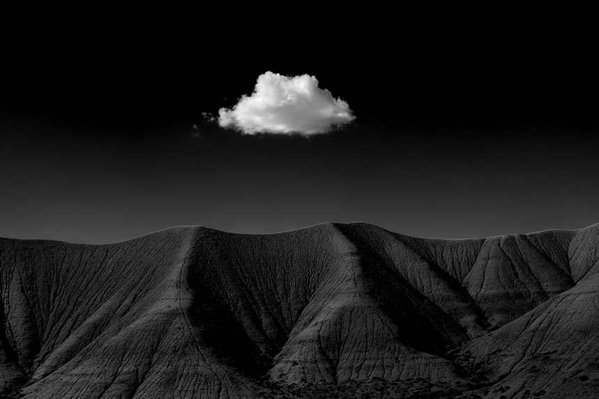
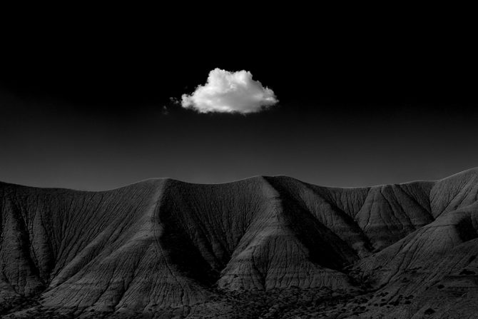
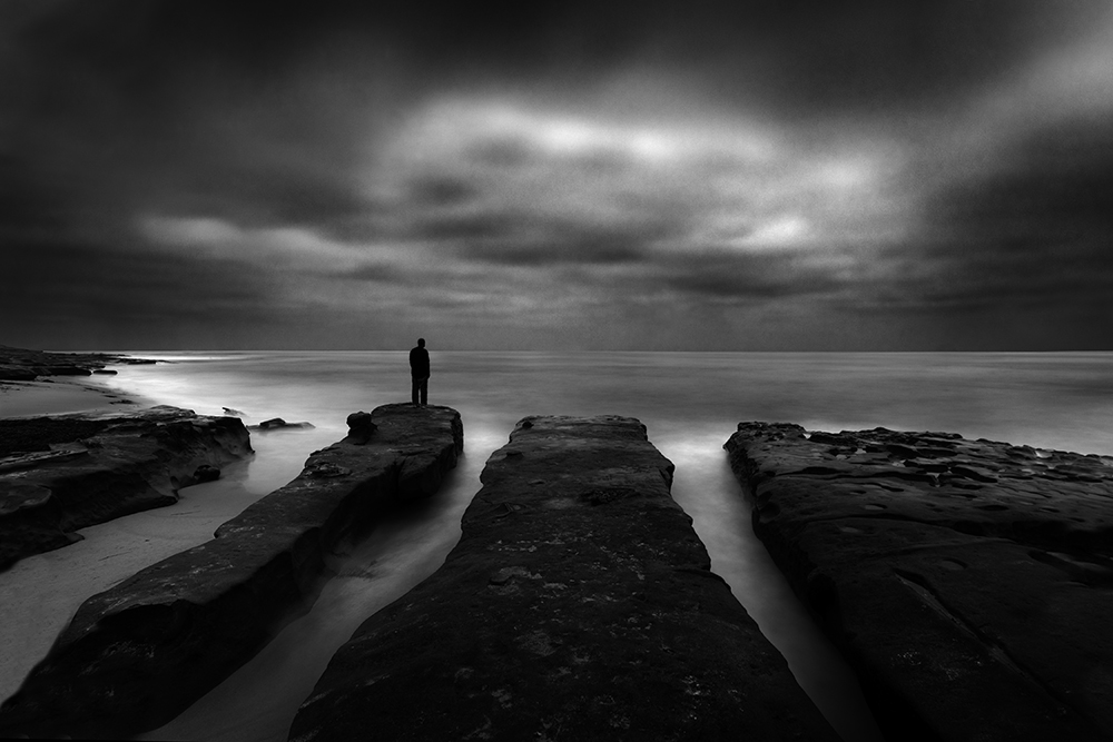
I’d like to tell you the story behind the image of Harbinger No. 1; how I came across it, how I created it and how it led to a ongoing portfolio.
My son Jem and I were traveling across Utah on a Father-and-Son road trip, it was summertime and it was 105 degrees in the Utah desert. Driving along I70 just across the border from Colorado we came upon these “mud hills” which caught my eye. They were so void of life that they made me think that this is what the moon must look like.
We stopped and I photographed for a while, but was unsatisfied. While the images were “interesting” they just didn’t feel complete and they certainly were not great. So we packed up and descended down the hill, eager to get back into the air conditioned truck.
But as were returning I saw this lone cloud moving very fast across the landscape. Based on its trajectory I knew that in just a minute it would be perfectly positioned over this dark symmetric hill that I had been photographing and would give my image the focal point that it needed. I ran up the hill as quickly as I could and hoped that I could get at least one shot, all the time thinking about the Ansel Adams story and how he rushed to get just one shot of Moonrise, Hernandez.
I quickly set up my tripod and camera, focused, adjusted my exposure and was lucky enough to get off two shots. I chose the above image of because it was centered above the hills and as many of you have noticed, I love centered and symmetric images. I was so fortunate to have this one perfectly shaped cloud come by and oblige me that day.
I like to name my images with the first word that comes to mind and this image immediately screamed “Harbinger” at me, and the dictionary’s definition became my artist statement:
Harbinger: \?här-b?n-j?r\ noun
1. one that goes ahead and makes known the approach of another; herald.
2. anything that foreshadows a future event; omen; sign.
People most often ask me about the processing of this image and I think that’s because many assume the key to a great image is in the processing. While there is no doubt that processing is important, it’s certainly no more important than the shot or your vision. If you focus on just the processing at the expense of vision or the shot, you may end up with a technically perfect but mediocre image. As an artist I try to focus on all three areas.
Vision
My vision for this image occurred at the moment I saw that cloud moving into position and I knew exactly how I wanted this image to look. It was going to be dark and that cloud was going to jump out at you! Sometimes that burst of vision can come later when I’m processing the image, but I don’t think it’s too important when the vision occurs as long as it does occur. Vision is what drives us to force the shot into compliance with our vision.
The Shot
When I composed this image I purposely centered the cloud and put the horizon in the center of the frame. Why? Because that’s just how the image felt to me. Next, I wanted a dark and graduated sky and so I used a polarizing filter which gave me both. On images i intend to be dark like this, I’ll often underexpose the image by 1 stop and then in processing I’ll dodge up the highlights.
Processing
When I converted this image to B&W I decreased the blue color channels to darken the sky, but I couldn’t go as far as I wanted because too much noise was being introduced. So to further darken the sky I burned it down with a very large and soft edged brush that was set at 1%. I work slowly to darken the sky to a pure black at the top and a very light gray at the hill’s edge. I dodged the cloud up so that it had a true white, but I was careful not to overdo it and lose highlight detail. This black sky and almost white cloud created this wonderful contrast that I love.
Next I burned the hills down so that visually they did not compete with the cloud for attention. And lastly I dodged up the very small edge of the ridge line to separate the hills from the sky. The final result is a dark image with a very bright subject, which is my preferred style.
When I created this first Harbinger image I really hoped that I could create an entire portfolio of similar images, but I never dreamed that I’d be lucky enough to find other such opportunities. I thought, how often will I see a single cloud over an interesting setting like this? But strangely enough I have found a few more and slowly my Harbinger portfolio is growing. Click here to see the entire portfolio.
Like all of my portfolios, this idea occurred spontaneously. I find that it’s easy to be creative when you are excited about a concept that inspires you!
Cole
November 11, 2011
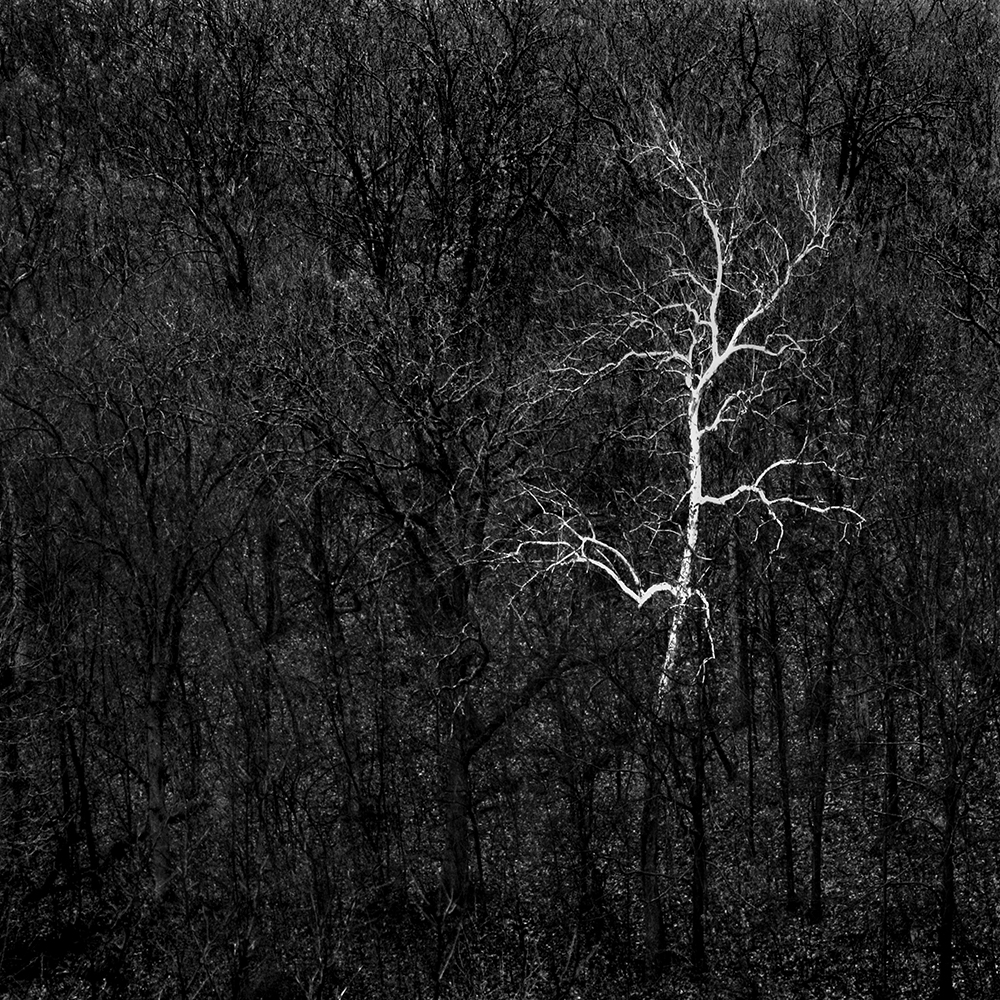

It was autumn and I was driving on I-70 just outside of Kansas City when it started to rain. The hills were covered in a dense forest of bare trees and as they soaked in the water, they turned black…except for this one lone white tree. Instantly I could see the potential for this image and I knew that I had to have it!
But I had already gone too far and so I had to travel several miles further until I could exit and turn around. Then I drove back past the lone tree a second time (but this time on the wrong side of the freeway) and traveled several miles further until I could exit and turn around again. I did this several times until I could find a spot where I could safely stop and hike to the right vantage point.
Then in the rain and wearing business clothes, I traipsed down a hill and sloshed through a muddy bog just to find just the right location. I’m not saying my trek was as tough as the pioneers had it crossing the plains, but it certainly would have been much easier to stay in my car, turn up the heat and act as though I hadn’t seen that damned lone tree!
However it was worth it, I like how the image turned out and this was just another in a long line of experiences that taught me to ALWAYS STOP when I see a great image. (See http://www.photographyblackwhite.com/photographs-create-images/) Yes, it would have been easier to keep going and yes, sometimes I do convince myself that I’ll come back later and get the shot. But my experiences have taught me that there’s rarely a second chance.
Always stop.
Cole
P.S. If I’d have seen this tree in the summertime, there’s no way I’d have stopped unless I had 100% DEET on my shoes, socks and pants. There’s a whole nother story about “chiggers” that I’ll have to tell sometime. I think I’ll title it “Chiggers: The Gift That Keeps On Giving” or “Why Pouring Gasoline On Your Legs And Lighting Them Might Sometimes Be A Good Idea!”
October 28, 2011

I’ve just created a short video to introduce people to the diversity of my portfolios.
Over the years I’ve been advised to pick just one subject and work to become known for that. However that approach has never appealed to me and I’ve always enjoyed pursuing a variety of subjects and styles. I have always believed that you must do what you feel and love because in the end your opinion of your work is really all that matters.
Cole
October 21, 2011

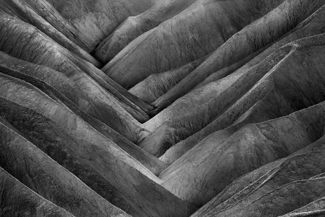
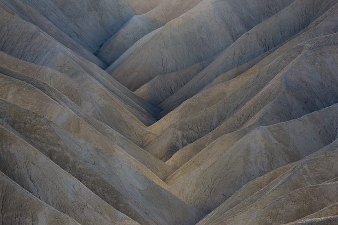
This is “Time No. 2” that I created at Zabriskie Point in Death Valley, perhaps the most photographed spot in the entire park. This image was created just before the sun went down and it’s amazing how Zabriskie Point can look so differently as the light changes from morning, to noon and to late afternoon.
Today I wanted to show a “before and after” so you could see what the original image looked and how your vision can change it. Sometimes vision takes place as you’re shooting and sometimes it occurs when you’re processing the image. And sometimes your vision changes over time and so you go back and change the image repeatedly (you should see how the The Angel Gabriel has evolved over time).
This original image is quite flat and muted, and so to make this a “Cole Thompson” image, I had to improve the contrast and separate the colors. I do this by adjusting the color channels in the black and white conversion tool of Photoshop CS5. By sliding each color’s adjustors in both directions, you can see how it will affect the contrast and separation. With the colors I had in this image, I was able to change the b&w version quite a bit by adjusting the color channels; the Red and Yellow channels brought out highlights, the Blue channels darkened certain parts of the image, and the green had no effect. When adjusting the channels, be careful not to go so far that you introduce unacceptable amounts of noise, particularly in the blue channels.
I then dodge and burn the image with my tablet to further enhance the contrast. In this image I used a very small brush to individually work each piece of the image so that I brought out the striations that separated each set of hills. I particularly paid attention to the ridge tops and brought out the highlighted edges.
One of the most important steps in my conversion process is to use the “Histogram” to check the blacks and white and then to adjust them using “Levels” if necessary (it’s almost always necessary). After you have established a good black and white, you can use “Levels” to adjust the midtones and really change the mood of your image, for my images I generally am pushing the midtones darker.
Once the image looks great on screen, I then use the global contrast adjustment to push the contrast even further so that it will print with the same “pop” that it has on screen. Remember that a monitor uses transmitted light and that always makes things look better than it will on a print. The reason for this is that a print uses reflected light which is quite dull and flat by comparison. By pushing the contrast further than you think you should, it will help ensure the printed piece looks good.
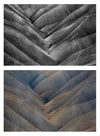
For me, the appeal of this image is it’s simplicity, it’s detailed contrasts and the compressed perspective. Death valley is really a spectacular place, especially in the winter. I go each January and just revel in the timeless solitude.
Cole
P.S. What I don’t like about side by side comparisons is when someone always writes and says “I like the color image better!” I’m just kidding of course, we all have our individual tastes and mine just runs to the black and white.
October 14, 2011
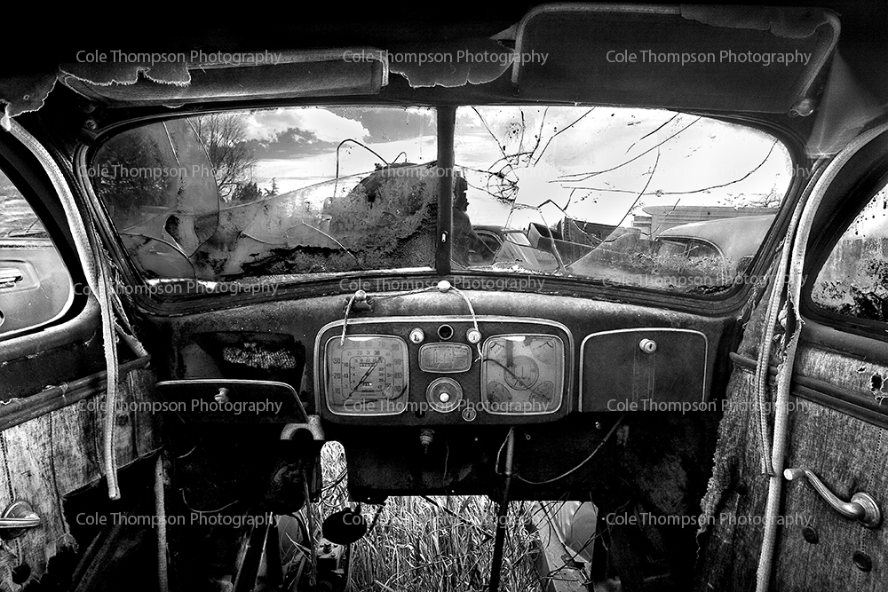
Old Car Interior is one of those images that is both complex and yet simple at the same time. This 1934 Chrysler interior was found just down the road in my friend’s backyard (I say “junkyard” but Frank gets mad at me). I was looking at the car’s dashboard and marveling at the incredible nostalgic detail, and thinking “if I could only capture it!” I had an idea of how I wanted this to look, but wasn’t sure if I could actually do it.
I’ve always believed that the rule of thirds was the key to a successful image, however not the traditional rule of thirds, but my own! It is:
- 1/3 the vision
- 1/3 the shot
- 1/3 the post processing
(you can read my post about the rule of thirds here: http://www.photographyblackwhite.com/rule-thirds/)
My first challenge was space, this was a very small interior and it was not practical to photograph from inside the car. Fortunately there was no back window and so I set up the tripod so that I could shoot through the back window. To capture the interior I used a 10-22mm zoom at 15mm on my 20d, making it a 24mm in full frame terms.
My next challenge was that it was quite dark inside the car and very bright outside. One exposure was clearly not going to span that wide dynamic range and so I decided on two exposures, one for the interior and one for the exterior. I chose not to use HDR as I personally find the look a bit unnatural. Using Photoshop I cut out the three windows from the exterior exposure and pasted them into the interior exposure, giving me a perfect exposure for the entire scene.
The processing was responsible for the uniqueness of this image. Using my pen and tablet I went over each piece of the interior to bring out the detail with what I call “local contrast enhancement.” This is a fancy way of saying that I would dodge and burn each piece to enhance the contrast in just that area. I prefer this localized approach rather than using a global contrast setting, which would affect all areas equally.
Part of my style is extreme contrast and so I would burn down the shadow areas to ensure great blacks, which further gives the impression of contrast and sharpness. In all I spent 50 hours to get this image right, which is the longest I’ve ever spent on an image.
The results surpassed my initial vision and has become one of my most published and requested images. I was by Frank’s today and visited “Old Car Interior” and was shocked to remember just how dull the interior actually looked compared to my final image. And something else that impressed me was the detail I was able to convey with 8 megapixels, demonstrating that it’s not always about megapixels!
Cole
Note: The matted 10 X 15 print of Old Car Interior sells for $400 but will be on sale for $275 until 11/1/2011. Just email me and please mention the discount.
October 4, 2011
If you’ve read many of my blog entries, you know that I believe in keeping things simple. And I’m not just talking about the image, but my thinking, my workflow, my printing and everything else. It’s a philosophy that serves several purposes; first it allows me to stay focused on what really matters. Second, it minimizes distractions such as setting up and tinkering with hardware and software. Third, it makes things easier to diagnose and fix when they do go wrong. And fourth, it helps keep my mind clear of unnecessary clutter.
Many people feel that they cannot produce good images with just the basics, and I disagree. From my experience the basics can produce incredibly beautiful images that most people would envy. I would also suggest that the incremental improvement that these “extras” provide, is so small compared to the time/money spent that they are a poor investment. Your time would be far better spent on finding your vision than setting up programs and plug-ins, or to learn to see better rather than trying to learn to use special inks for your printer.
I’m not saying that there aren’t some “things” that will improve the quality of your work, but by far the largest improvement any of us could achieve would be to improve ourselves rather than our equipment. I tell people that if there is a place for some of these things, it’s after the basics have been mastered.
I have been a technophile most of my life and there were times when my equipment and processes were more important to me than the work I created. I always had the latest equipment and all of the newest gadgets. It was an expensive vanity and it kept me from doing what I really needed to do, and that was to find my own vision. And perhaps that’s part of the reason we do it, it’s easier to buy new equipment then it is to develop our creativity.
I feel passionately about the concept of simplicity and so I approached The Center for Fine Art Photography to see if I could teach this philosophy in a workshop. They agreed and so starting on Wednesday October 19th, I’ll be teaching a workshop entitled “Keeping it Simple.” They keep the enrollment small at the Center and so it will be an intimate workshop.
This seminar will be focusing ultimately on the image, but will also be covering vision, shooting, workflow, printing, framing, marketing and other topics. You can learn more about the workshop at the Center’s website: http://c4fap.org/workshops/2011Simple/
Cole
P.S. In the spirit of full disclosure; I have served on the board for The Center for Fine Art Photography, I am friends with the director Hamidah Glasgow and I donate my time to teach these workshops.
September 27, 2011
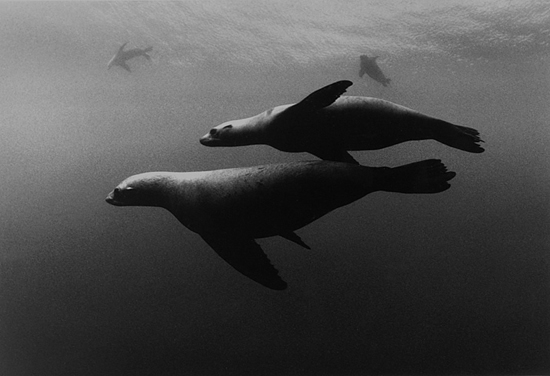
(Image: California Sea Lions #1 – Copyright 2011 by Chuck Davis)
My oft cited reason for “Photographic Celibacy“ is that I don’t want to copy the work of others, but there is in truth another reason; jealousy.
When I look at great work I become very jealous and wish that I had created something that wonderful. This happened to me today as I was putting my new and unopened copy of LensWork into the “give away” pile. I saw an image on the cover that stopped me dead in my tracks, an underwater image of sea nettles that caused a chill to go down my spine. I raced to devour the rest of the images and found they were created by Chuck Davis, an underwater photographer and cinematographer out of Pacific Grove, CA.
One of my loves in life is scuba diving and I’ve always longed to see great black and white, fine art, underwater images. Now at last I have and I am jealous.
Please check out Chuck’s website, he has such a variety of incredible images, and please drop him a line expressing how you feel about them. I think they are magnificent!
Cole
September 23, 2011

A Close friend sent me this article to consider and I really do not know where I stand on this issue.
I donate images to charity events. I have donated to some of the big name national events but mostly I donate to local causes such as our High School Arts Program, local Food Banks and Women’s Shelters.
Part of me understands what he is saying, but part of me disagrees. What are your thoughts?
Cole
The Career Benefits of Boycotting Charity Art Auctions
By Matt Gleason
Posted: 06/ 8/11 12:25 PM ET
There is a tradition of auctioning original works of art donated by artists to raise money for charitable causes. There are many good causes that hold such events. No matter how good the causes, though, I have come to the conclusion that artists must stop donating to every single one of them.
Don’t ever donate your art to a charity auction again. Half a century of charity art auctions have changed the way collectors buy art. These fundraisers have depressed prices of art across the board and kept artists in a subordinate position that has no career upside or benefits.
Instead of tossing away another great artwork to a good cause, join the good cause of boycotting charity art auctions. When you join this cause …
•You stop taking revenue out of the art world
•You stop shifting art collector dollars to the bottomless pits of recurring annual Beg-A-Thons
•You don’t contextualize your art as being a synonym of pretentious panhandling
•You don’t announce that your art is worth low bids
•You don’t risk that your work will be publicly seen getting no bids
•You don’t empower strangers to devalue your artwork
•Most importantly, you stop publicly proclaiming that you give your art away
The argument against me is simple: Donations of art to charity auctions raise money for good causes and raise the profile of artists who put their art in the public eye. It is a good argument. It has worked well. This seductive sales pitch has pulled in countless millions of dollars over the past few decades.
Problem is, this argument has not lived up to its bargain. Sad news: Your profile got humiliated because the collector got such a bargain on your art. If your art was one of dozens of trinkets on a wall with a hundred other artists, your profile actually disappeared there in the crowd anyway.
I would love to hear the story of the artist whose career rocketed to success because he or she donated a work to a charity auction and this act alone tipped the first domino toward an avalanche of success coming his or her way. This narrative is always implied. I’ve never seen it happen.
Charity art auctions are the emptiest of promises to artists: you give us your work, you get nothing in return except a party invite to an event where you are a second class citizen. Watch as the price of what you really will let your work go for is nakedly advertised to the select group of people to whom your work is meant to be seen as rare and desirable.
Suppose you want to at least deduct a donation of your art to the charity, guess what? The law only allows an artist to deduct the cost of materials. Meanwhile a collector can buy your work for the minimum bid, have it appraised at its full retail value and donate it to some other good cause for that top dollar amount.
As for the merits of the infinite number of good causes out there, what is the value in giving up a painting that would sell for a thousand dollars retail in order to see it raise 50 Bucks for that cause? Pick one charity, donate generously and keep the collectors assuming that the price you ask at the gallery is the best and only price they are going to get.
Someone has to be the bad guy here, so you can blame me for inspiring you to donate cash to a good cause and to keep your art career safe from the bargain bin. Print this out and send it with your regrets to anyone asking you to devalue your work in the name of glamorizing their efforts on behalf of yet another worthy cause in a world of infinite and endless good causes. Tell them the art stops here.
Matt Gleason
September 22, 2011


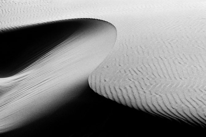
I’ve just returned from my annual Bandon trip where I take 10 days and think only about one thing: my art. Every year I worry if I’ll see something that inspires me and I get myself all worked up over it: Will I find something? What if I don’t? I’ve only 5 days left, now the pressure really is on!
It’s kind of like those nights when you just cannot get to sleep and you keep watching the clock, and with every hour the pressure increases because you have one less hour. It’s counter productive, we know, but we do it anyway.
So after days of walking and looking, something caught my eye. I was at a spot on the coast where the wind surfers congregate because of the fierce winds. Another affect of the winds are these magnificently crafted dunes that are compressed into a very small space between the surf and the cliffs. In that tight space wonderful shapes and shades of light are formed, different from what I normally see at traditional sand dunes.
It was there that inspiration struck; suddenly, unexpectedly and spontaneously. I saw something in those dune details that inspired me and I worked like crazy, everywhere I looked I saw something magnificent. I came back by a day later and I saw anew all over again. I ended up creating about 25 images for a new portfolio (title at present, unknown). The above image is one of my favorites from this new series.
Despite the pressure we put on ourselves, inspiration cannot be rushed. It just happens and when it does, you’ll know it by your excitement and how easy the images come together.
Cole
P.S. My next newsletter will be out in about two weeks and I’ll have this new series along with some other images from my Bandon trip.