Year: 2010
October 23, 2010
This blog appeared on the Singh-Ray site on Tuesday, October 19, 2010
Cole Thompson explains how he uses long exposures to create his mystical black and white images

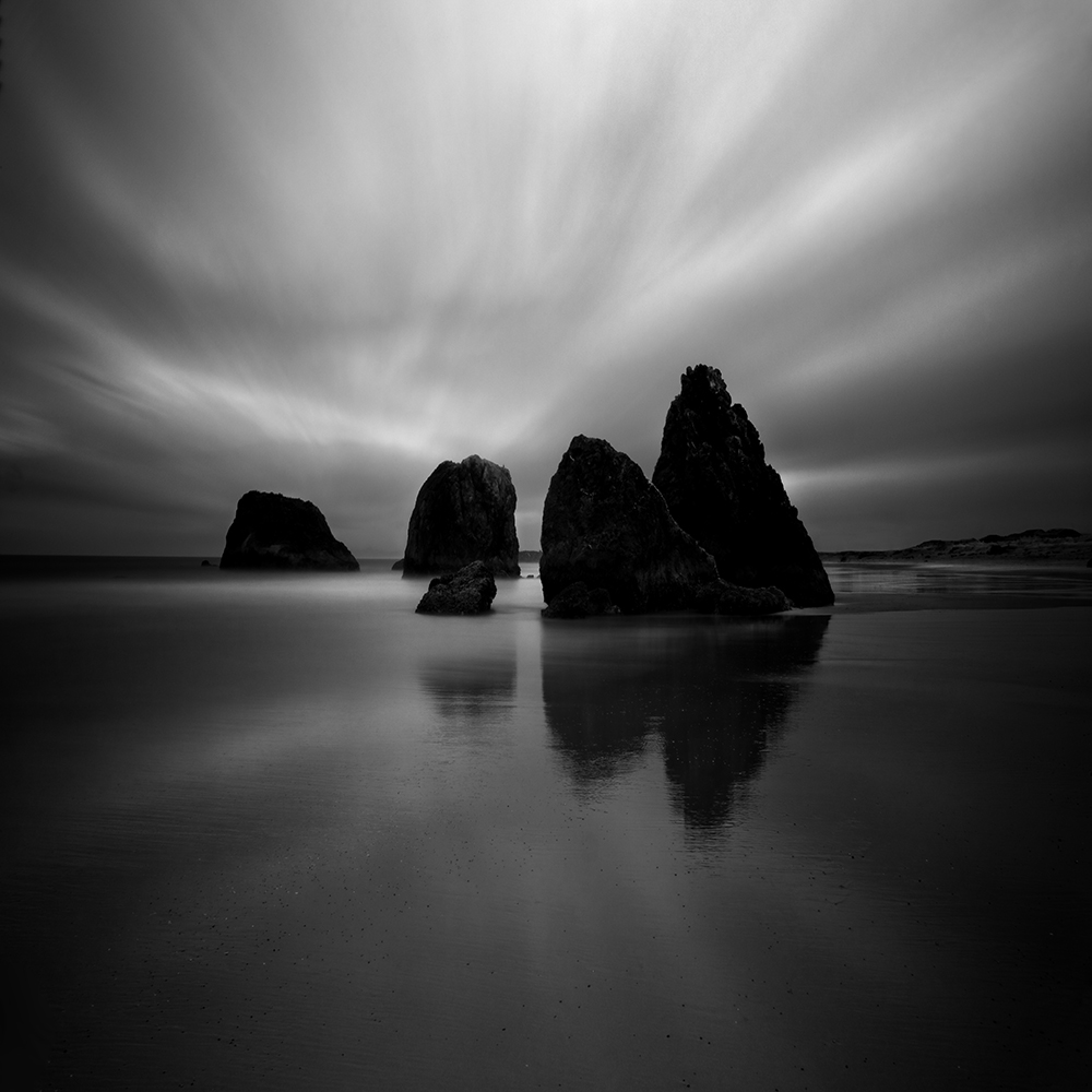
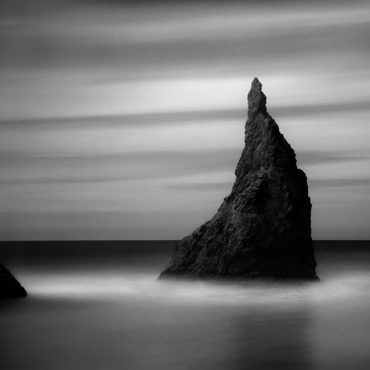
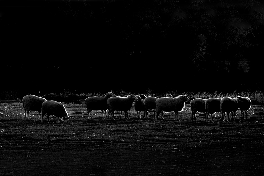
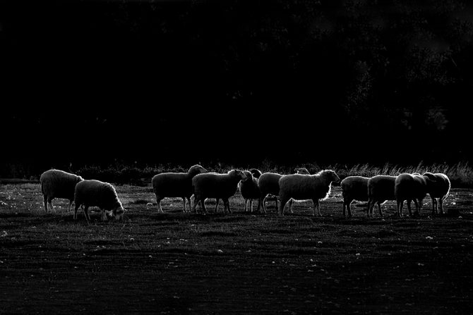
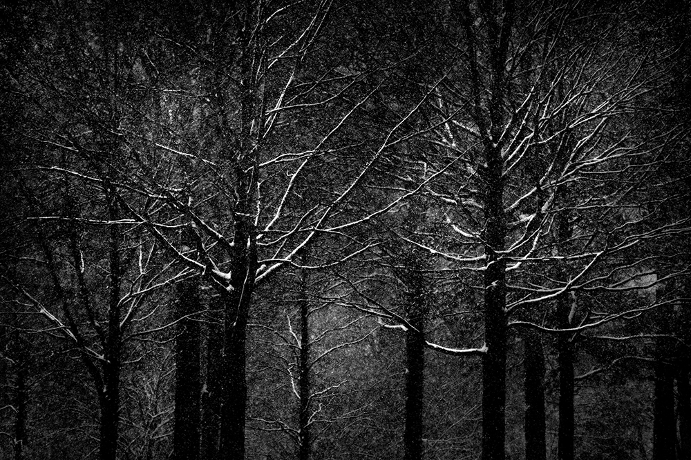
Fine-art photographer Cole Thompson creates his images and visual essays in dramatic black and white. His images involve the use of very long time exposures of 30 seconds to several minutes. “I have always been intrigued by monoliths, first by the statues on Easter Island, then by the monolith in the film 2001: A Space Odyssey and most recently by Stonehenge in England. In each case, seeing these monoliths prompts the question; Who built them and for what purpose? I’ve always loved visiting Bandon Beach in Oregon because of the natural monoliths strewn along the coastline. Randomly placed, it is as though the earth were God’s chessboard and the monoliths the pieces from an unfinished game. I’ve included several images of these Bandon Beach monoliths to illustrate my use of long exposures for my various monochrome print portfolios.

“I have often created my monolith images using long exposures of 30 seconds, but recently I found myself experimenting with daytime exposures of up to 5 minutes. In each case, whether 30 seconds or up to 5 minutes, the Singh-Ray Vari-ND filter was essential to creating these images. If you’ve ever tried such exposures with a fixed ND filter, you know the challenges. First, to compose you have to remove the filter because the filters are so dark you cannot see through the viewfinder. Second, when removing and replacing these filters you can accidentally change the focus or the focal length of your lens. Often you’re not even aware of these lens movements until later, when it’s too late.
“When I mount the Vari-ND filter on my lens, I dial it to the minimum (Min) setting. At this point the filter has already added about 2 f-stops of density which is just enough to darken the image in the viewfinder a bit, but I can still see clearly enough to compose and focus accurately. I then rotate the front ring to increase the density by as much as 6 additional f-stops. When I need even more density, I stack the Singh-Ray Mor-Slo 5-stop ND Filter in front of the the Vari-ND to achieve up to 13 stops of density. This allows me to use very long exposures, even in full daylight.

“Here are some of the things I’ve learned about using very long exposures. First a tripod is a must and a remote shutter release is desirable. While it’s true that slight camera movements do not seriously affect the very long exposure, it’s best to eliminate vibrations as a “best practice” and because camera movement can ruin an image with a 5 second exposure or less. I shoot at ISO 50 at F22, put my camera into RAW/monochrome mode and set the exposure mode to manual.

“The most frequent question I am asked is how I determine my exposure. I use the in-camera meter for exposures up to 30 seconds, and beyond that I find I must extrapolate because the digital SLR’s I use only meter up to 30 seconds. With my camera set to F22 and 30 seconds, I dial my Vari-ND’s density ring until my exposure is correct. To extrapolate for exposures longer than 30 seconds, I do the same thing but set the exposure to 2 f-stops below ideal and then quadruple the exposure in my head. If 30 seconds is what I’m metering for, then quadrupling brings me to a 120-second exposure.
“But strange as it seems, if I expose at 120 seconds, the image will be very underexposed. So I’ll generally expose at 300 seconds for a good exposure. I’m not sure why the 120 seconds doesn’t produce the correct exposure, but it could be due to some kind of digital equivalent to ‘reciprocity failure,’ which is a phenomenon experienced when shooting extra long exposures with film. The reason for such reciprocity failure with film is that the longer the exposure, the less effective the film is in recording the light and so the exposure length needs to be increased. In the case of my digital camera, when the meter says I need a 120 second exposure I extrapolate that reading and give it 300 seconds. It works for me.

Something else that is very important when using the in-camera meter is that I must completely isolate stray light from coming into the viewfinder and affecting the meter reading. To do this I use a Hoodman eye-cup which allows me to seal the viewfinder with my eye. This is essential for a correct exposure.
“Shooting long exposures at the beach creates a couple of additional challenges. Waves hitting the tripod legs will cause them to sink into the sand, ruining the exposure. I can either move out of the water line or build wide feet for my tripod that give it a larger footprint. The beach also has strong winds and a lens makes a great wind sail. I combat this by using a heavy tripod that allows me to hang a weight onto the center column to steady it. I also position myself between the wind and the camera and often turn my jacket up above my head and use it as a wind shield.
“Lastly, let me repeat that camera movement is the primary enemy of long exposures. Even the slightest movements can ruin the image. Sometimes it’s just not easy to detect this movement by checking the camera’s display. For this reason, I check every image with a hooded loupe which enables me to see the image clearly even outdoors.
I have found extra-long exposures to be especially appealing to me, perhaps because they help convey nature as timeless. I’ve come to a point where the technique has become part of the message in my work. Choosing the length of the long exposure will control how that movement looks in both water and sky. Exposures from 2-30 seconds can give a completely different look in water while the longer exposures measured in minutes are usually needed to produce dramatic skies.
There is no better tool than the Vari-ND to produce these types of images. As I’ve said before in my other Singh-Ray posts, this filter not only makes it easier for me to create these images, in many cases I could not have produced them without the Vari-ND.”
To learn more about Cole’s work check out his previous stories on this blog and pay a visit to his website.

Labels: Cole Thompson, Mor-Slo, Vari-ND
October 7, 2010
Pablo: Vinnie, how have you been? Wonderful new piece, what do you call it?
Vincent: I’m not sure, maybe “Big Moon in Sky” or something like that. My friend Don suggests I call it “Starry, Starry Night.”
Pablo: Question for you, what paint did you use on this? Is this the 3000 series of paints?
Vincent: No! It’s the new 5000, I wouldn’t be caught dead using the 3000, have you seen the tonal range on those paints? Appalling!
Pablo: I agree, personally I wouldn’t ever purchase a painting if it used those paints.
Vincent: Agreed, what are those other painters thinking?
Pablo: This canvas is nice, what is it?
Vincent: It’s a new canvas, out of Germany and I really like the texture on it. I’ve been searching and searching for the right canvas and I’m just am not happy with anything yet.
Pablo: I know what you mean, I’ve been searching for years for the perfect canvas and will not rest until I do. Hey, I’ve been noticing the perspective on this piece and it leads me to believe that you’re using a 54″ easel? Placing your canvas a little higher are you?
Vincent: Yes but not a 54, it’s a 57 and combined with those new Hartford stools (they have a great padded cushion) I sit so much higher and really like the feeling when I’m working. Plus, they adjust so easily.
Pablo: Wow, I’ll have to check those out, I think Al’s apothecary is carrying them.
Vincent: I heard a rumor that you’re trying some of those new camel hair brushes? Tell me it isn’t so Pablo!
Pablo: Where did you hear that? It’s true, but I’m not telling anyone. They are so much better than the cat hair brushes that I normally use. Have you tried them?
Vincent: I wouldn’t be caught dead with one of those, do you know what would happen people found out that I was using Camel hair! I don’t have to tell the scandal…
Pablo: I see you’re using those new frames from Friar Wilson, how do you like them?
Vincent: Pretty good, they’re a lot cheaper so my margins go way up. I need a little extra “ching” so that I can purchase that new satchel from Mary the Seamstress. Have you seen it, it matches my frock and is really nice for carrying around my art supplies.
Pablo: Yes, those are nice, but not as nice as the ones made by the Maid Vivian!
Vincent: You’re nuts, those look horrible! You’ve got a poor sense of colors Pablo.
Pablo: Me??? You’re the one stuck in the past man, wake up!
Vincent: Look at us, talking about paints, easels and brushes. Does any of this really matter? I mean, do you think photographers sit around and talk like this? I suspect not.
Pablo: Good point. Maybe there’s more to painting than equipment and tools and such?
Vincent: I think so, perhaps it ought to be more about the art?
October 7, 2010

Lightroom vs Photoshop, does it matter?
Nikon vs Canon vs Fuji…who cares!
Film vs Digital…who cares even more!
Those who think the cost or bulk of their equipment reflects how good of a photographer they are.
People who think a prime lens is the key to a great image.
People who think art is a competition; and for them to win, someone else must lose.
“I’m only an amateur” (said in an apologetic voice)
Photographers who complain that photography isn’t taken seriously as an art form, and who then act like a photographer rather than an artist.
People who think that an artist statement needs to sound like a dissertation on the unintelligible, and then go on to prove it.
Photographers who worship processes and equipment more than the art.
Those who don’t understand that photographing a unique subject is not the same as creating unique work.
Artists who take themselves and their art too seriously.
Well meaning people who want to tell you how they would have created your image.
People who look others art and say “anyone could have done that!”
People who are threatened by other people’s success.
Artists who have MFA’s and want you to know about it.
People who mistakenly think that a degree in art makes you an artist.
Photographers who follow “the rules.”
Photographers who say there are rules that must be followed.
Caring what others think of your work and producing work to please others.
And lastly this one just makes me sad: Those who do not believe in themselves and their ability to be creative.
Cole
July 16, 2010

I believe that to succeed in one’s art, one must first identify what success means to them.
Sometimes when you’re younger, success simply means “rich and famous.” But as we get older our values change, we have grown, matured and success is no longer that obvious. Also, we start to realize that success means different things to different people.
So, what does success mean to you? To make it easier to digest and compare answers, let’s keep our definitions to three short items.
1.
2.
3.
I’m anxious to hear everyone’s thoughts.
Cole
P.S. The question “what is success” is not just for “professionals” (I dislike that distinction) but for everyone.
July 3, 2010
Focus on Singh-Ray Filters
Showcasing images made with Singh-Ray photographic filters
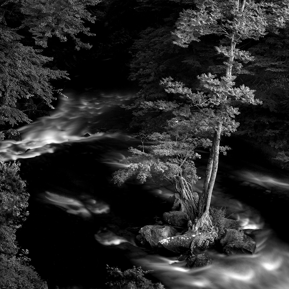
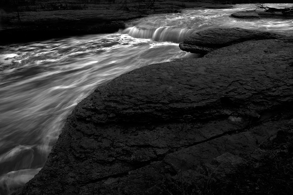
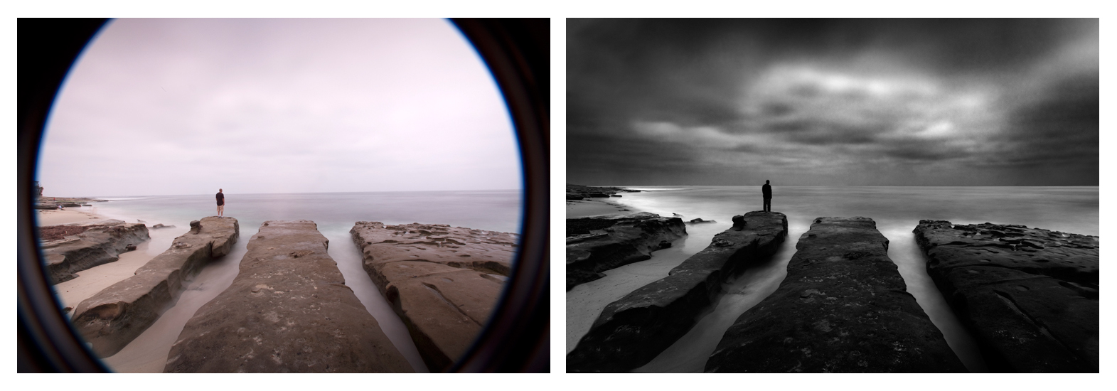
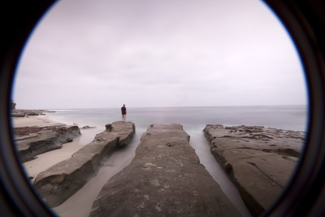
Colorado photographer Cole Thompson is dedicated to creating his fine-art images and essays in dramatic black and white. A major feature of his work is the use of very long time exposures of 30 to 90 seconds and longer. “I believe that long exposures and water are a natural match. Portraying water as fluid seems so much more natural to me. My Singh-Ray Vari-ND lets me easily explore exposures of varying durations by simply adjusting the density from about 2 stops up to 8 stops, or anywhere in between.

Dark Waters
1-second exposure
“My strong attraction to long exposures came about because of water. I was intrigued by the way moving water looked at different exposures; a 1-second image looked so completely different than a 10- or 30-second exposure. My very first long exposure of water was this 1-second image entitled Dark Waters created on the Blue River in Kansas City.

Lone Man No. 35
30-second exposure
“This led to my photographing water in all kinds of waters and often using a very long exposure to create a smooth, milky white look to the water as in Lone Man No. 35 created in the Honduras.

Poudre River Spillway
30-second exposure
“Each exposure length can create a completely different look. So I’ll photograph the same scene over and over from 1 to 30 seconds to get the right feel. Here is a very simple image of water flowing over a spillway on the Poudre River in Colorado.

Rocks and Mist
30-second exposure
“Another factor affecting how the water will look is the speed at which it is moving and the direction it is moving in relation to the camera. In Rocks and Mist created in La Jolla, the waves were rushing in and out giving the water an appearance of fog.

Rushing Waters
30-second exposure
“Likewise in Rushing Waters the water is often mistaken by viewers as a cloud flowing over a mountain rather than the reality; rushing waters flowing over a large rock near Washington D.C.

Fluid Water No. 6
10-second exposure
“Many of my images are created at 30 seconds, but sometimes a faster exposure allows for more definition in the water — such as in Fluid Water No. 6 which was a 10-second exposure created on the Poudre River.

Primordial Soup
30-second exposure
“The speed of the water and its direction of movement often affect the look of the ‘fluid water’ as in Primordial Soup created on the Oregon Coast. In the foreground there is a very slow-moving pool of water, while in the background the crashing waves of the beach are rendered soft and without definition.
“Getting long exposures during the day requires a great deal of neutral density. I use the Singh-Ray Vari-ND and then stack the Mor-Slo 5-stop ND filter on top of it, giving me about 13 stops of ND. This will allow me under most conditions to get a 30-second exposure in bright sunlight.
“I use the camera’s meter to determine exposure and am very careful to block stray light from entering the eyecup while metering. I usually start with a 1-second exposure and then work my way up: 5, 10, 50, 20, 25 and 30 seconds. You’ll be amazed at how different each shot can look.”
Another tip from Cole: “Turn off the long-exposure noise reduction and use the mirror lockup for exposures in the 1 to 5-second range — mirror lockup is not needed for longer exposures.”
To see more of Cole’s work and learn more about his creative techniques, you’ll want to check out his previous stories on this blog and visit his own website and blog.
June 26, 2010

Printing is a very large topic, but it doesn’t need to be a complicated one. I keep my printing process simple because I’ve found that the fewer the steps, the fewer things there are to go wrong. As I said in a previous blog entry: “Let me oversimplify and summarize it this way; I produce my prints with a copy of Photoshop and an Epson printer, and that’s about it. You don’t need complicated or expensive extras to create great black and white prints.”
Here are my guidelines for great B&W prints:
1. Start visualizing the print the moment you look at the camera’s preview screen.
Have you noticed how great the image always looks on that little screen? One of the reasons it looks so good is because it uses transmitted light, or in other words the image is back-lit, and that produces an image that is very bright and contrasty. Unfortunately a print uses reflected light and that just cannot hold a candle to that little screen. I have to work very hard to get my print to look that good and I use preview screen image as my goal; it will not look exactly the same, but it will have that same pop and sizzle.
2. Make sure you have true blacks and true whites.
When people come to me with the complaint of flat and dull prints, I almost always find that it’s because they do not have true blacks or whites in their image. To know if you have a true black and a true white, you must look at the histogram because your eyes cannot judge this accurately by looking at the monitor. There are several ways to get a true black and white, such as using Levels, the contrast control (not recommended) and by dodging and burning. Whatever method you use, have that histogram open and let it be your guide.
3. Contrast is what makes the image pop.
Look at the image above, it has a great deal of contrast and that’s what makes my images pop. To increase contrast many people instinctively go for that nasty contrast control, I say nasty because it generally has nasty unintended consequences like blocking shadows and blowing out highlights. There are other ways to improve contrast such as Levels and my favorite; Dodging and Burning.
4. When you get the image to look good on screen, then you have to go further still.
An image that looks good on screen with transmitted light will look flat and dull when viewed as a print with reflected light. So once it looks good on screen, you must go further and increase your blacks, increase your whites and increase your contrast. While you’re pushing the image further, your instinct will be to stop because the image can start to look artificial, but with time and experience you’ll come to know how far you need to go and how far you should go.
5. Don’t Search for the “Perfect Paper.”
There are thousands of paper choices these days and you shouldn’t get hung up on finding the “perfect” paper, there’s no such thing! There are many great papers and you simply need to find one that is suited to your work. I use either Hahnemuehle Photo Rag 308 which is a matte paper or Epson Exhibition Fiber which reminds many of an air-dried “F” surface, reminiscent of the darkroom days. I find that these two papers work for 99% of my work.
Why choose a matte or a glossy? A lot of it has to do with your personal preferences and the vision you have for the image. The Hahnemuhle is a “fine art paper” that has a nice texture and works well with most of my images. I use the Epson Exhibition Fiber for prints when I want a more “traditional” look and when I want a bit more pop from the blacks. Glossy/semi-gloss papers will always give you better blacks than matte papers, but the differences between the two are minimal when they are put under glass. Another reason I prefer matte papers is that under glass there is no reflection off the paper surface, I find that reflection on glossy paper very distracting.
6. Spend good money and get a good printer.
Unfortunately this is an area where you must spend some good money to get a good print. General purpose home or office printers just cannot produce a great black and white print. I love the Epson printers and their K3 inks, but the other big names produce nice work too.
I am often asked about special inksets and profiles and RIP’s. I don’t use them, I find the Epson ink and “Advanced Black and White Mode” gives me everything I need and it keeps my workflow simple.
7. Avoid the extras.
I know that people swear by such things as profilers, calibrators, b&w converters, plug-ins and RIP’s, but from my experience they only add a little bit to the image and they really complicate the workflow. Another danger of using these extras is that you can lose sight of your objective and get caught up in the process. So my advice is; put those extras away until you can produce a great print using the basics, and then you might consider getting them out again (but I’m guessing you won’t!).
8. Look at the print the next morning.
Sometimes you can stare at a print for so long that you get a distorted view of it, so leave it for the morning and look at it with fresh eyes. You’ll often find that you’ll want to tweak it again. Fresh eyes are always good.
Producing a great print doesn’t have to be complicated, in fact “complicated” just gets in the way of a great print. Keep it simple, standardize your workflow and become very good at the basics and you’ll soon have a procedure that produces great prints and is reproducible.
Cole
June 11, 2010

I often receive requests to show some “before and after” images to help people understand how much of my work is done in camera and how much is done in Photoshop. I’d say it’s generally about 50/50 but that can vary by image with some images almost ready right out of the camera and many requiring extensive processing in Photoshop.
Lone Man No. 20 is a good example of a 50/50 image. As you can see, the image I started with and the final image are both quite similar and yet quite different. The original shot has all of the important elements; the composition, the long exposure of the water, the clouds and the lone man, but it doesn’t have the dramatic effect of the final image.
Probably the first change you’ll notice in the final image is that the severe vignetting has been repaired. I was shooting with an extremely wide angle lens and I had two stacked neutral density filters on my lens, as a result a great deal of the filter was included in the photograph. To repair this I first cropped the image and then I used the clone tool to fill in the missing corners.
Next you’ll notice that the sky in the original image has very low contrast and is quite bland. To bring out the sky detail I split the image into two halves, upper and lower, and converted them to b&w differently. In each conversion I used Photoshop’s “Channel Mixer” but in the upper half I used some blue channel to improve the contrast and detail in of the sky. Next I used some pretty aggressive dodging and burning to bring out the definition and detail in the clouds, this information was in the image but it was almost hidden to the eye. As a rule you can generally recover image detail as long as you have not over-exposed the image to the point that you have blown out the highlights.
Note: one of the side-effects of using blue channel in the conversion and dodging and burning is that the image can get very grainy. When using this technique you must carefully balance the good-effects with side-effects.
Next I converted the lower half of the image to b&w, darkened the image and greatly enhanced the contrast. This dark and contrasty approach is the look that I like and it often has the effect of making daytime look like night time. The March/April issue of Photo Technique Magazine featured an article on my work and they used the phrase “Darkness at Noon” to describe this look.
All of this produced a basic final image, but it still didn’t have the dramatic impact I was seeking and that I had pre-visualized before I captured the image. So my final step was to dodge and burn to bring out the highlights and selectively darken blacks to locally enhance contrast. As I did this I carefully monitored the histogram below:
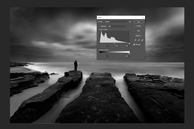
 This histogram shows that I have a good black and a good white, something your eye cannot always discern when looking at the image on the screen. Monitors are often out of adjustment and our eyes can be fooled, but the histogram never lies. People often complain to me that what looked good to them on screen, often prints flat and muddy. Generally the problem is revealed in their histogram; they lack a “true” black and good contrast.
As you can see from my final image, it does not represent reality. Reality is not my goal but instead I strive create images that reflect how I see the scene through my vision. That is why I advocate that photographers work just as hard on developing their vision, as they do on their technical skills and equipment. The image begins and ends in your mind’s eye.
May 25, 2010

A funny thing happened in Omaha…well, not really.
I was photographing the sky scrapers of downtown Omaha, just as I had just done in Minneapolis and Des Moines, when a young security guard rode up and told me that they had observed me on the security cameras and that I couldn’t photograph the First National Bank building across the street. I had been through this scenario before and so I forcefully told him that I was on public property and that I was free to photograph the building. I could tell by the look on this poor guys face that he didn’t want to be in the middle of this and so I said “Look, it’s not personal, but I face this all of the time. I am on public property and I can photograph anything that I want. Go ahead and call it in, it’s okay.”
A few minutes later he looked up and said “she’s coming” and yes she was! A female supervisor was marching towards me with a lot of attitude and demanded to know what I was photographing. She then stood about 1 inch from my face and stood on my materials so that I couldn’t photograph, and insisted that I give up my camera so she could erase my images. The situation was quite comical because as I pointed out to her, I could call up hundreds of images of the same building using my iPhone. Because she would not let me photograph and wouldn’t allow me to me leave, I asked that she call the police to resolve the impasse.
I’ve been in this situation a number of times before both with the police and with private security guards and I’ve generally found the police to be polite and educated about our rights. Once I was stopped while photographing a bridge in Florida because it was adjacent to a Navy base, the officer requested some information and was polite and even apologetic. This was a positive experience.
However my experience with private security guards has not been so polite or positive. They seem to have been given strict orders about not letting people photograph their property but they seem to lack an understanding of the law and our rights. This can create a dangerous situation to your person, your images and to your equipment.
Some things that you can do are:
1. Know your rights. You can download a copy of “Photographer’s Rights” and carry it with you: http://www.krages.com/ThePhotographersRight.pdf
2. Be confident, firm and cooperative. Knowing your rights can help you be confident and firm, but you should also be cooperative and explain exactly what you’re doing; “I am a fine art photographer and I’m photographing…..” While an explanation is not generally required by law, there can be no harm in being cooperative.
3. Be polite. While you may be in the right, that rent-a-cop can still hurt you (oh mamma), delete your files or damage your equipment. So be polite and only bring out the attitude if it’s really needed.
4. Call the police. If your confrontation is with a private security guard and you cannot resolve the situation, one option is to call the police and hope that they will protect your rights. Of course it could go the other way and you may be detained until the issue is resolved.
In a post 911 world photographers are being scrutinized more than ever. I’ve noticed that certain pieces of equipment seem to draw attention: a large camera bag, long lenses and tripods. Whenever I’ve used a tripod on the Mall in DC I am questioned.
I do try to appreciate both sides of this issue, the police and private security guards have their orders and their intent is honest; to prevent future attacks. However we do have rights and it would be pretty difficult to be a photographer if you’re not allowed to photograph! So my best advice is to know your rights, keep your cool and be polite.
Cole
P.S. Regarding the impasse in Omaha; before the police arrived the supervisor received an urgent call and left me standing there. As I was leaving the police arrived and asked if I was okay, I said yes and left.
April 20, 2010

Do you LOVE what you’re doing? Does your current project so excite you that you spend your lunch hour working on it? Do you rush home so that you can use that last hour of sunlight to create a few more images? If not, then perhaps your current project isn’t the right one for you…at this time.
I believe that you must be completely excited about the project you’re working on or it will not be your best work. I’ve seen many pursue a subject simply because it’s “unique” or “different” with the hope that this will be enough to earn them notoriety. However my experience has been that “different for different’s sake” is not enough; there must be real passion in the project or it will fall flat.
I keep a list of potential projects and every new idea, silly or not, goes on this list for future review. With time some of these ideas look even sillier and I wonder what it was I was thinking! However some ideas are really good ones but just not right for us at that moment in time. That’s why I write down every idea, review them periodically and never remove them from the list. You just never know when these ideas and your mood will mesh and a fantastic synergy will be born.
There is such an emphasis in the world today to be different and to get noticed. There are trends that photographers sometimes feel they must follow in order to be in vogue and fit in. There is so much competition that we all feel this desire to be unique so we can rise above the fray. While each of these factors must be considered as we make our long term plans, they should not be our primary focus. What we must focus on is producing art that is uniquely ours, work that is true to our vision and producing something that reflects our passion.
Only then do we stand a chance of being “successful.”
Cole
P. S. I’ve promised several people that I’d create a blog entry on what “success” means, I’ll do that soon.
April 7, 2010

Where do you find the “great” shots? It’s a question I’ve been thinking a lot about lately.
Earlier in my career I thought that you had to go to a great location to get a great shot. You know; Death Valley, the wilds of Africa or the mountains of New Zealand. These are beautiful locations and so it made sense to me that I would produce great images there.
Then I went through a period where I believed that great shots were everywhere and all that was needed was the vision to “see” them. I remember reading a statement by Edward Weston, who infirm and confined to a chair said that he ought to be able to look down at his feet and find a great image.
That’s a great theory, but what’s the reality? Does location contribute to the creative process? Can I really find great images in my own back yard?
My actual experience has been mixed; I have been to some great locations that have produced some great shots but there have been other times when I couldn’t see a thing, only to find another photographer had created incredible work at the same place. I would look at their images and marvel how it was that I didn’t see that. Conversely I’ve also been to some uninspiring locations and produced some wonderful images that others had passed by.
My current thought is that creating a great shot is like panning for gold. There are always a few nuggets laying on the surface, but for the most part the gold is hidden beneath the surface and you must really work hard to find it. So while beautiful locations have produced some great work for me (gold nuggets), the bulk of my images (gold dust) came about from hard work.
I have noticed that great locations can be inspirational, but without vision I’m only likely to see the shots that everyone else has photographed before. After all, when a gold nugget is large enough to be noticed, everyone else notices it too! Think about how many similar images of Yosemite you have seen, that’s because gold nuggets are easy to see.
A short time ago I was in a creative slump and went on three trips. At the start of each trip I really believed that the location would inspire me to create great images, but as each trip produced mediocre images I blamed it on the weather, the boring landscape or my lack of time. Eventually I had to face the reality that it wasn’t the location, it was me. My conclusion: I’d rather be inspired in a uninspiring location than to be uninspired in a inspiring place.
So how would I answer the question “Where do you find the ‘Great’ shots?” I think you find them wherever you’re at and while location can help, it can never take the place of vision.
Cole